Jolie Laide, a new gallery near City Hall on Juniper Street, opened the doors to their first show with the brightly-colored, funny and melancholy works of Kevin Baker, Tom Costa, and Austin Eddy—the decorative, the decayed, and the domestic. The large new space is bright and welcoming with exposed brick and open space in the front room and italian plaster walls in the rear gallery. It provides an interesting architectural background for the current show which features both architecture and interiors. Although Jolie Laide already represents local artist Jordan Griska, their debut show highlights experienced, but little-known artists that are new to the Philadelphia art scene.
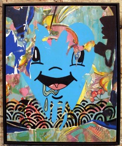
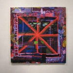
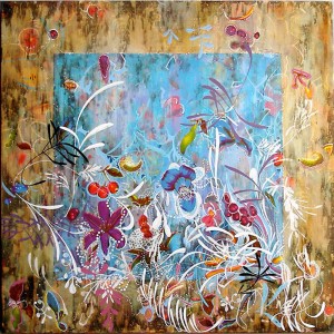
Kevin Baker (NYC) paints on oil cloth print; his decorative motifs, reminiscent of Indian miniatures, surround the oil cloth’s floral and fruit elements that frolic in an abstract swirl. The works range from two foot to four feet in width and are mostly unframed showing off the unembelished oil-cloth print on the sides. This glimpse of the works’ substrate is echoed in some of the paintings where Baker has scraped the paint away from the cloth surface, allowing the imagery from the prints to participate in the painting, as is the case with the titular figure in Handsome Fruit.
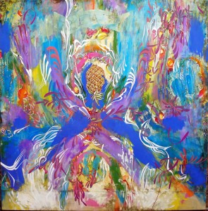
Gallery Director and show curator Travis Heck selected pieces from each artist that straddle a transition in the subject or style of their work. This shift in perspective adds depth to the show as a whole. While some of Baker’s earlier work shares a hallucinogenic quality with Odilon Redon—recognizable subjects float in a hazy, decorative dream. Other, more recent paintings incorporate comic elements and pop art figures as well as patches and staples. The painting style of Hungry Heart looks more like ripped down layers of wheat-pasted wall posters. Much more than ‘merely decorative’, there is depth in the layers and satisfaction in the visible archeology of the creative process.
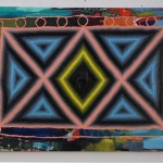
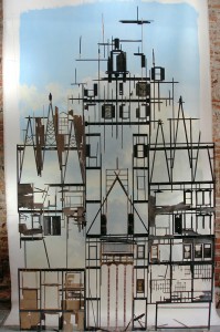
Brooklyn resident, Tom Costa’s paintings feature ruined building frames backlit by poetic skies. Often the canvas’ form mimics the shape of the building framework creating a container for a structure that is no longer a container. The overall image is almost romantically beautiful, like skeletal trees in winter. But there are disturbing elements in the details—small moments like the barely visible folding metal chairs in the rubble at the bottom of A High Place are reminiscent of places we have all been and they make the destruction seem more dangerous and personal.
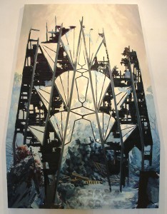
Costa works from elaborate models built out of what look like dollhouse construction materials. The current show includes one such display, Living the Dream. Seeing the eight-foot-tall model affected the way I went back and looked at the smaller paintings, which range in height from four to six feet. The perspective in all of Costa’s works is very cinematic: head on, level with the structure, clear, focused, omniscient. I didn’t question this point of view at first but once I’d seen the huge model I realized that the omnipotence implied in the paintings is factual. It is a wonderful demonstration of the artist’s actual control over every element in his work. The final feeling as I toured the work again was an odd sense of responsibility for each of these vignettes.
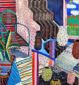
Hailing from Chicago, Austin Eddy‘s offering is a series of chair paintings that initially cracked me up. A friend at the opening said “I don’t know what to think of the chairs” and shrugged. They remind me of the 70’s and of Warhol prints and make me wonder in the same way that pet portraits do. The more time I spent with them, the more they grew on me. While there is an attempt at painting the objects and spaces three-dimensionally the surface treatments on the chairs seem to undercut the illusion of depth and bring the viewer back to the flatness of the painting surface. The color and composition of each is energizing and compelled my attention. And they are funny, like really well-drawn caricatures of someone’s patio furniture.
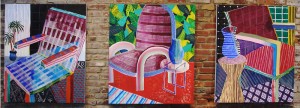
Eddy repeats the subtle theme of transition running through the show. His earlier work portrayed slightly more traditional interiors, narratives of a person’s life through their home. But the transition to chair portraits is amusing and a little accosting. They are more personal and somehow say more (or ask more) about the resident than the hallways and homes of his earlier work. Seeing Baker’s recent approach to altering his canvases and adding pop art humor sent me back to the older paintings looking for clues. And Costa’s revelation that he works from models deepened my interest in his subject matter since they were no longer documentations of happenstance decay but instead read as carefully controlled environments. Altogether the show’s subtext about changes in each artist’s subject matter, technique and development was an unusual motif usually reserved for grand retrospectives and to me it added an element of life and growth.
