The Frankford Ave. art scene is thriving. It seems every week a new gallery or art space is opening there. It’s worth a trip!
VWVOFFKA
“Small Objects”, on view at VWVOFFKA is the collaborative body of sculpture, print and found objects by Linnea Vegh and Steven Streisguth. The show embodies the concept of collaboration on many levels. Point and counterpoint can be found formally, conceptually, and in the process of making. The collaborative spirit can also be seen in the way these artists specifically wanted Vwvoffka’s space for it’s inviting, homey appearance (it originally was meant to be a living room). They even brought in living room chairs, a rug, and a lamp to make a comfortable place for visitors to view and discuss the work. Visitors are allowed to touch the work because the artists themselves always want to touch the art they view in exhibitions, Vegh said.
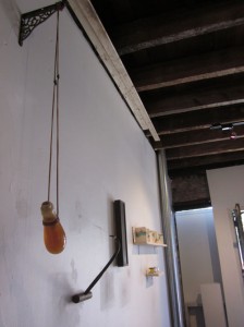
Vegh and Streisguth do not fully spell out the ideas behind the objects they create. At the same time, their goals of making and transforming objects are clear.
With unlikely combinations such as gears and pool balls or a wooden hook next to a honey-colored glass container hanging from rope, the objects feel familiar but from a different culture or time — tools perhaps or specimens from long-forgotten rituals. Ron Klein’s work with found objects coupled to natural materials comes to mind. (www.ronklein.info) Like Klein, Vegh and Streisguth seek new narratives with their old materials. Surprisingly, Josef Albers is an inspiration for this work, according to the artists. A University of the Arts professor who studied with Albers taught both artists. The Albers influence comes in through the excitement in new combinations, however, not in the artists’ use of color.
According to Vegh, she and Streisguth bounced ideas off each other through the many stages of making this work over the course of 9 months, between December 2009, and September 2010. They would meet in coffee shops or text pictures of work in progress. Ideas were shared and work was made individually and together.
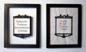
Dry humor appears occasionally. “It Is What It Is”, made of a found trivet with the saying “Today is the tomorrow you worried about yesterday” and a print on paper saying “And it’s worse than we feared” made a wry set.
Vegh and Streisguth met while attending University of the Arts for their undergraduate degrees in fine art. This is their first exhibition of collaborative work.
Extra Extra
Extra Extra’s current show, “A Diamond Is Forever,” addresses the concept that larger than life ideas cannot be fully manifested in our minds except in part and by analogy. This is a post-modern subject matter for an exhibition – moving beyond what we can grasp, such as the object and the background, and taking in the entire, unending field. It is not surprising that several of the artworks have a scientific quality to them. Even the title and card for the show brings to mind images of James Bond’s sci-fi gadgets, and the space explorations of the 1960s and ‘70s. A neutral color scheme throughout downplays color to focus on the ideas behind the work.
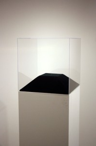
Humor sits on the exhibition like a welcome guest. Looking around, my mind filled up with futurist ideas from the 1960s, a time when aluminum was the next new thing. In Dave Murray’s “85% of the Art I Made Turned Into A Diamond”, the artist used the incinerated remains of 24 attempted projects to make a 0.29 carat diamond. Displayed on a huge pedestal, the extremely minute diamond is a pretty effective piece. However, I think it is the title that makes this work, pointing the viewer’s thoughts towards ideas about the artist’s journey and the importance of failure, happy accidents and chance, and away from the “precious” object itself. The little object needed more dramatic lighting to enhance the artist’s ironic intent.
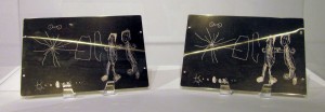
Daniel G Baird’s great works called “Pioneer 10 and 11” stand out in a show with some unevenness. Made of gold-anodized aluminum, the etched plates are the same size and material as the rebus-like message plates attached to the exterior of NASA research satellites Pioneer 10 and Pioneer 11, except for one important difference. The imagery on Baird’s plates translates the NASA image into a childlike drawing of that image. According to NASA’s website, “Pioneers 10 and 11, which preceded Voyager, both carried small metal plaques identifying their time and place of origin for the benefit of any other spacefarers that might find them in the distant future.” (http://voyager.jpl.nasa.gov/spacecraft/goldenrec.html)
Here is an image of what the original looked like:
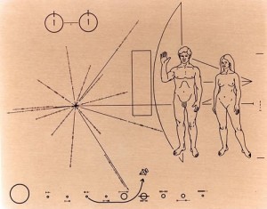
In Baird’s artist statement he says this about his work: “The ideal images meant to convey our position in the galaxy, the hydrogen atom and humanity among other things has become undermined, obscured and only able to convey a child’s creative interpretation of a seemingly irrational world. It highlights the shortcomings of this attempt of perfection, a criticism of the ultra rational and points to the potential of an ever changing body of knowledge.” This piece is one of the strongest in the exhibition because it pays attention to both the conceptual and the formal sides of the idea. One small point, plates rest on clunky plate holders that are a little too distracting and cover some of the drawing. With its research on childlike ways of drawing, Baird’s work connects to work by Cy Twombly. It also echoes Mary Kelly’s Post-Partum Document from 1973-79 with its focus on human development and the way in which we express – or try to express – who we are as humans to others.
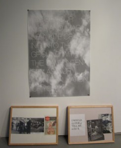
The risk with conceptual art is that formal qualities get sacrificed to the concept. Here, the arrangement of objects by the curators works well, but some of the individual pieces fail on the materials’ front. For example, Alexandr Skarlinski’s “Idea (Kite),” a black and white poster with the phrase “Close your eyes and imagine a kite crashing into the ground with the same intensity as our own realization of youth.” Propped against the wall beneath the poster, two identical wooden frames, side by side, present memorabilia of youth – photos of youthful hijinx, protest march and a flyer about a rock concert. The choice of materials and the arrangement of the parts is so low energy and expected that they drag a potentially great idea down.
The same can be said of the untitled, digital print triptych by Michelle Ceja. The piece comments on our skewed desire for consumer goods by altering the image of an expensive car. But poor quality materials or workmanship – intentional or not — detract from an interesting idea. Artists can use cheap materials, but they should be used in order to advance the work. Dave Murray had another piece in the show, a framed digital print called “You Will Never Get This Time Back,” but it is difficult to focus on the image for all the scratches in the glass.
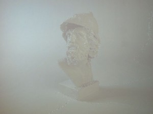
Jordan Tate’s untitled projection of an animated Gif is another strong piece in this exhibition. It displays a photograph of a marble sculpture as if it were being viewed in Photoshop after the magic wand tool had selected an area of the picture. According to the artist statement, Tate wants us to see the work not as an object but as a “representation of a reproduced reality.” The work is unique for the way it shows an image that, because of the animated selection lines, would be considered to be in the process of revision. It brings up questions surrounding what constitutes a photo, and what boundaries exist between photography and animation, and indeed photography and the documentation of real world objects.
Extra Extra’s gallery sits downstairs, separated from the welcome desk, which is in the upstairs loft space. The bare bones gallery and nothing else gives the exhibition a clinical feel and leaves the viewer feeling like an uninvited interloper. Better to have a gallery attendant in the space, a human presence to greet and answer questions.
2424 East York
Searching for another exhibit at 2424 Studios I ran across an exhibition of paintings and drawings by Ellen Abraham and Marge Feldman, two women fully-engaged in making art even though they are no longer twenty-something. These ladies – who also have other occupations and families – are living proof that artists do not peak at thirty, and can indeed continue to change and improve if they work at it.
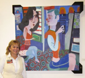
Energy, a variety of viewpoints, and a strong sense of color mark both bodies of work. Ellen Abraham’s large oil paintings, transfer drawings, and sketchbooks portray everyday scenes of bars, the subway, and city life. Like artists of an earlier era, Toulouse-Lautrec, Max Beckman, and Otto Dix, for example, Abraham’s exaggerated figures, and flattened pictorial spaces attempt to capture the gestalt of today. Abraham is phenomenal in depicting gestures that sum up her characters. While she’s not doing portraits, her archetypal depictions have the verity of Kirchner. Satire and humor are at the forefront of her work. She places the viewer in the scene – in the midst of chaos, danger, and in the faces of uncompromising characters. The bright, saturated palette is in direct contrast to the subject matter she portrays. There needs to be more layering of color, and a stronger sense of the form in order to draw the viewer in and to get a more effective exaggeration in some of the paintings. The patterns added a rich layer to the compositions. Abraham’s sketchbook drawings are so concise and direct it would be excellent to see an exhibition of those alone, or an exhibition of larger drawings of these single figures.
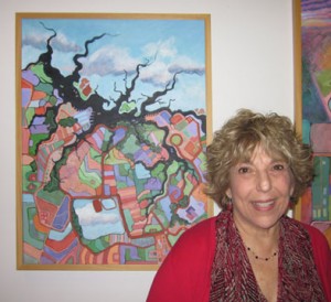
In her new series called “Heaven and Earth”, Marge Feldman’s work brings together topography, images of the city, schemas of thinking, and the connections within contradictions. Feldmen merges various points of view that cause objects such as electrical wires to come in and out of the picture plane. Linking abstraction and realism, Feldmen uses drawings she made on airplanes, found photographs, and imagination to weave together a metaphor for the reality she knows through her own experience. Marjorie Welish, Mimi Oritsky, and Mondrian are artists that come to mind because of their related interests in cartography, abstraction, and the organization of space. In her pieces, Feldmen successfully modulates color within a restricted palette. This series is a huge break from her previous work, which involved painting from life completely. It would be good to see the abstractions and exchanges within the imagery take over as this series progresses.


