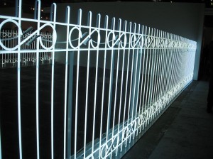
On the whole, we found the Armory Show contemporary pier (Pier 94) to be a disappointing mix. It felt like a cloud of low energy had descended and sucked the life out of the fair. Much of the sculpture and painting we saw seemed uninteresting–at least it didn’t interest us. Mostly photographs and video held our interest. Ivan Navarro’s light fence — which was so bright it might have been there to prevent the onset of SADs in the viewers — was no help. Ten minutes spent near its fluorescent rays contributed to our depression as we wandered around.
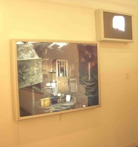
The lights that did brighten things up were the many photo light boxes we saw, with great works in them by Iain Baxter (Corkin Gallery, Toronto), Rodney Graham (303 Gallery, NY) and others. That’s what it took to cure us of our winter blues.
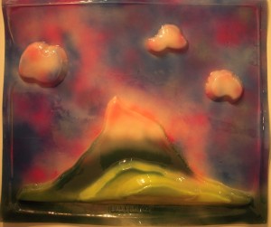
Better than the lightboxes, we fell in love with Baxter’s vacu-form landscape (also early–1965). It looked so fresh that its age surprised us.
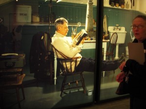
Cate, our photography expert, noted that light boxes, which had been hot several years ago and then went out of fashion, must be in again. Iain Baxter’s boxes date from the 1960s. He’s was a professor at the University of British Columbia when Jeff Wall was there. The gallerist told us Baxter was a lightbox pioneer and that his background is in biology. He has interests in environmental things. Another Canadian who loves his lightboxes, Rodney Graham, deliberately confused identity, time and space, real and unreal in his image of himself as an old-fashioned lighthouse keeper. The image peeking out on his book page was of the same space, perhaps even the source picture–or vice versa, a copy–in reverse!
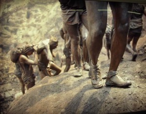
And from still another continent, a terrific Alfredo Jaar lightboxed photo of the glistening legs of a gold miner (Gold in the Morning, 1985-2004, 51.1 x 74.8, at Oliva Arauna, Madrid) standing in his sneakers in the mud was so beautiful and gleaming, it reminded us of a Nike ad.
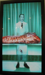
Video–those light boxes with moving images–also looked good. The odd Robert Wilson/Steve Buscemi collaboration at Jiri Svestka Gallery gets props for its icy color scheme but also for its stasis. The actor smiled or didn’t smile; that was about it.
A video installation, by Leandro Erlich at Sean Kelly Gallery, stopped everyone in their tracks:
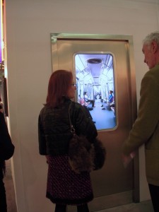
A subway train door was embedded in a wall, and the video screen was the door window. The swaying motion of the train, mixed with the play of perspective into the receding lineup of subway cars–a 1.5 minute loop–was soothing and magical. As in the Robert Wilson video, the slight motion was overwhelmed by stasis. The asking price was $65,000, door included.
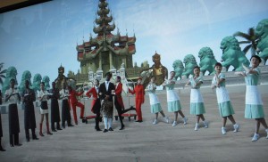
The Russian collective AES+F at the Melbourne Gallery Anna Schwartz pulled us to a halt with its captivating video The Feast of Trimalchio. We spoke to the gallerist who explained that the piece had been in the 2009 Venice Biennale (group show) as a multi-channel projection, and that AES+F had represented Russia at the 2007 Biennale. The subject of international tourism was not the only piece we saw that played with the old art historical idea of exoticism in art, but unlike the traditional 19th century Eastern potentate portraits and damsels at the well, the nouveau versions are self-conscious and ironic. The figures, with their CGI motion, had a feel of Second Life and avatars–and the new global order.
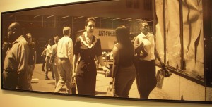
Photography looked good in general at a fair where sculpture and painting seemed to have few interesting moves. Stephen Shore’s street photo–with its blend of old and new was a great kind of ambiguous present.
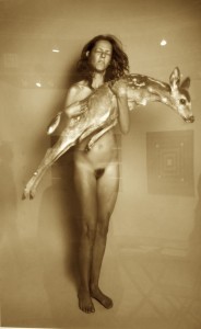
Not all of us loved love Ryan McGinley’s new work (at Ratio 3 San Francisco). Roberta gave the new black and white large format studio shots of people with live animals (from an animal shelter) a thumbs up. She liked that the artist had broken out of his snapshot shooting mode and of course she’s a sucker for animals. Libby was not so sure, saying why did the people have to be nude. Roberta said he always shoots nude people, exhibitionists, that’s what he does. Libby was not convinced that she wanted to look at these for long.
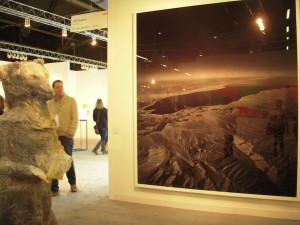
But we all loved Florian Maier-Aichen’s Salton Seas photo (at 303 Gallery, along with Rodney Graham). The enormous photo of a desolate landscape with mappy qualities started small and somehow after much manipulation ended up huge!
Sculpture was not a complete loss.
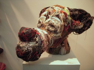
Robb Putnam’s puppy dog, Wastrel, was Goofy with a hangover. Several tongues of the same materials as Wastrel, stuck right out of the wall at us, defying us to like them. We did. Phoebe Washburn’s pickle jars on a shelf gave us a giggle at Zach Feuer. But if we didn’t already take her seriously, we’re not sure we would have enjoyed these coming to the work fresh.
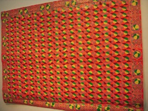
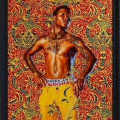
A few paintings rose up and demanded attention, including Delson Uchoa’s intensely patterned quilt of a painting at Luciana Brito Galeria, from Sao Paulo, and some contemporary portraits of youths inset in old paintings from Kehinde Wiley–his usual strategy.
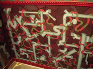
Patterns and delicate drawings in a room installation by Alexander Gorlizki at Greenberg Van Doren Gallery, NY, were also noteworthy. The patterns in the installation varied in scale from the micro pictures with Indian miniature detail to bold patterns on the rug. Gorlizki had a solo show with Gallery Joe in 2008.
Spinning
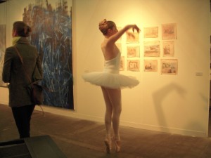
Every year we notice a strange theme in the art work on display. Oddly enough, we noted a bunch of spinning sculptures and one pirouetting ballerina–some kind of weird new trend, we hope not.
There was a spinning calla lily right as we began our Armory journey.
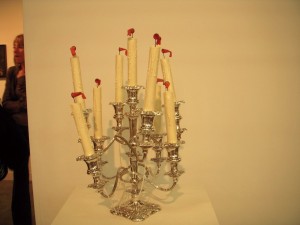
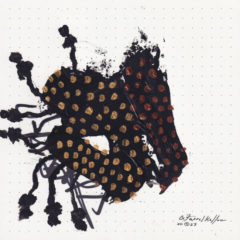
Then later on, a candelabra with windsocks spinning by Joseph Kohnke near the Pierogi booth. And again at Volta, there was a spinning tree. We don’t get it. Perhaps it’s an effort to put some life into a recession year in art. Stay tuned for another post about Volta.


