[Andrea critiques Washington, D.C.’s newest public artwork series by individual works and on a broader level; she makes the point that sited art should be aimed at neighborhood dwellers, not visitors or curators. — the Artblog editors]
This year’s program of temporary, public artworks in D.C., 5×5, reflects both a broad and ambitious approach to work sited, and in some places constructed, in public venues across all four quadrants of the district. It is the second series of temporary public artworks supported by the D.C. Commission on the Arts and Humanities (DCCAH).
The purpose of public art
In a day’s viewing, I managed to see a dozen of the 25 works–five curators had each chosen five artists–and given their wide dispersal, it is unlikely that anyone will see them all. Years ago, I worked in a large public art program, and I’ll acknowledge my prejudices: with art sited in public locations and with public funds, I strongly favor work directed at the neighborhood regulars, even if it is conventional in form, over work directed at the curator’s and artist’s professional colleagues. And I do mean work directed at the general public, not condescending to it. I also favor temporary projects, which can be experimental, since they will not be forced upon what may be unwilling viewers, in perpetuity.
The DCCAH put out a call to curators for proposals and chose five out of a large, international response. Artwork could be in any media, including events and performance, and other than expressing a desire for geographical inclusivity, the commission gave no guidelines. I think the DCCAH should have given the curators a clearer directive. Publicity for the project states its ambitions: activate spaces to attract residents and visitors beyond the city core; showcase innovative art and engage viewers; develop opportunities for artists to experiment that are not possible with permanent, public work; build relationships with local residents, galleries and cultural institutions; create an environment in which regional and international artists merge to reflect the city’s identity; and promote the creative profile of Washington, D.C. to the nation and the world. That suggests artwork directed at a local community, tourists, and a sophisticated, international community aware of the global art scene.
Public art usually serves either the interests of the local, grassroots community, the area’s artists, or the real estate and tourism industries–which, of course, may or may not be locally owned, but always generate local jobs. Appealing to all of them is really too much to ask from any single work of art. The quantity of high-end construction that was recent and ongoing in D.C. indicates that developers currently play a very big part in the city; one wonders about longtime, impoverished residents.
If the DCCAH hoped that the 25 commissions together would cover the breadth of their ambitions, they were leaving it to chance. Overall, I’d say they were lucky. The curators had their own ideas about audiences, some of which came through more clearly than others. Each developed a statement of intent, which one could occasionally glean from the artworks, but which mostly functioned to sell their proposals to the selection committee, I’d guess. However, it was notable that most of the works in 5×5 referenced topics of current, social interest.
Successful community appeals
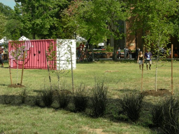
Lance Fung’s project, “Nonuments,” was such a targeted and creative interaction with a rapidly changing neighborhood in southwest D.C. that it will likely capture the art world’s attention. Already involving a range of artists and the surrounding community, it hit the audience trifecta. Fung selected a temporarily vacant plot of land surrounded by glossy condos, offices, a Safeway market, and on one side by public housing, and sited five artworks in what had been a pedestrian crossroads–creating a temporary park and sculpture garden, dedicated to the common man–hence the title.
With support from Washington Project for the Arts (WPA) as a community partner, the artists created work in situ, and with a lot of community involvement. WPA sponsored a competition for neighborhood schoolchildren to propose their own monuments to everyday subjects and unsung local heroes, which certainly spurred local interest. Fung described the evolution of the conversations that ensued among neighbors who might never have met, but for the art.
Cameron Hockenson’s “Migration” appeared to have escaped from an animated sci-fi film. Several long-legged creatures, as tall as giraffes, were actually communal bird housing on stilts, which could support swallows and other migrating species. Although the work had a playful quality, it referenced a range of displacements, including that of the urban poor who are moved to clear the way for luxury construction, and the birds whose traditional migratory paths have been disrupted by global warming.
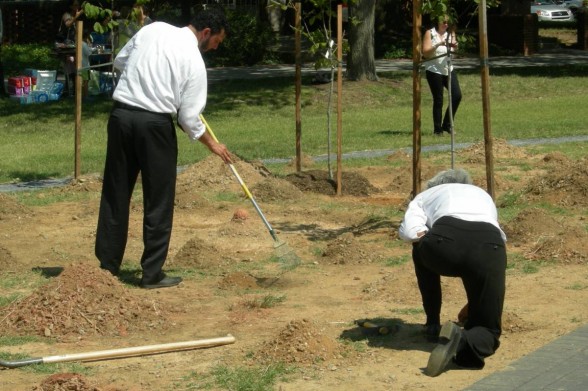
A 30-day performance, “Digging,” by Nora and Eliza Naranjo Morse, mother and daughter, was enacted by community volunteers. Participants dress as a single occupation, which will change over time, as they dig and pile up earthen mounds, which they will return to level land at the work’s culmination. Dressed as office workers, participants in dark slacks, white shirts, and ties dug and occasionally stopped to answer questions from passersby. Given the un-shaded, midday sun, they were clearly a committed workforce. As the piece progresses, they will also dress as service industry workers, farmers, and criminals. The stratification of the workforce, as well as the fact that here, they all perform the same work, raises a range of pertinent questions during a time of the first real national discussion about the inequities of minimum-wage work.
A line of young trees meandering around the other artworks was a contribution by longtime land artist Peter Hutchinson. “Thrown Rope of Trees for Washington, D.C.,” laid out by the eponymous act, was destined to be moved at the end of the project, since the city would not commit to caring for the trees. Community reaction has been so enthusiastic that a petition has been started for them to remain where they are.
Jennifer Wen Ma’s “Portrait Garden,” constructed of plants and black ink, also attracted enthusiastic volunteers as it evolved. Designed so that from a bird’s-eye view, it resolves into the portrait of a community member, chosen by lottery, it may only be truly appreciated by those working in the private building along that side of the park, and by the birds.
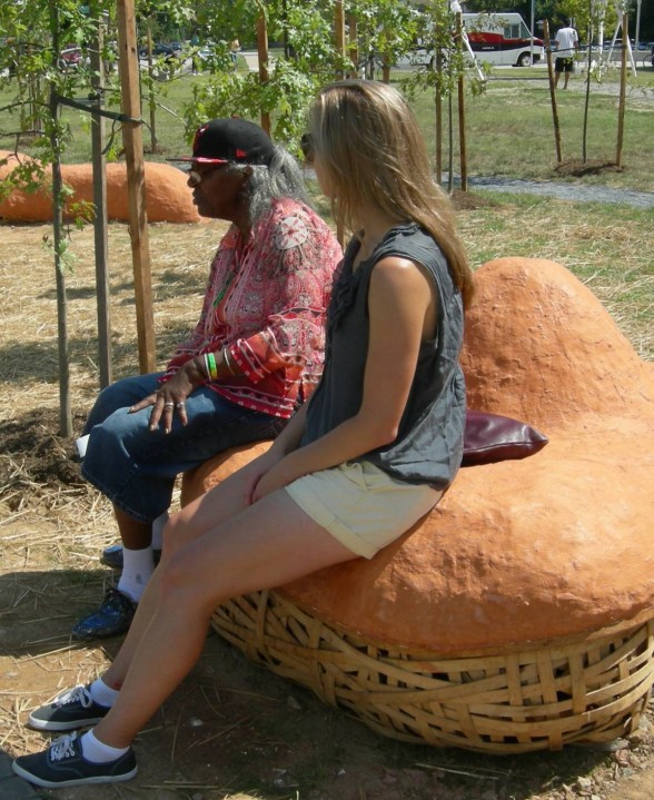
Michael Koliner, a D.C. artist brought in by the community partners, made a multi-part work that functioned as street furniture as well as sculpture. It was constructed with help from community members who attended a public event, where they danced in mud to mix the clay that would top the artist’s basket-like forms. The organic forms spoke strongly of the continuity of human need for food, shelter, and social support, as ceramics, basketry, and unfired clay construction are among the most ancient of human materials.
Timely attention to race and class
“Peep,” by Jonathan Fung, whose shell was a shipping container perforated with openings–large peepholes–was the work that communicated least clearly. Its interior was filled with sewing machines, referencing a sweatshop, and children’s blocks, which Fung said referred to lost childhoods. He described his topic as human trafficking, but neither the views I saw nor the experience of a soundtrack made that clear.
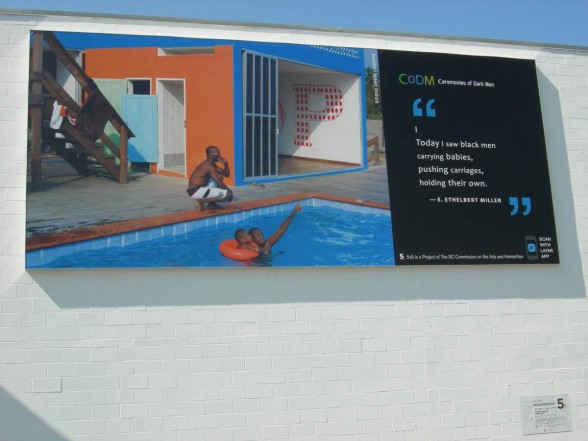
“Ceremonies of Dark Men,” curated by A.M.Weaver, consists of billboards and billboard-sized banners sited around the city, each with a photograph and an excerpt of poetry, intended to encourage black men and boys, and counter their pervasive and negative coverage in the media. The three I saw avoided easy solutions and feel-good imagery. Photography by Isaac Diggs, Stan Squirewell, and Don Camp spoke effectively in the vernacular of the sites, and the work had been carefully selected to address different audiences. The billboards are connected through a downloadable app to information about the artists and recitations of the poems, and users are encouraged to conduct a virtual conversation on social media.
My first reaction was that I’d seen a lot of identity art in the 1980s, and wondered about its relevance. But with so much recent news of young, black men killed because of racist stereotypes, the project is not only timely, but necessary as a public health and safety program, and as an attempt to live up to the broken American ideal of equality. Some foundation or corporate funder should really take this project national.
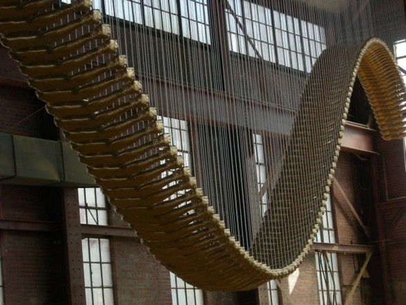
I saw only a single work commissioned by the other three curators, so cannot comment on the range of their projects. Shamim M. Momin arranged for Glen Kaino to suspend a huge, bridge-like structure from the roof of a vacant industrial space in a neighborhood of new construction. It resembled a dinosaur’s partial skeleton, but what at first appeared as vertebrae were casts of Tommie Smith’s arm and fist, raised so memorably at the Mexico City Olympics. As poetic as the work may be, the site is likely to be public to only the few who are aware of the 5×5 project.
Works representing democracy and equality
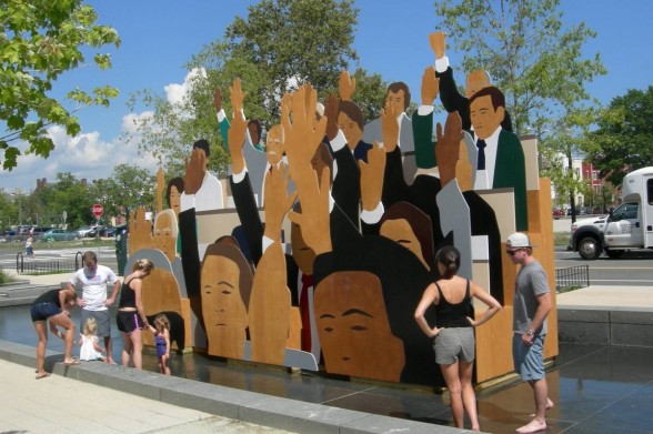
Kota Ezawa, selected by Justine Topfer, created a large-scale, wooden series of flats in a shallow pool within a recently-constructed public area in the Southeast. They illustrated a melting pot of figures with hands raised. The artist intended it to signify voting, an act basic to democracy. I associate a group with raised hands with new citizens, saying the pledge of allegiance–which still supports Ezawa’s subject. Neighbors with small children were making use of the pond for play.
Stephanie Sherman said that most of the 5×5 work she curated was performance-based. I saw a mural by one of her artists, Dignidad Rebelde, who worked with D.C. street artist DECOY in the recently gentrified neighborhood called NoMa. The work depicts neighborhood children’s portraits embellished with various Egyptian and African imagery.
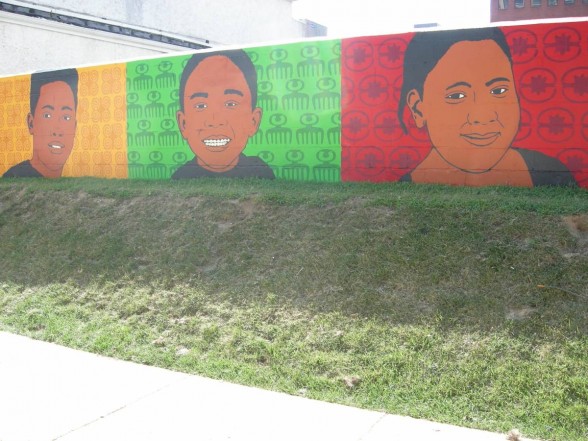
While cheerful, it embodies the feel-good manner I have seen in far too many Philadelphia murals-with-a-message, and suggests speaking down to the audience rather than seriously taking on the problems associated with gentrification. On a Saturday afternoon, another artist was demonstrating printmaking to a group of adolescents. I’m sure the participants enjoyed the mural and printmaking, although I’m not certain that they represent the current population of the district. And I can’t guess what the patrons of the upscale cafes and businesses across the street think.


