 First I have to confess that I am writing only about Cherry and 3rd Street in Old City on First Friday because I dashed from Swarthmore to First Friday to a Diane Reeves concert, which meant I never got to 2nd Street. But fear not. Roberta got there and will add to the First Friday news.
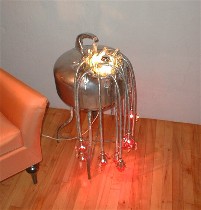
 The first gallery I visited was lit by wonderful found-object lamps by Warren Muller. Bahdee Bahdu is his gallery, and it shows a mix of functional and non-functional art and art-furniture. The pieces in the gallery, said Muller, were supplied by his network of artist friends–which doesn’t make it any less than swell, since they’re all seasoned pros like Isaiah Zagar and Burnell Yow!–but look for a curated show there in December.
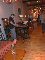
The atmosphere in there was clubby and festive, with a couple of great musicians (shown from left, John Kennedy and Heath Allen)playing some nice jazzy stuff.
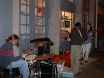 The music theme continued on Third Street with two outdoor groups, one serenading in front of La Ghiottone restaurant, and another rocking in front of Well Fed Artists Gallery(shown).
At Well Fed, a co-op which shows work by a bunch of young artists squeezed into a gallery the size of a bathroom, the art is crammed up and down on the walls. Lots of surprisingly traditional landscape paintings and photos filled the walls, plus cartoons, drawings, etc. The standout landscapes were on the back wall toward the left. The Dutch landscape coloring–brown earth, barely blue sky–was reduced to small vertical paintings that suggested wide spaces. (I don’t know the name of the artist, but as soon as I find out, I’ll add it to this post). The big advantage to a place like this is youthful exuberance and low prices. So if you know what you like …
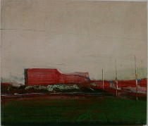 At Pentimenti, on the other hand, the show was devoted to work by one artist, each painting hung with the kind of care and reverence that’s supposed to sell art. Swiss artist Franco Muller’s acrylic on panel and on paper landscapes looked great, with a wiped paint look and beautiful grayed-out colors suggesting urban industrial and post-industrial, uninhabited places.
Muller also had some interesting photographs in the back room, many of which looked a lot like his paintings. A video back there also had the wiped look, and sort of reminded me of my television when it’s on the blink. Anyway, Muller’s paintings were the strongest that I saw in Old City Thursday and Friday.
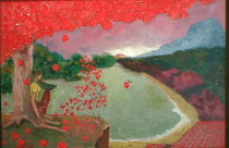 The austerity of Muller’s vision stood in sharp contrast to some luscious paintings I had seen the day before on Second Street at ArtJaz. Artist Dilip Sheth’s heavily impastoed acrylics on canvas (shown, “Out of Eden,” on canvas) and painted-over giclee prints have a clear fauvist ancestry. Sheth, however, prefers to think of his work as untutored, said ArtJazz owner Pamela Brown. I’d have to argue with that, but it would be quibbling over labels–not so productive.
Sheth’s colors are tropical outbursts, fitting for a painter who was born and raised in Ethiopia. But even though Sheth’s landscapes are unpopulated, with a touch of the surreal, the spaces, unlike Muller’s, are romantic and inviting. They reminded me also of Persian miniatures, and I’d have liked to see them shrunk down in size. Other work in the show included mergers of still lifes with figures (is that an oxymoron? well, you’ll see what I mean if you stop in), also with a hot palette.
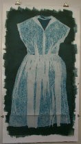 And changing my tune from landscapes to portraits, I had also seen some photograms Thursday at Muse Gallery by Neila Kun. Although I was a little distracted by the presentation (the graphic power of the painted-on edges of the photo emulsion and the bull-dog clip hanging method), I thought the images of clothes were successful as portraits of people and of eras.


