 While looking for images of the Emily Brown show at Gallery Joe, I came upon a link to Brown’s new website. I later told her I wasn’t sure what I liked better, her art show or her Web site. No kidding. It was fun, with camera pans giving a virtual tour of Arch Street and of each of the rooms inside the gallery. Last time I visited, when I clicked on each picture, I got a blowup. Great. But just now I tried again and that feature wasn’t working. Boo.
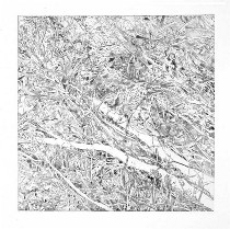
The image I was looking for was a relatively modest-size etching (I can’t tell you the exact size because the page isn’t working now, but it’s in the 20″ square range) called “Fallen” (shown above). Here, Brown seemed to be getting at something other than the transcendence of nature and man’s place in it. A turbulent nature menaces the white, fallen limbs, which seemed to me like human limbs, caught in the web of writhing tree parts.
I bumped into Brown at a Leeway Foundation event last week and told her that I loved this image and why. She said she had made it in the fall of 2001–following 9/11–and like so many artists I know, she had struggled through a lot of feelings and an inability to continue business as usual. So it was work she wasn’t sure of as she created it. That struggle and lack of complacency comes through and gives it strength.
 Coming back to the image with that information in mind, I see that those two limbs were the twin towers as well as the victims, the tangle of leaves and branches the mound of debris that we saw every day in the news.
The large pieces at Gallery Joe set a record in scale for Brown, with “Elegy,” the triptych in the vault, exceeding 8 feet in height. Only one panel of another triptych (the left panel shown left) fit in the gallery. These pieces are more typical of Brown’s work and beautifully done, but the large scale in a small space like the vault seems like a mistake to me. I’m reminded of a Ugo Rondinone piece I saw many years ago in which he papered a wall with a gigantic, black-and-white wooded scene. I’m also reminded of Adam Cvijanovic’s scenic wallpaper at the Fabric Workshop.
 I would prefer to see these pieces in a far larger space. Gallery owner Becky Kirlin said “Elegy” was created with the vault space in mind. How about a museum wall, instead?
Of the large pieces, the argument for size seemed strongest for “Fond Farewell” (shown right), it’s view of the treetops at once peaceful and vertiginous, the size fundamental to that dizzy feeling.
 No longer referring to Brown’s relatively modest large pieces, I’d like to say that in general, there’s a lot of unjustified large art out there, work that seems to me to be undermined by its own ego and ambition.
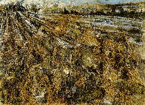
I suppose you could argue that Alex Katz’s humongous canvases are milking the billboard motif, or that Anselm Kiefer’s got his entire country’s guilt on his mind (image, Kiefer’s “Nuremberg” is more than 8 feet high, 14 wide).
But I think that art needs to be something for daily life, and museums the recorders of the best or the quintessential of how we live (i.e. what art people buy and hang). To create a piece that could fit only in a museum seems not right.


