Jennifer Bartlett, painter of cool, grid-based paintings, made a series of enormous works about the sea in the late 1970’s and 1980s. It takes a big space to show them, and right now you can see several in Locks’s cavernous upstairs gallery.
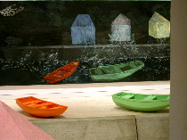
Bartlett’s approach — deconstructionist, quizzical — is so different than the straight-ahead sea-love depicted in Manet and the Sea and I’m still trying to digest what I saw. If Manet gives you unselfconscious picture-making about the sea. Bartlett gives you self-conscious art-making that seems to be about looking. (top two images, details of “Sea Wall” 1985)
If some of the Manet paintings are spectacular, Bartlett’s paintings are spectacle.
Let me be clear. I’ve always liked Bartlett’s paintings and I like these, too. Bartlett’s a painterly painter– in a drippy, layered, dot-and-dash kind of way. And her subject seems to be looking through the veil (grid) at life. I’m ok with that.
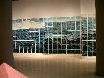
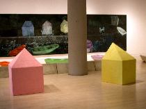
“Sea Wall” from 1985, the big night-time scene with little rowboats in the painting and on the floor in front of it is quite beautiful and if the boats are stand ins for people, you can read it as poignant — dark night of the soul and storm-tossed boats.
But there’s something about the self-consciousness of the spectacle in this work that makes me want to run back to the unself-conscious sea-love expressed by the previous century’s painters.

It’s not that the sea is deconstructed that I find so difficult, it’s that, at base, the work seems to be referring to itself more than it is to any thing outside itself. And that’s ultimately less reverberant than a descriptive picture. (middle two images, details of “Atlantic Ocean,” 1984, which used to be housed in the Phillip Johnson ATT (now Sony) building in New York)
I understand we’re now at a time where concept drives the art.
I also understand the scale thing. These works were made at a time when big was a requirement. But here, the enormity kind of deflates the sea. Go figure.
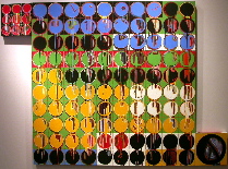
Bartlett’s paintings make the sea mundane and not sublime. And while these paintings are so big they must be experienced with your whole body, walking before them in a gallery they convey more about the installation of art in a gallery than about anything else. (image left is a new work, “Footnotes” 2003, note how abstract)
I think back to Arcadia’s “The Sea and the Sky” show a while back. Many of the artists in that show (e.g. Vija Celmins) were imposing a contemporary, distanced point of view on the sea. And yet, somehow the work embodied the sea in all its sublime beauty and scariness. Most of that work was small (gallery size might have been a factor). But it seemed to get to the nub of the sea without losing the sea. I’m not sure Bartlett’s done that.
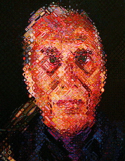
I want to compare these particular works of Bartlett’s to work by Chuck Close, also a grid painter, and work by Alex Katz, not a grid painter but a people and scene painter. (image is Close’s “Paul” –Cadmus, that is, from the PMA)
Bartlett’s work is really nothing like that of either painter and yet the three together capture something of the coolness, the bigness, and the abstraction of thought in 20th century art-making.
In a way, all three seem to embody the era’s self-conscious mirroring the mirror.
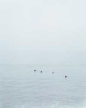
Catharine Opie’s photographs of tiny surfers and the big, grey sea, featured in the Whitney Biennial, bring us back to picture-making about the sea. Manet’s not the reference here. Celmins may be. (bottom image is Opie’s c-print “Untitled 3 (Surfers)” 2003)


