Silly though they may seem, some of our lists about what we saw at the Whitney seem to the point of what art is about right now. Here are my contributions.
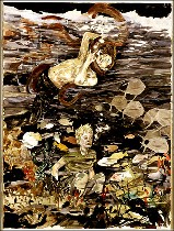
1. How about Jordan Kantor’s list (see my post of Feb. 4, 2004) goes to the Whitney? Five of his picks made the biennial and they offered high, middle and low points. Tam Van Tran was a high point, with his voluptuous takes on nature’s survival as stationery. The middle point was Hernan Bas, airless watercolors in camouflage colors of fey boyscouts, not even so nice to look at (right).
And the low point was Banks Violette (shown left) with his s&m Merlin-in-vinyl installation, surrounded by romantic drawings of unicorn-y horses. All I could think was this guy has seen too much Matthew Barney.
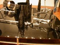
Others from Kantor’s list include Andrea Bowers’ photographic graphite-on-paper political drawings of women on the barricades (they were first cousins to Sam Durant’s drawings of civil rights protests, also in the show). And Christian Holstad’s room installation, pieces from the series “Another Dark Room in Which to Stagger Sorrow.” My notes say “inelegant room.” From which to stagger immediately, I wonder now, because I can’t remember any of this piece for the life of me. Not a good sign.
2. Mirror, mirror. Mirrors kept reflecting me wherever I went in this biennial. Metaphorically speaking, for better or worse, mirrors reflect the self-absorption that’s plaguing the art world this year, which seems to be all about style and fashion and posing, nature and the human condition be damned.
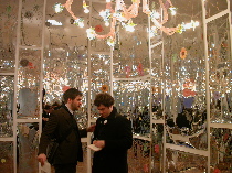
The twin highlights in mirror art came from Philadelphia’s own wallpaper wizard, Virgil Marti, and the ebullient, obsessive Yayoi Kusama. Marti’s flowers-and-leaves-on-mylar defined a Versailles-like cannabis growing room, topped by one of his grand antler chandeliers (shown right). Good sh__. Kusama’s “Fireflies on the Water” offered a space-walk through the starlit universe.
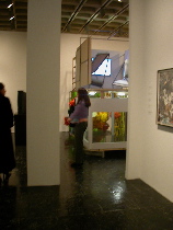
Eric Wesley’s scaled-down sets for the (faux) upcoming tv production of “…So This is Reality” (shown left) wasn’t great to look at, but the concept was on target, as were the mirrors. We’ve all been looking at the mirror of our tv screens for so damned long that we even believe what’s on there is the real world and we are our own celebrities. That self-absorbed culture is precisely what most of the art-making in this biennial seems to be about (but unlike this piece, much of it was not satirical).
The other mirror practitioners left me cold.
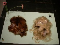
David Altmejd’s installation, “Delicate Men in Positions of Power,” which included birds, chopped-up ape men (two ape heads, shown), wigs and mirrors seemed more like Bloomies on a particularly bad day than a museum of natural history.
Taylor Davis’s mirror pieces were minimalist, graceless shapes, all defined by the flat, straight edges of the glass. The concepts about architecture, the viewer and the object seemed banal.
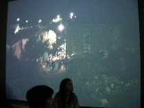
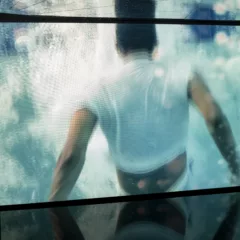
3. Watching paint dry: The artistic tradition of videos that move more slowly than watching paint dry is alive and well at the Whitney. I couldn’t stick a single one of them, but then again, there was so much else to see so my patience was pretty thin. The worst perpetrator was Cory Arcangel (BEIGE) and his cartoon clouds drifting ever so slowly across a cartoon-blue sky. There was no there there. There were theres in the rest, but the timing was definitely worthy of failure at Tisch where they teach you exactly how many seconds a viewer can stand looking at something. They include Sharon Lockhart’s gatherers of hay (this is real world time, and I can barely survive it), the late Jack Goldstein’s underwater sea shots, and Craigie Horsfield’s endless shots of life on El Hierro, one of the Canary Islands (shown left).
4. The “Survivor” video award goes to Chloe Piene for “Blackmouth,” her roaring Jane of the Jungle covered in mud. Runner up prize is Aida Ruilova’s screaming videos with repetitive sound tidbits of desperation.
5. The “Survivor” model’s award goes to Chloe Piene, again, for her “Mmasturbator” half-beaver drawings (she spared us the genitalia).
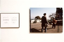
6. At this point I’m feeling guilty for being so snide about a show that had lots of good work in it. So here’s a list of things I liked in addition to those mentioned in the Mar. 12 post: Richard Prince’s car cemetery; Robert Longo’s waves; Alec Soth’s life on the Mississippi photos, along with Katie Grannan’s freaky Americana (btw, there’s also an artist named Katie Grinnan in this show!) and Rob Fischer’s “Ten Yards” junk collection, all in the same room talking to one another; Raymond Pettibon’s drawings and wordplay; Layla Ali’s basketball headed cartoon figures; Emily Jacir’s Palestinian prose poems with photos of longing (shown right); Fred Tomaselli’s usual hallucinogenic collages.
On top of that there are things I want to think about some more: Laura Owens’ painting, Mary Kelly’s lint, Philly naive Barnaby Furnas’s cinematic blood-and-guts takes on heroic death; and Lecia Dole-Recio’s layered skins of color and paper.


