If you go upstairs at The Print Center there’s some work worth seeing.
First, there’s Debra Werblud’s “Totentanz” (or Dance of Death) installation (above), which captures and reflects light against dark. Thirty curved plexiglas sheets printed with photographs of vultures directly borrowed from Eadweard Muybridge’s motion studies, hang from the ceiling on down, in front of a light source. The sheets swoop and bank, the dark, forbidding birds blocking light even as the plexiglas glows around them.
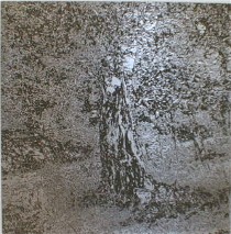
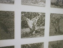 Even better are the two grids on either side, 230 zinc plates each etched with an olive tree in infinite detail and variety. The plates catch and absorb the light in various ways, depending on where you stand. They’re beauties.
The physicality and instability of light overtakes the bookish sources of this installation–birds published in 1887 in “Animal Locomotion” and the etched plates referencing printing techniques born in the Middle Ages.
 But somehow Werblud largely overcomes the flatness of the plates and the original bird images (not to mention the Dance of Death literary sources) and holds the room.
I was less enchanted by the Dance of Death conceit, with vultures and olive trees representing opposites. It was the light and the dark.
Also, the modernity of plexiglas, its filmic qualities and its flexible shape, created from page-like rectangles, talk nicely to the modernity and rigidity of the grids on the walls.
(Werblud, a Penn alum, will speak Monday, March 29, 5 p.m. at the University of Pennsylvania School of Design, B-3 Meyerson Hall, 34th & Walnut Streets.)
Less is more
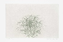 In the other upstairs room, Korean artist Young-Sook Jang’s deceptively simple intaglio prints are hard-headed meditations on spatial relationships (shown right, “The Plants”).
 These prints, which at first blush seem too easily likeable and at the same time easy to overlook for their subdued approach, offer plenty of food for thought.
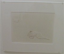 Two figures rest on a lawn, a large space between, one 3/4 out of the picture–no doubt in more ways than one (shown left, “Two People”). Plants impinge with only a leaf or branch into the roughened background, be it sky or land, a suggestion of relationships in space and time and seasons.
The low-key colors and minimal contrast in these contemplative works would not survive in the riotous profusion of stuff in my house, but if I ever got more Zen in my housekeeping, these would shine.
On the other hand
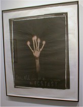 Downstairs, Lesley Dill’s depressed, Victorian, tea-stained multimedia pieces irritated me with their claim to plumb the feminine psyche (shown, “Leave me Ecstasy”). I found the mix of words, images and materials for the most part less than satisfying, and less than understandable–and even repelling in some cases. Excuse me, but if you try to stitch my tongue with words I will not find it spiritually uplifting. I read self-abuse into this. And if that is not the intent, it is certainly the outcome. Please preserve me from this brand of feminism, spirituality, misguided romanticism, art-making, or whatever it is.


