Glorious weather it was on Friday, and the gang showed up early for the 5 p.m. curator’s walk-through of the Big Nothing at ICA. Trouble was, as Director Claudia Gould said at 5:15 to the waiting hundred or so in the lobby, “Nothing was bigger than we expected.”
(All the wordplay around nothing has got to be considered one of the festival’s highpoints. They should run a contest for best pun.)
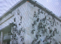
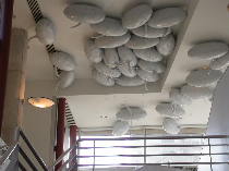
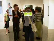
As it turns out the lobby wasn’t a bad place to mill around because nothing was everywhere, from Richard Artschwager’s small black lozenge pasted on a window (not shown) to Doris Salcedo‘s video documentation of 126 chairs falling slowly down the side of a building, a political piece commemorating death in a repressive regime. (image top)
Up on the ceiling in the mezzanine was a group a white balloons in the shape of thought bubbles — a nice 3-D cartoon representing cocktail party chatter. (The mezzanine is where the beer and pretzels are served at ICA openings.)
My friends Bay, Sunya, Margo and I followed everybody in to the gallery once they opened the doors. Curator Ingrid Schaffner and a couple commentators talked about several of the works but ICA’s acoustics are less than great and — hand-held microphones notwithstanding — I heard less than nothing but not a lot. I did learn that the earliest nothing in the show is by James Lee Byars (not shown) who was influenced by Taoism and by spending time in Japan. Whether that makes Japan the Olduvai Gorge of nothingness is not clear.
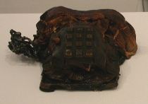
Allan McCollum and Matt Mullican whose recent collaboration “Your Fate” I told you about in a previous post are represented here in works that are playful and creepy. Mullican’s two melted telephones (one is shown left) are macabre and drew people over like magnets.
The burned skin-like surfaces remind me of specimens you see in glass vitrines at the Mutter Museum.
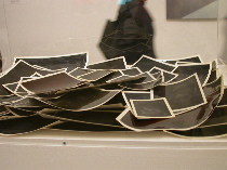
McCollum’s “Glossies,” on the other hand, is a stealth piece. (image right) People looked at the pile of what appears to be overexposed snapshots in a vitrine (image) and kept on walking. Of course that’s not what they are. “Ink and watercolor on paper with self-adhesive plastic laminate” says the label which makes “Glossies” very much in keeping with McCollum’s black paintings in pastel frames which are not paintings at all but plaster objects.
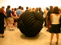
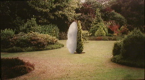
Scanning the room, I saw nothing much to suit just about anyone. Two freestanding works, Katarina Fritsch‘s “Knot” and Yayoi Kusama‘s Infinity Box seemed to represent the two ends of the nothing spectrum. Knot is positively nothing and Infinity is negatively nothing.
“Knot,” (image) cartoony and dark, was a piece you wanted to touch. Like Mullican’s piece it has sensual, skin-like properties.
But whereas I saw no one trying to touch Mullican’s melted phones, I saw Director Gould chase off a couple of folks trying to cop a feel of “Knot.” The beautifully crafted work (Curator Schaffner told me it was made of plaster with a steel armature and the surface was painted black, although later I ran into ICA’s outgoing PR guy John McInerney who said the surface was graphite, so I’m a little confused.)

At any rate, installing the work involved a crane-like machine to lift the heavy load off its pallette and position it on the floor. Somewhere during the install, “Knot,” which is on loan from the PMA which owns it, received a ding which necessitated numerous trips between the PMA’s conservation lab and ICA to cook up just the right matte black for the fix.
That matte, black, by the way, is a wow. Coupled with the intertwined strands of rats tails which evoke hair and yarn and make you gag when you think rats, the piece is powerful visualization of the void.
Kusama’s piece (left and right are details) is sly and private. It stands in the middle of the space and looks like a large, mirrored telephone booth reflecting everything in the neighborhood. There’s a small rectangular aperture for viewing what’s inside — a strobe-light show of one of Kusama’s trademark infinity spaces. People were lined up for a view. It felt like waiting to use the telescope to look at Mt. Rushmore. Call it the national monument to nothingness.
It was a hard piece to photograph if you didn’t know what you were doing but infinitely satisfying to experience in person. Where Fritsch’s piece is all darkness and forboding Kusama’s is lyrical and calming.
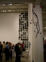
Local artists Eileen Neff and Paul Swenbeck and Tom Chimes are great additions to the show which, if not infinitely big, is finitely big — sixty artists, two floors of work — and no benches for the weary.
Swenbeck’s faux vines snake around the galleries like something you might like to keep your eye on lest it grab you. Curator Schaffner called them a garden that haunts the big nothing. (image left)
Neff’s digitally-worked photograph of a white cloud and a pine tree kissing in a garden is whimsical and a little wild. (image right above)
Ramped up
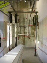
Judy Pfaff‘s ramp installation is an architectural intervention with textural wall drawings. I’m not a fan of the ramp space as a venue for art but I think this piece works. Not only does it work with the windows, the handicap railing, and the utilititarian nature of the space but it’s about architectural space which is a good move for what is a problematic architectural space. (image right)
Metal bars create structure and anti-structure playing off the ramp and the windows. Colored tape on the walls everywhere masks off grids and creates an urban feel. One line of green string running up the ramp wall spoke to me of mural painters using a “snap” line to demarcate vanishing points and create fictional “real” space through perspective.
The colors are mosly muted and the piece — all organized but a little chaotic — seemed a great transitional work between what’s downstairs and what’s up.
“When Claudia told me about the space I said ‘Please don’t do that to me’,” Pfaff told the crowd with a laugh. She said she changed the piece radically only ten days ago. It was going to be abstract but then it got imagery (Japanese tea house, Italian Rennaissance building).
“I keep thinking I’m Asian although nobody else thinks that,” Pfaff confessed.
Winds of War upstairs
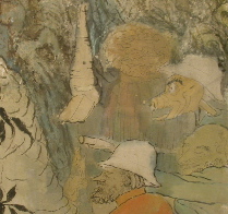
Yun-Fei Ji‘s drawings and paintings in the Project Space at the top of the ramp are elegant storytelling mixing traditional scroll and ink techniques with a sensibility atune to German expressionism (echoes of George Grosz) and today’s cartooning. (image is detail from “Dinner at the Forbidden City,” 2001)
Slow and fast at the same time, you read the work for its details which are plentiful and subtle. Ji, who spoke at the opening, referred to the ancient tradition of Chinese story-telling paintings in which trees represent the highly educated man of letters and the wind always represents the emperor. Artists sometimes could be critical of the emperor in these works, but they did so in an oblique way in order to allow the emperor to receive the message while at the same time saving face.
All that changed during the Maoist regime which had a tradition of its own — revising history by purging people from images in photographs and paintings as they became persona non grata.
Ji’s work, which seems both oblique and story-telling (one scroll is of the Boxer Rebellion; there’s a Nixon in China drawing) is a great paradigm for narrative art.
Nothing much else upstairs
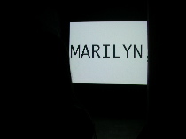
It’s all dark upstairs with numerous video and slide pieces requiring the void to make them look their best. I didn’t didn’t look long but offer this as the snappiest piece,(image right) a text messaging work in which streams of words flashed on the screen then disappeared. Whether or not there was meaning in the words was unclear — and irrelevant. The piece was like a brain on speed — jumpy and all over the place. Which is kind of like our electronics-driven culture. (I’m in the dark on whose work it is, sorry.)


