 Libby and I went to two openings in the Rittenhouse Square neighborhood last Tuesday and ran into a bunch of folks also double art dipping on the muggy night. Here’s a peek at the Art Alliance show, a four exhibit lollapalooza onsite with a fifth in its satellite space.
We didn’t make it to the satellite for Julie Cardillo’s paintings and we skirted the big show of historical photographs by Alfred Stiglitz and others, “Camera Work,” curated by Photo Review’s Stephen Perloff. We’ll get to those later. What we devoured with gusto were new drawings by Rob Matthews, a video installation by Matthew Suib and dioramas by Ahmed Salvador.
Rob Matthews dreams of flyovers
Artblog fave Rob Matthews (who’s also got work at Gallery Joe til June 26)is debuting a new body of work, called “The Dumbest Man.” (more about the Gallery Joe show in my previous post and at the Weekly.)
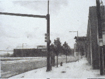
Made in little over a year (Dec. 2003-April 2004), the finely-detailed and dreamy pencil drawings are rooted in the artist’s memory of place. (top image is “Dumbest Man over Philadelphia”) Matthews says the work, a break from his other, darker themed works (sleepwalkers and dead bodies in Hitchcockian interiors) was triggered by thoughts about Don Quixote, Steve Fossett and “decorated sheds.” Hmmm. Translating, that would be dreaming impossible dreams (Don Q), flying around the world in a hot air balloon (Fossett) and …bad taste (a la “Learning from Las Vegas”)?
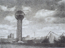
What’s depicted are cityscapes from around the country, many belonging to places the artist has ties to, like Wilson, NC, where he was born and Cooksville, TN where his wife Tracy is from. These are not your typical picture-postcard images. They zero in on oddball constructions like the squat, unlovely Sun Sphere in Knoxville, TN, a World’s Fair relic, or the fiberglass mascots attached to buildings (Big Boy…the cow-pig atop a building at Snyder and Delaware in Philadelphia.) (image above is “Dumbest Man over Knoxville”)
Each work includes one tiny, drip-like aberration in it. You might think it’s an erasure mark except that each time it’s exactly the same — a petite emanation floating in the sky. The ghost of Steve Fossett in his hot air balloon? The artist? The viewer? The critic? God?
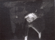
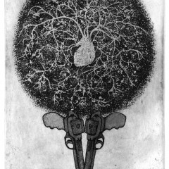
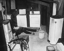
The drawings, like the sombnambulist fantasies (image left is “Sleepwalk Philadelphia” and below is one from the series he did on spontaneous human combustion) are filled with a dense, velvety atmosphere that’s completely unnatural but totally believable.
Once you’ve adjusted to the haze, the focus comes into snap and you see the buildings and the scenes for what they are — forlorn places whose odd, ugly contemporary architecture (often decorated with fiberglass animals) and plug ugly streetscapes exist everywhere.
Somebody probably thought the idea sounded good (sure, let’s put those animals on top of the butcher shop’s entryway; and sure, let’s make a big tower to commemorate the World’s Fair.) But for whatever reason, these projects fell short of the dreamers’ visions.
Instead, there’s something wrong about each and every one. The pig/cow (pog?) over the shop at Delaware and Snyder in “Dumbest Man over Philadelphia” is meant to be cute. It’s just weird. The mirrored golf ball on a fat stick in “Dumbest Man over Knoxville #3” (the World’s Fair “Sun Sphere”) is squat and looks like a big glitzy microphone. And, as Matthews told us at the opening, the Sphere was supposed to tower over the landscape but it was built in a kind of gulley where just about everything towers over it.
The drawings are a treat and a nice complement to the Gallery Joe work. The guy’s got stretch as they say.
Matthew Suib’s dumb Hollywood
Another artblog fave Matthew Suib’s been appropriating imagery in his video work for quite some time. Here in a three-piece, multi channel installation he’s brought together some of Hollywood’s finest source material (biblical epics, westerns and Hitchcock) and edited them all to put his own spin on things.

“Cocked,” (image left) a western that’s a high noon stare-down with a punchline, has every big, whiskery actor who’s ever spat tobacco or tread the old west for Hollywood — Charles Bronson, Clint Eastwood, Henry Fonda, to name a couple — caught in those edgy closeups that directors put in right before all hell breaks loose on Main St.
Paced like a movie, “Cocked’s” denoument at the end of ten minutes is a great, pacifist, non-Hollywood ending.
One of two features projected large and double-sided on translucent material hung in the middle of the gallery,(The other is “Heston”), the viewing’s fine from either side and so are the plush benches.

“Birds” circle the center projection in three small monitors placed high on the walls. Excerpted from Hitchcock’s “The Birds,” the flyers flock and part for solitary winged adventures and in one nicely-timed move, they fly up together just as a bird flies up in one of the “Cocked” sequences.
“Heston” (image above) which seems to borrow from “The Ten Commandments” slows down the action, deletes the words, and distills a number of images down to heavy breathing, stolen glances and some wonderful sound effects. While it reminded me of Bill Viola’s slo-mo “The Greeting” (shown at the Fabric Workshop and Museum in 1995) which turned an old master painting by into an action sequence, “Heston” is doing something quite other — poking fun while paying homage and also turning Hollywood pictures into paintings with sound.

Suib’s work keeps getting better and better, which is not to knock the earlier stuff like
his “Make No Mistake” (shown above) which deletes the words from Bush’s “Axis of Evil” speech and leaves the smirks. It’s a riveting work that states its politics squarely. I also love the 1998 “The Shadow People,” an altered home movie, shown at the PMA’s Video Gallery summer, 2002. That piece, which takes a crisp film-to-video clip to the point of disintegration, is the best metaphorical nuclear family meltdown I’ve ever seen.
I convened a video discussion group in 2002 and Suib was among the brainy and articulate film and video makers who attended. Here’s my two-part PW article, if you want to dip in to some of the nuts and bolts of the trade.
Ahmed Salvador’s Romantic hallucinations

Ahmed Salvador’s brand new work is sculptural instead of photographs, which was a surprise. (shown is detail from the new work, “Sidelong Glances”) What’s consistent between the artist’s work in the two media is the subject matter — the falseness of the material world and a kind of Romantic longing for beauty. Here, the new work, called “Sidelong Glance,” is a group of miniature landscape dioramas in long, thin boxes placed high on the wall (some so high you must view their contents from across the gallery). They have a kind of Antarctic appeal — white expanses that look like snow masses at the ends of the earth, some of them accompanied by lights that suggest the aurora borealis. The fact that these scenes come to you through slit-like openings makes them feel as if the viewer is looking through a peephole or perhaps a periscope at some uncharted territory.
There’s a poignance here and a longing for some better world that is found in a lot of work by young artists. I believe it’s massaging something very deep and expressing fears about the future we all have.
You may remember Salvador’s photographs from his Fleisher Challenge exhibit in 2002. (Here’s my blurb about it in PW.) The photos, too, were fantasies. What looked like planets or stars in voids of space were really doctored closeups of doorknobs or drawer knobs. They were funny in a way and yet had the same kind of woe is me the world’s full of falseness to them that I found sad and sweet.
On a final note, the opening was well attended, and even the babies turned out. Salvador and Kelley Roberts had their baby girl in tow as did John Murphy and his wife Justine. At one point, the four-some made a kind of ad hoc play group on the floor under the dioramas. It made it kind of homey.


