Thoughts about what’s here, what’s been and what’s to come permeate the photographs at the Open Lens Gallery–(which is the entry way into the Borowsky Gallery, not to mention, the Gershman Y).
“Facades: Architectural Landscapes,” up until Aug. 15, includes images of facades of old commercial strips around the country by local photographer Sandy Sorlien, the gates restricting access to homes in Las Vegas by Jerry Russo (from Boston), and the architecture in a Parisian cemetery, by Philadelphian David Lightner.
As a grouping, I found the Russo and Lightner work a nice pair.
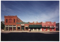
Sorlien’s work (at top, “Main Street, Smithville, TX (Antiques)” 26″ x 38″ color coupler print), seems to be about something else entirely, and not just because it’s in color while the other two shoot in black in white.
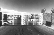 Russo and Lightner are looking at entrances into a mysterious what, gates into the unknown.
Jerry Russo’s gates to the desert
The land behind Russo’s Las Vegas gates looks very much like the land in front, making the need for the gates seem like folly. The harsh contrasts of the desert light and the size of the images (right, “Gate (Untitled)” 35″x46″, iris print) and their modern method of manufacture give the work a modern look to comment on today’s world, full of people looking for their little piece of real estate heaven.
David Lightner’s gates to heaven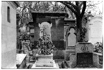 The shots of the cemetery are also about people looking for their place in heaven, or some guarantee for their entrance into a mysterious what. The prints have the subtle gradations of light and the smaller scale of old-fashioned photos (left, Tomb of Pissaro-May, 37″x22″). Oh, and I should add they are old fashioned photos–silver gelatin prints.
But the tales from the crypt are also about self-important folly. And the gaping black portals into the mausoleums bespeak decay and belie the Pearly Gates, just as Russo’s barren landscapes belie the wrought iron gates. To put it another way, beware, all ye who enter.
Sandy Sorlien’s lost Main Streets
 Sorlien’s work, on the other hand, seems to have a romance to it about times and places gone by. She uses modern methods to create a view from today of yesterday’s places. Their cinematic color sense mixes Hollywood westerns and an early 20th century ideal of American Main Street life–without the people. The buildings are facades or shells of human activity now lost.
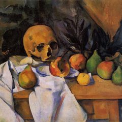
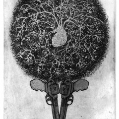
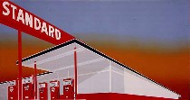
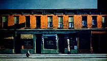 The work also brings to mind Ed Ruscha’s silkscreened gas station (right above, Ruscha’s “Standard”) and Edward Hopper’s views of empty city streets (left, Hopper’s “Early Sunday Morning”)–ambivalent salutes to American commerce.
The sky in “Main Street” speaks not only of big skies but of the winds of change.


