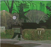
The MFA shows from Penn and Temple offered more for me to think about than some of the pros.
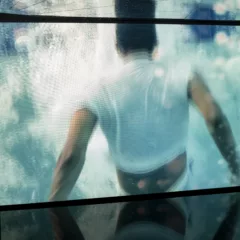
Yi Zhou’s thesis exhibit (already gone!)at the Temple Gallery, set me thinking about how this work could never have shown 10 years ago. It seemed fresh, if not 100 percent cooked, with a nice mix of flat Asian aesthetic mixed with a slightly cartoony, outsider touch.
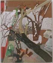 The horizontal planes push out of the side edges, blocking the possibility of perspective, making the space claustrophobic, and suggesting the world before our eyes is the world everywhere. In “Tree Fallen,” the ground tilts up to further exaggerate the airlessness and threat.
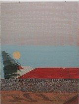 Nature’s colors have been processed by photos, photoshop, early color movies. I’m also reminded of “South Park,” with it’s flat spaces and simplification.
More MFAs
The Penn MFA exhibit included samplings from a number of in-vogue art styles, which is way better than samplings from a number of out-of-vogue art styles which I found around the corner and down the street. Canvas has basically taken a dive, replaced by wood panels for the most part. And paper is still hot.
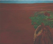 Helen Chuang, who was babysitting the gallery space when I arrived, had a couple of deserted landscapes (one on panel, one on canvas) that felt weirdly unfamiliar, with wide swaths of flat spaces, these punctuated by dots of growth that suggested life and colonization in the harsh environment. The more successful, “Foreign Land” (shown), as well as “”Spinifex” are takes on Australia. I’m happy to report these did not remind me of any particular in- or out-of-vogue art style.
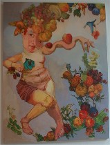 Susana Reiriz’s ebullient, 8-foot tall canvas, “Chiquitica,” made me think about the decorative and lush quality of Ann Craven’s birdies that we saw in New York last month, not to mention Chiquita Banana, the commercial goddess of the fruits. Anyway, its spirit and energy was better than orange juice.
Safety zone
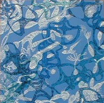
More subdued were Si Young Rhie’s pattern painting look-alikes, which amused me no end since I couldn’t really detect a literal pattern repeat (shown, “Floating Plankton”).
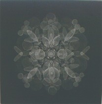
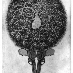
In a way, the control of this work (I admired its blues, it’s white details) was not that different from Sean Riley’s nicely realized obsessive mandala of bubbles, “Full Bloom.”
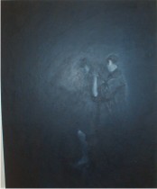
And I suppose, while I’m drawing comparisons within the show, there were Natalie Eve Garrett’s noir hot love scenes, barely visible, but also somehow a little tamped down.
I wanted something riskier from those three.
Dirty pretty things or not
But risk there was in a couple of transgressive sculptures and a series of transgressive drawings.
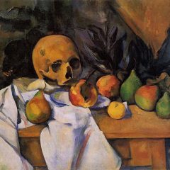
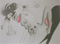 Jacqui Lantigua’s dirty pictures with body parts that morph into one another and repeat in unexpected ways, the feet in fuck-me shoes straight out of Karen Kilimnick’s jerky-lined drawings (below, Kilimnick’s “Planning the Attack of Malta”), stopped me cold after my initial urge to run away.
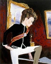 It was the merger of fashion/girly aesthetics with cartoon-action-multiples sex-and-violence fantasies that caught my attention. I didn’t love it, but I can’t dismiss it, either.
And then there were these really scary sculptures of microcrystalline wax by Laura Frazure.
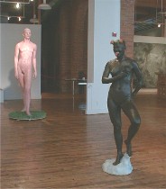 “Ambisexual,” (the pink one in the rear) with an inch of red penis (Hedwig?) and the small, perky breasts of a 13-year-old girl is more than 8 feet tall and plain old upsetting to look at, its pinkness picking up the kind of realism and loss of idealism that have made modern sculpture tough to look at some of the time.
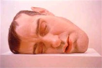
I’m thinking here of Ron Mueck (below, “Mask II”)and Robert Gober details like hair and flesh tones. And that’s putting aside the larger picture of the sexual ambiguity, presented in a theatrical look-at-me way.
The other creature, a dark-skinned female equivalent of a classical faun, with horns, and oh horrors a red curling tongue and vagina is equally theatrical, at six feet.
 I would rather not look at these, but they were pretty amazing frontal attacks on your bourgeois takes on sexuality. I’m going to have to let them marinate in my mind. I think there’s a kind of paean here to the seven deadly sins, one sin more wonderful than the next, perhaps, but I’m not so sure. I need to see more to know what I’m looking at. And I need to know a little about the artist.
Also showing were Demetrius Oliver’s inkjet photos, Sanghee Park’s austere figure sculptures and Jeremy Vaugh’s drawings.
Back with the grownups
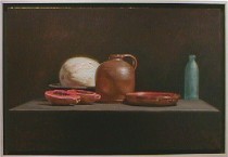 Over at Artist’s House, Noah Buchanan’s still lifes, thanks to some really sexy fruits, rose above their genre (shown, “Still Life with Papayas”). I was intrigued by the burst of color and suggestion of juicy flesh before an unusually austere, dark, rectilinear background.
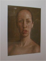 And in the way back, where Artist’s House tends to hang paintings that look like they were made in the 16th century, a self-portrait by Christina Kelly stood out from her lying-in hospital meets valley of the saints paintings.
Others showing there were Stefanie Lieberman with picture postcard Hawaiian landscapes and Elena Petreva’s painted panels, painted, scraped, repainted, with wineglasses and some other object (heart, brain?) standing in for people.


