 Libby and I once fulminated against Robert Ryman‘s white on white paintings after being snowballed by his retrospective at MOMA. We’re still fulminating. What we mind is the optical forlorn-ness of the un-color work and the artist’s grandstanding. In a world of roygbiv how could you penalize your rods and cones (to say nothing of the viewers’) by making white-only work?
Arcadia University’s Big Nothing show,”Open,” is a white on white show. And while I found the hour I spent in the gallery difficult on the eyes, nevertheless, there’s pleasures to be found — in the white gallery whose space sings with light playing off its walls, and in the pleasing, child-like treasure hunt atmosphere which requires you to hunt for the art and rewards you when you find it. I’m still not keen on white work, but in the “Open” atmosphere I didn’t mind it as much as I thought I would.
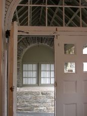
If you think the theme is extreme, you’re right. But this show, curated by Arcadia Gallery Director Richard Torchia and Sandra Firmin, University of Buffalo Associate Curator (and former Arcadia staff) is a show of extremes. All the works take the art to the limit — sometimes the limit is conceptual, sometimes it’s visual. Some work is extremely tiny, some is extremely subtle, some is extremely silly. The show is like an hallucination. Now you see it now you don’t. (top image is gallery door with EXIT sign which is a piece, “Word Event,” 1961 by George Brecht)
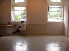
What you do notice is the gallery — a splendid old space with high rafters, glorious open duct work and light that flows in through big windows creating atmosphere that’s Vermeer for the 21st century.
Tyrone Sinclair, the Arcadia senior (finance) who’s the gallery attendant was reading when I took this shot of him under the windows and in front of the faux wainscoting (which is a piece, “Wainscot III by Francis Cape). I didn’t know it at the time but Sinclair’s part of the show. Not only is he keeping track of attendance as dictated by Micah Lexier‘s untitled piece but he’s wearing a Lawrence Weiner temporary tattoo as required by Weiner for his piece “Enough of This enough of that”
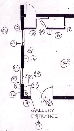
As for the hunt and gather aspect of the show, the checklist and a gallery map (shown is detail) give you clues about the 58 works (name of artist, location of work, materials) but apart from that you’re on your own to discover what’s art — and what’s gallery infrastructure.
I forsook the checklist, preferring to guess at which was which. While I was right in some cases, I misjudged in others. It’s amusing and made me realize the limits of my thinking about architecture and about art.

For instance, in one corner there are hinges running up the wall where two walls abut. (not shown) I thought it was a piece having to do with the wall being a door. Wrong. Whatever it is, it’s not part of the show and it’s not art, according to gallery staff Jessica Bakule who kindly showed me round.
On the other hand, I wondered about this circle in the square cut in the wall (shown above) and dismissed it as infrastructure. Wrong. It’s part of a complicated work, “Concealed Cavity” by David Blamey.
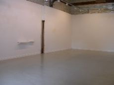
Here’s more open room. You can’t tell but on the left past the shelves and past the cut in the wall is Siobhan Liddell‘s “Daily Life Daily Death” made of yellow thread which casts grey shadows. The cut in the wall demarcates where the partition wall used to join the outer wall. That absence is Yane Calovski‘s “Wall Space.”
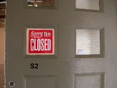
Here’s an example of silly. It’s the sign in the entrance door. (image) That’s Michael MacFeat‘s “Sorry We’re Closed.”
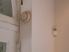
Finally, up high near the door is the world’s most ancient smoke detector.
Because of its lovely antique nature, I knew right away it was art. It is. Say hello to “Detector” 1996, a turned wood piece by Phil Grauer.
In another post I’ll focus on more of the discrete (less architectural) pieces in the show.


