I have to put it right out there, on top of anything else I say, that if you’re going to see one show this month, based on the First Friday offerings we saw in Old City, I’d pick Gallery Joe‘s “Small Drawings.”
It’s a group show with many of the usual suspects, but there was some new work too, and I loved almost every single piece.
Of new work, what I loved were the three Sharon Horvaths from the “Mother Baseball” series and Samantha Simpson’s animals.
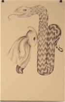
The Simpsons had an easy readability, with their figuration and open-ended narratives. The creatures reminded me of the sweet badgers in the Frances children stories, and the relationships between the creatures was touching. A sense of humor cut any chance of the work dipping into cloying, and the drawing was tender (right, “Bonk”).
The Sharon Horvath work, inspired by baseball diamonds and parks offered up an unexpected sexiness and thrill in both the juicy line-making and the subject matter. The suggestions of thrill rides and mandalas brought baseball diamonds beyond their mere geometry and architecture.
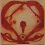
Their scale and decorative qualities made me think of tiles, and the way the colors take over the paper’s space turns these drawings into paintings.
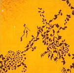
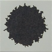
Other work that was unfamiliar and interesting included Sid Garrison’s squares (left), this one reminding me of Japanese gestural paintings of nature, and Renato’s restrained portrait of a paper bag.
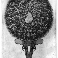
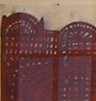
I’ve also included Astrid Bowlby’s “Velvet Lace” for its sense of concentration and just because I think everything she’s been doing is great. We write about Bowlby a lot, so I’ll stick to the picture (top).
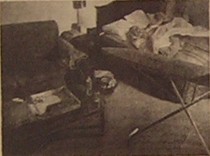
I’ve included a Rob Matthews drawing (right, “Sleepwalk: Roanoke 4”) for its sense of mystery and just because I think everything he’s been doing is great, and because I like the way he places everything in some city or another, a la on the dark road of life with the Matthewses and Sam Spade.
The work, pulled from the gallery’s flat files, includes a lot of stuff I’ve seen before, but I was happy to take another look.
Gallery Joe pretty much rescued us at a point when we felt dispirited and beaten down. The humidity was a killer, and a lot of the work we saw looked like work we had seen before.
Harry Anderson lights Snyderman
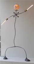 Even Harry Anderson at Snyderman ,whose lamps have always seemed like perennial punctuation marks of wit and light, somehow seemed a little short on humor. The most anthropomorphic of them seemed a little literal, the others not so juicy (left, (Jax”).
 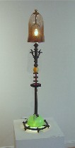 I thought that the work would stand out in the intimacy of a livingroom, where the ideosyncrasy of the work would pop, better than in the gallery space, where the linearity and expectation of the unfamiliar worked against the lamps. I also don’t remember him using this much custom glass, which lent a seriousness and Victorian look that took away from the sheer joy of rethinking something old (right, “Tractor”).
 More on Becerra
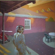 I know Roberta mentioned Roland Becerra at Rodger LaPelle in her First Friday post, but I thought I’d add that in the flurry of everyday images that he used to fill out the show, the ones that seemed interesting were the ones that suggested there was some scary supernatural force or warped narrative, represented by either the green light Roberta had mentioned or other surprising changes like the goop covered, Klingon skin (left, “Covered in Goop in Backyard”). I didn’t necessarily think that capturing his own face at odd angles with odd expressions necessarily brought a painting from mere representation to some kind of commentary on reality.
And Yoder, too
I thought I’d also add to Roberta’s comment about Yoder (same post as Becerra), the strongest work at Nexus.
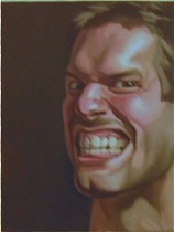 What interested me was that I thought it was unusual to see self-portraits of a handsome man completely without dignity, grimacing like he’s trying to examine a filling in his wisdom tooth. I don’t think these unembarrassed self-examinations bear comparison to Lucas Samaras, who was performing and transforming himself.
In a way, the grimaces form a commentary on the minute self-examination of painting a self-portrait. But I have to agree with Roberta that I want something more, something that puts the artist in modern time. The sepia tone suggests a past time that’s inconsistent with the faces.
The rest of Nexus
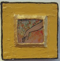 Also at Nexus were works by Delia King, who is a mural artist and who we had seen selling her back-of-glass paintings on the Second Street fence about a year earlier. Her exhibit, “Un/Married Woman” was a little uneven. The highlights were some tiny pieces, “A Couple,” “Arm” (left) and “Face,” and a larger painting, “Untitled.” The come-hither of the arm in “Arm” was captured by the simplest of means. And the sense of dowery and waiting was captured in the rich environment of the figure in “Untitled.”
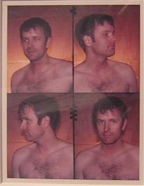 In the back room photographer Chris Macan, whose work we had also spotted along the fence about a year earlier, showed “The ID Project,” portraits of people without their shirts, four shots apiece a la cheap photo booths. He used polaroid technology and had a booth set up in the back for any volunteers (Shown, “Rick, ID Series #7) .
Macan’s show statement talked about surveillance with proto ID photos and that people often found ways of revealing their identities, even when deprived of the clothes and jewelry they use to make a statement. But the finished products seemed not so much about governmental surveillance and stolen identity or even revealed identity but rather about old-fashioned peephole voyeurism.
Macan, who has some energy and ideas about working with others, when we last met him was trying to start a photographers collective. He said it didn’t work out but he hasn’t quite given up.
Another new spot
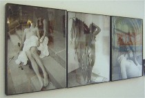 Roberta had mentioned that Carbon 14 looks like it’s about to make a comeback. We also found “Collective 114,” which is really the apartment of Kyle Robinson. He had so many artist friends (and an artist mom)and they were tired of losing half their price to the galleries, so he offered up his walls and put a sandwich board outside. He said he hoped to do it again for future First Fridays.
I especially enjoyed a triptych of photos by Jennifer J. Jones with its pieta imagery (left).
 And speaking of triptychs, Terrence LaRangione used triptych thinking while arranging his portraits of toys at Spartaco Gallery and I started the evening with a bang with this triptych of socks, including the hot pick ones with Warhol’s Jackie O. We also ended with a bang, oohing and aahing with the rest of Philadelphia over the fireworks along the river.


