 I’ve been thinking about one of the shows I saw in New York by Karel Funk, trying to figure out what it was that interested me in the photorealist portraits of guys against white backgrounds, acrylic on panel, averaging 15″ x 18″.
Roberta and I had seen some work about a year ago of tiny, tiny little self-portraits, maybe 3″ x 3″ on thick panels with white backgrounds that these brought to mind (I went through my records but couldn’t figure out the guy’s name–if anyone knows who I’m talking about, I’ll add his name to this post). But those had an intensity and probing not relevant to Funk’s images.
The most obvious reason these were riveting was one of the reasons I should have rejected them–the total finickiness of the realistic illusion. Each hair looked like a delicate brushstroke, and the brushstrokes were smoothed down to give a photo finish.
Followers of fashion
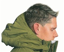 But the portraits were not really portraits, and that’s the crux of the matter. They are fashion shoots. The hoods of the jackets, in wonderful colors, are at least as much of a subject as the faces and the hair. At the beginning, I thought they might all be the same person, just like when you look in a catalog and you can’t tell if the models are all the same person with slightly different hair styles.
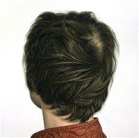
In one portrait, the hair is all you see, the face so unimportant it’s facing away. What you get instead are the swirls of the hair pattern, the slightly greasy part near the scalp, the ends blown by some fan perhaps(top).
The jackets might make you think the white background is sky and these are bold men going forth into elements. But that’s not what’s happening here. Instead, the jackets make me think the white background is a photo backdrop. The wind in the hair made me think fan, not nature.
 And speaking of not nature, one of these young men had vaguely blue eyelids, his forelock flipped up to perfection with goop (above right). Whether he’s metrosexual or homosexual, the point is, he’s clothing sexual, the hormones all focused on his outfit, and who he is, is not part of the picture. His face is also partly hidden–of course by the jacket hood. What I am saying is that his portrait is fashion-plate handsome with some youthful idea of sexuality in denial of the body that has nothing to do with the human condition and everything to do with Ralph Lauren.
Hollow men
 These portraits lack the personal features, emotions and accoutrements that make a portrait sing. Is there pride here of the urban burgher? Is there a sassy confidence or a rough sexuality?Is there shyness, a sense of humor, a twinkle? Nothing. All there is, is an image that sells a stylish coolness.
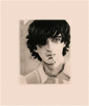
I would put this work in the same genre as Elizabeth Peyton, although the materials and approach are so different (right, Peyton’s “Marc”). We’re talking here about a lot of immature posturing aimed at not giving too much away.
Miscellaneous other artists
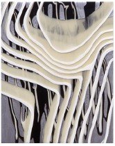 I saw just three small pieces in a group show at Jeffrey Coploff by Kathleen Kucka that piqued my interest, their layers of undulating stripes creating topographic, biological and botanical spaces that made me want to see more (left, “Petite Black and White #1,” acrylic on alumninum).
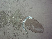 I also admired “Beast” and “Mirror My Mirror,” a couple of embroidered silk and crystals pieces from Angelo Filomeno at Gorney Bravin + Lee. Besides the obvious excess pattern and decoration thread, the stitchery brought to mind the mix of Goth sensibility and Asian-inspired drawing technique of Ernesto Caivano, but the wild back-story was missing (“Beast” detail right).
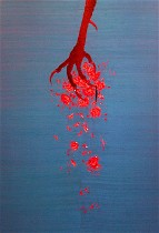
The hold of decoding black on black made “Beast” and “Mirror” work better than the blue and red “Vulture,” (left) plus the black added a darkness that helped further the dark thoughts.
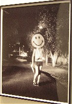 I also went to a show of Israeli art at Lehmann Maupin. Rona Yefman’s photographs of young people would have fit nicely into the clown show over at Cheim & Read (see post), especially her bare-breasted “Girls with Groucho Marx Masks” hanging out in the backyard, and “Smiley,” (right) a girl walking down a dark street, her head covered by a huge smiley face, in her hand a huge knife. These forlorn photos, and her portraits of “Gil with Flower” and “Sigalit on the Beach” get to the internal places that Funk’s portraits try to hide.
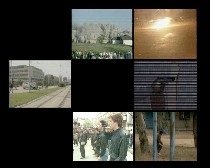 Also part of that show was a video installation, “Lullaby,” by Doron Solomons, with a rat-a-tat explosive soundtrack and a grid of repeating images of violence from the TV. The video was hard to see due to excess light in the gallery, but it still made its point. It was somewhat obvious, as is most political art, yet I couldn’t stop watching. I thought I’d mention it because he showed his “I Clean Richard’s House and He Cleans Mine” at the Borowsky Gallery back in December (see post).


