 This is the second time I’m writing this post. I put it up Thursday night, and by early this morning, Blogger had eaten it whole.
I’m trying again only because the show, “Several Steps Removed” is so terrrific and I have to share it. It’s all prints and plates or other matrixes used to create them, and if you want to know a little more about printmaking, or you just want to see some terrific stuff, this show is for you (I figure that includes everyone in our reading audience).
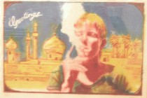
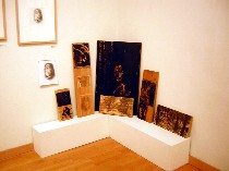 The show, at Fleisher Art Memorial produced with the Philadelphia Print Collaborative, has a wide range of work, from the retro-hip lithograph(top) by Alyse C. Bernstein to the old-fashioned-looking woodcuts from James Mundie (top, Bernstein’s “Greetings” and left, a collection of Mundie’s wood blocks and prints and original drawings).
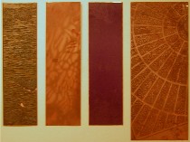
My first surprise was coming upon some pieces by Richard Hricko, a printmaker whose work I keep stored in my mental flat files for favorite artists. His three prints were created with four plates, one of which was a gorgeous, gnarled piece of flattened bark ( the leftmost of the four plates shown right). He printed on both sides of translucent silk, creating layers of pattern and light. My photos didn’t even begin to do the prints justice, but the plates themselves are pretty swell.
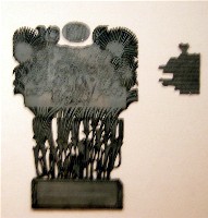 Some of the plates competed with the final product for beauty. I’m thinking here of Mundie’s woodcuts and Judith K. Brodsky’s photo etchings with a plate that’s a noteworthy object in and of itself (left, the plates for “At 65,” based on a poem by her father).
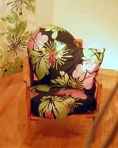 Next to Hricko’s delicate prints were Candy DePew’s silkscreens on fabric. The oddly shaped chair cushions were a delight. The hanging fabric seemed dispirited although it used the same motifs (right, “Blooming Tuffet”).
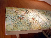 Among the highlights of the show were the pieces that demonstrated innovative methods. I’m thinking here of Shelley Thorstensen’s child-scarred dining room table turned into a woodcut (left), as well as her plaster intaglio prints, printed from scratched-into plastic blocks. Also of interest were Ron Rumford’s intaglios from polymer clay plates, using a process that included baking; Mary Phelan’s letterpress prints using everyday materials like sand for her textures.
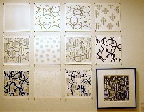 Also pushing the envelope of what an art print can be made from, Charles Burwell used a computer to layer and then print his imagery. Part of the fun of his display of the layers was figuring out how they fit together to make the final print (right, “Composition Wave” and display of layers).
Daniel A. Heyman’s “Forgotten Salt,” made with linocuts, also provided a kind of puzzle for examining the link between the matrix and the final print. The linocuts were stacked in a nearby rack, looking inviting enough to pick up. (No, I didn’t, but I did try, unsuccessfully, to maneuver the racks so I could get a better look.)
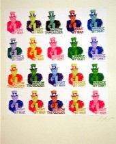 Examining the how-did-they-do-it for almost every one of the artists was one of the great pleasures this show had to offer. Another nice demonstration came from Jesse Goldstein’s poster “Field Day” and the three silk screens used to make it. Goldstein also included a silkscreen print, “Fight My War,” (left) an example of the traditonal use of silk screens for political postermaking which more modern–but cheesier– reproduction techniques are replacing. The image is a grid of Dubya urging one and all to “Follow the leader.”
Every artist in this show had something special to offer: Joan Wadleigh Curran’s “Chestnut” etching; Kevin Strickland’s untitled monoprint, Patricia M. Smith’s “Hours” book made with woodblocks and offset lithography, Rochelle Toner’s snappy etchings, Janet Towbin’s all-over patterns, and Charlotte Yudis’ celestial etchings, made with a touch of alchemy. But after seeing this show, I’m convinced that all print making has a touch of alchemy.
This show was part of the Big Nothing project organized by the Institute of Contemporary Art, but the logic of making it fit was a bit tortured and not worth repeating. What is worth repeating, however, is, Go see this show.


