 The assumption about art is it’s worth something, hence the pedestals, vitrines, museums, auctions and galleries. But thanks to my touchstones for all things subversive–Andy Warhol and Marcel Duchamp–the true value of what we call art is constantly open to question.
“Erasures,” the show now up at Vox Populi, a part of the Institute of Contemporary Art-organized Big Nothing, seems to raise issues of preciousness at least as effectively as it raises issues about nothingness and erasure (see a slew of Big Nothing-related posts during the month of May if you have the energy to browse through a month of our archives). I don’t want to give the impression that I think this is a great show, but I do want to give the impression that you might find the highlights here are worth the trip.
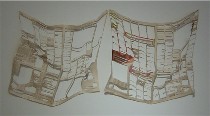 M.Ho, who previously blotted out chunks of newspaper pages with rectangles of pretty pastel colors, shown previously at Vox, in her new piece “Half Life” (right) cuts out sections of the page, leaving a lacy doily of newspaper hanging off the wall, the ads half obliterated, and the news even more partial and selected than when it started out. As a newspaper page, it’s worthless now. (Was it worthless before? Tomorrow, today’s news is worthless anyway.) As art, I’d guess it’s worth a bit more even though there’s less of it.
With fragility and thoughtfulness being a hallmark of preciousness, and this being fragile and thoughtful in spades, I guess it’s worth more than shredded paper, even though it is shredded paper. At last we have a silk purse made from a sow’s ear.
The act of cutting half the news implies that half was worthless in the first place–or perhaps it implies that the half that really matters never gets reported, or perhaps it implies that the half that really matters never gets read by an indifferent, know-nothing public, or perhaps it implies that half the news is a big nothing (I’m afraid I can go on and on about what cutting out those holes suggests, but that’s enough). All I know for sure is Ho has transformed something of little lasting value and quotidien into something more precious and persistent–by making it disappear, in part.
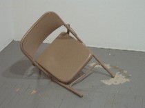
At this point I want to say I also loved Tristin Lowe’s “Disfunctional” [sic.], a chair that looks whole but collapses into charming uselessness and danger. Its worthlessness, its human qualities, and its silly awkwardness make this piece worth its weight in gold (Lowe’s piece shown at top). I (try to)think; therefore I am a chair.
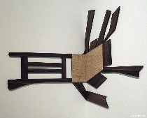 Visually, in its many collapsed states, it reminds me of Richard Artschwager’s “Chaise Eclatee” (left).
Natch, I’m crazy about anything that I can play with, and Lowe’s chair fits the bill.
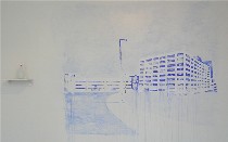 So does Mauro Zamora’s “Ode to the Lot,” (right) a wall painting meant to be sprayed into oblivion. A handy spray bottle of water rests on a shelf next to the painting so any viewer can participate in the erasure process. While I liked squirting the water and I liked the piece’s drips and varied blues, this thing will disappear shortly and leave nothing of value.
I digress here
I appreciated Zamora’s “And then…” for its subject matter–trees taking over a derelict building, because nature always wins in the end. I suppose nature always winning is a commentary about art as well. It may be precious–for now–but the elements and time will ultimately destroy everything. This brings to mind a story I read long ago in the New Yorker about an artist who worked in radioactive material because the half-life of radioactivity persists longer than almost any substance known to man. I wonder if he’s still alive.
Genuine decorations
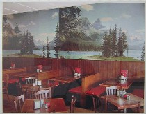 Simon Cuthbert’s photos about people’s choice of simulated landscapes to decorate interiors hit another level in “Zebra Flip,” a photo of zebras applied to a wall of storage lockers in a Japanese subway station. The doors opening and closing promise constant disruption to the image which is damned silly in the first place.
Cuthbert offered his travelog of a variety of silly vistas applied to walls (left, “Greasey Joes”), but I’m not sure why his pictures should be taken as any less silly a construct. Why should I look at his pictures of zebras on the locker when I can go look at the lockers themselves?
The issue here seems to me to be mediocrity or bad taste. I’m not so sure it’s about purity of nature and purity of walls or any other kind of genuineness, that position being subverted by the presence of Cuthbert’s photos.

John Lorenzini’s “Awaiting Subject #1,” “… #2,” and “… #3” (right) was a visual “Waiting for Godot,” lightjet prints of photo backdrop paper with no subject (until #3, when an umbrella and a photo light appear).
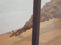 John Stoney like Ho is taking something useless and somehow making it precious. His pieces of cast cow dung are encased, like jewels, in a vitrine. “The Problem with Airplanes” is a little brown airplane emitting a solid turd of puffy smoke (left). I confess I could barely look at this work for its aggressive brownness and sheer ugliness. However, the thought of the airplane as us is rather winning.
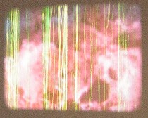 The 16-mm film loop of Nadia Hironaka‘s “Camoflage” [sic.] includes footage of famous special-effects explosions from movies (eg. from “Independence Day”) being degraded by sandpaper as it loops around the projector. This is another piece about a process, not a product. So in the end, what you got is nothing.(For a great piece of hers that’s up right now, go to Moore College’s Philadelphia Selections Five — and see what Roberta had to say in her post about the show.)


