 I dropped by Vox Populi yesterday evening for one of their regular gallery talks, in which the artists tell what they’re doing and why.
I’d never stopped by before, but the small crowd, mostly a core of regulars and Voxers was welcoming.
First I looked at the show, to which I had given only a cursory look on First Friday. I was surprised by the number of people using silkscreens and stencils and airbrushes.
In addition to the Samantha Simpson, Amy Adams and Eva Wylie pieces, which I admired last time (see First Friday post), this time I visited everything else.
Just when I had declared to Roberta two days earlier that sculpture was dead (I was dead sure I was right, too, so maybe it was my brain that was dead), here was sculpture that was quite alive. Three of the pieces involved reflections of color on walls–a tactic that brought to mind some Kevin Strickland pieces I had seen at the Project Room.
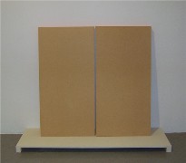 Yun’s pieces were chock full of other references. “Oh, C’mon” (left) were several pairs of particle boards edged in orange tape from Home Depot resting against the wall on a low, ceremonial pedestal, looking like tablets or scrolls or screens. The tape cast an orange aura on the wall behind, suggesting something almost religious or supernatural, or at least the idea of slowing down and taking in the magic of the world around us.
 “Get Your History Straight,” (right) half the advertising slogan Philadelphia used to market itself to gays (the other half is And Your Night Life Gay) is a sort of deck of cards structure made from paint chips (also from Home Depot), the colors reflected on the wall. The pipe-like shape blends right in with the real pipes in the room, and the little gray (floor color) pedestal, just a box, really, elevates it again above the reality of the pipes, and again requires a slowing down to take in the magic.
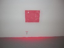
 Yun again makes you notice in “Ooops” (top) and “Come to Philadelphia” (left). In “Ooops,” she’s also thinking about the way that old plaster walls look in the deteriorating old city where next-door buildings have been razed, and how what’s old sifts down and casts is spell over what’s below. In “Come to Philadelphia,” scented markers are barely visible through a slit on the side of a carefully finished box mounted at face level. The scent as just loud enough if you get close enough to notice it. The box makes me think of the three wise men carry frankinsence and myrrh in what I imagine were sandalwood boxes. But inside, here, are children’s markers, the experience of them something to be enshrined.
I was also struck by the materiality and sculptural implications of Anne Schaefer’s “Per Square Foot,” (right below) its individual squares implying objects rather than paintings.
I stayed long enough for the talk and here’s some of what I heard, in the order I heard it:
From Anne Schaefer
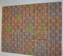 Schaefer comes from a fabric and silkscreening background, working with imagery that falls somewhere between commodity and fine art. By using modules, which work like tiles and have a commercial connotation, she is taking some of the personality out of the work. The owner can arrange the modules to taste. The imagery in this particular piece came from a 1930s decorative dishtowel. She was surprised at how, by putting together so many of the modules, the work dominated the space (right, “Per Square Foot”).
Schaefer is putting chance in the hand of whoever shows her pieces, but not in their manufacture.
Eva Wylie was absent, but Anne represented her:
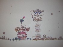 Wylie’s work, was silkscreened directly on to the wall, and she referred to it as a landscape. The method she uses, searching a word, in this case “crown” via Google, adds an element of chance, but ultimately, she is controling the final product. The crowd oohed and ahhed over the challenge of silk-screening directly onto the wall. We all wondered how she avoided drips.
From Amy Adams
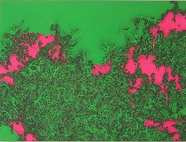 Adams is interested in accumulation. She starts with a shape with no meaning, and has a number of stencils of the same shape in different sizes. As she adds the shapes, the work gains significance to her, and she thinks of it as microsopic and massive. She thinks of the work as having something to do with mass production.
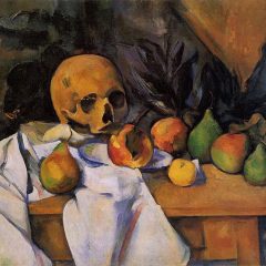
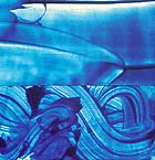 There’s no materiality to her surface (she works with an air brush), not much illusion of depth, only the illusion of the imagery, and she mentioned David Reed (left, a Reed painting) as one of her influences.
From Gus Boyce
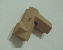 Both of Boyce’s tiny chipboard house models are of his childhood homes (right, “5223 North Chalet Court,” about 3″ x 3″ x 1 1/2″ deep from wall), and they are his idea of what an aerial view of them would be like. They serve as a backdrop for his memories. He also likes the surveillance quality, and zeroing in a cropping stuff out. At one point, he discovered he could zoom in on his childhood home (I’m not clear if he could view both of them) from a Website that had satellite photos of the area where he had lived, but that came after the inspiration for the work.
I’m not sure he nailed down in his mind his rationale for such specificity in naming the pieces versus the uninflected material and minimal detail in the pieces themselves. But the craftsmanship was meticulous. He cited sculptor Charles Ray and Victor Hugo (for his drawings) as artists he liked.
From Stefan Abrams
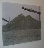 By choosing places and moments with even lighting, so even that they give the illusion of objectivity, Abrams is making photos that are highly subjective. His subject matter here is landscape, and about how technology creates landscape (left, “Rock Piles”). But the photos, which are made with an analog 4×5 camera (it’s hard to make such large prints with a digital), are also about photos as flat spaces. He is avoiding anything narrative in these images. Unfortunately, I think the images need to tip his hand a little more. Right now the images look as objective as he says they look. There’s no hint of the subjectivity that might be there. It’s how they look that counts.
From Linda Yun
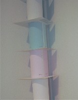 Yun is trying to pay attention to her everyday environment, using everyday materials elevated to art. She said she had a professor once compain about “Home Depot art,” but almost everything she makes is from Home Depot, she said. She’s attracted by the utilitarian quality of the materials. But what she does is make her viewer notice, too–the reflected light of a color, a scent emanating from a small space, an ordinary outlet, the traces of a spider that lives inside the outlet (right, “Get Your History Straight” detail).
She likes to offer surprises and treats, and in the piece with the scented markers embedded, she pictured people swiping their noses along the opening like an ATM card. She also liked the feeling of violating the sculpture’s space.
From Samantha Simpson
Simpson is throwing down the gauntlet, ready to duel highbrow, unfriendly art. She said that art education weans young artists away from what’s easily pleasing to what’s sophisticated, smart and inaccessible. She felt that popular culture got all that was good in visual art, and high culture got austere minimalism. So she decided, after learning to scorn everything that drew her to visual art, to return to the things she liked as a child. She’s deliberately decorative, using color, prettiness, drama and narrative, using them as strategies to say something bigger and make her message accessible.
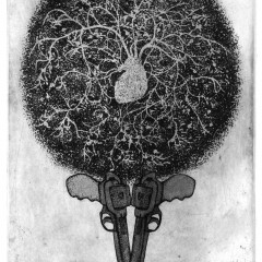
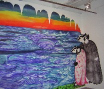 Her mural at Vox is about her grandmother, who she had just spent time with at a lakeside place called Rockyview, full of sick, elderly people. The badgers are her grandparents. Simpson has “millions of stencils,” which she used with an airbrush to create the piece, “Incident at Rockyview” (left). Right now, she’s been looking at Pre-Raphaelite art with its cheesy, romantic, over-the-top, feminine decorative qualities, as well as 17th century and Japanese prints, and Maxfield Parrish sunsets. Her work is not ironic.
I don’t know what else she said because I had to leave, but whatever I heard made me love what I loved all the more, and made me reconsider what I didn’t love. I won’t say I changed my view and judgment, but I will say that even the work I found less than convincing was made with great thought, and any one of these artists has enough cooking to make me look forward to where they go.


