There is no art page in PW this week alas. (It’ll be back next week…they’re rationing due to revenue issues). But there is art coverage in the paper. You just have to know where to look. In the listings under editors picks, you’ll find my review of the Junto show. And in the a-list, my piece about David Stephens’ Kontemporary Konflagration — cross burning — at Slought.
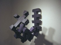
Here are a few more thoughts on both those shows. Stephens is not new to working with crosses. He showed a room full in Gallery Joe’s vault in 2003. (actually it was 144 but it seemed like the room was full — there seemed no room to breathe for all the crosses) The artist, who has a formidable history in the Philadelphia art scene, having sat on many boards and at one point having worked as a funder (at the PA Council on the Arts — at the same time Kimberly Camp was there according to Slought’s Aaron Levy)has pushed some of his crosses into what reminded me of 3-D cyber cad-drawings. (top image for example)
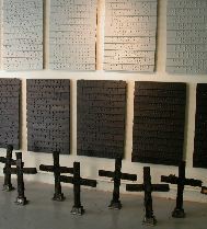
In several works attached to the walls the crosses seem to have crystallized into an accumulation (a crusade of crosses?) that defies gravity in a way that seems possible only in realms of animation. The crosses have a real world presence. They’re nobbly and rough-hewn and painted an improbable purple. But their aggressive,twisting horizontality took my mind to religion in cyberspace and crusades on websites.
I’m not sure anyone mentioned this before (Libby wrote here and and here and Colette wrote here) but the 12 grey and 12 black boards on the wall that riff on words are made also by accumulations. (image left)
Here, slats of wood are coupled in a way that they slightly overlap — like venetian blinds that keep light out. In this context, of course, they’re blinds that keep other things out, like reason.
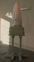
Libby asked me to mention something about Stephens KKK figure which she felt got slighted in all the bombast about burning. I loved the guy. First off, he is familiar like a low tech R2D2. Built from cloth and wood with a base that’s like a two-tier cake on birds’ legs, the figure tilts to one side with some kind of attitude. He’s a hood. (image right)
Then, if you crouch down and peep through the eye holes (he has holes in the back of his head and in the front) you look straight through. He is completely empty, a vacuum, a void, a straw man. Or maybe not. What you see when peering through the holes is such a small view of the world that you see almost nothing. So, as a lens through which to view things, he’s a myopia machine.
You can read more about Stephens’ career of community service in the arts at Gallery Joe’s website or at Slought‘s.
Stephens’ visually-loaded, verbally playful works are amazing. Don’t miss them.
One more thing about Slought before I leave it. Aaron Levy, the Director, told me he’s preparing for the opening of his archive-based exhibit at the Penn Rare Books Library. Levy has been working for over a year (if memory serves) on a project that riffs on archives and beehives and has to do with ideas about how much archiving is too much archiving. (As a pack rat I can relate to that.)
I remember Levy’s archive-archaeology project at Rosenbach Museum fondly as a weaving together of thought, material and of course theory. I can’t wait to see (and I hope hear) this piece having to do with beeeeeez.
Outside the norm at Junto
Just a word and maybe a picture. The exhibit at Fleisher-Ollman is a good one. As with shows of outsider art, the works are so disparate they should fight amongst themselves. But also like a lot of outsider art, the pieces are full of that inward-sucking energy that comes from a singleminded focus that’s a kind of disregard for the outer world and for the gaze of others.
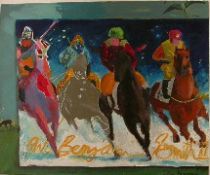
Best for my eye and sensibility were Kate Norton’s Beuysian wall of pelts (not shown) and W. Benjamin Smith‘s religion-fueled drawings and paintings.
I hardly knew whether to take Smith’s works seriously and that’s their charm. One work,(shown right) is called Four Horsement and its affect is so Leroy Nierman (artist of polo, golf, football, you name the sport — all done in breathless stop action and candy colors) I had to laugh. But Smith signs his name across the work in a William Hawkins-esque fashion and makes the piece a complete and pretty puzzle.
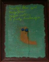
And as if that’s not enough, another work both Libby and I loved (shown,left) has an ochre-colored worm with gloppy green eyeglasses floating in a field of pasty pastel pthalo. Written in cursive on the work is the following: “Beautiful blue-eyed Baby Jesus Weeps within a Frosty landscape.” It’s not good advertising copy but it’s great art.
For more, here’s Libby’s post or see my PW piece.


