 The trouble with the internet as we all know is there are no filters to separate the wheat from the chaff. So we rely on institutions to keep us on tracks–universities and libraries and respected publishers for facts and information, art museums and galleries for taste.
Well, I was noodling around Dia:Beacon’s site thanks to a link on Doug Witmer’s new blog and noticed the Artists’ Web Projects link. Last time I had looked here, right around when Dia:Beacon opened, it wasn’t worth a look. But this time there is quite a list of things, ranging from the brand new to an archive that goes back to 1994.
The quality, however, is a mixed bag, some of the work feeling just like play, some of it feeling like please, a little play would be nice around here, and some of it just plain impenetrable. But there were rewards as well.
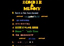
In the top group, I’d put Olia Lialina and Dragan Espenshied’s “Zombie + Mummy,” which offers a mix of little cartoons that are amazingly low-tech in their presentation but quite amusing, some swell graphics and some web-site satire that I thought was hysterical (image above a web-page still from “Zombie + Mummy”).
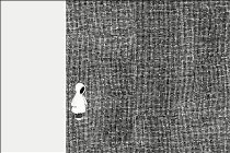
 The first three were annoying for different reasons. The Ana Torfs “Approximations/Contradictions” was stifling and stifled and really a music project; the Glenn Ligon was just a photo album (left, a page from Ligon’s “Annotations”) . These two didn’t take much advantage of the techno-wizardry that seems to me belongs in a Web project. Allen Ruppersberg’s “The New Five Foot Shelf” hit an early dead end and I have a feeling that can’t be all. I clicked, moved my mouse, looked all around for more, but nada. And the Marijke van Warmerdam’s “And then the Chimney Smokes” required me to download and then put the movie on a CD. Life’s too short.
But go into the archive. There’s more there, and some of them are quite amusing–but not much by the standard of art. Dia needs to do an editing job.

Here’s a suggestion: anything that requires a lengthy download ought to offer a quick sample. Otherwise your wasting your time on a pig in a poke.
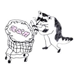
For someplace that does this sort of thing better, I’d go to the Vacuum for the current show, especially the Hedwige Jacobs pieces on the third floor (right, a still from Jacobs’ “Night and Day”).


