Why is it the MAM has such a great contemporary art collection in spacious galleries and the PMA’s seems puny — and crammed into two comparatively tiny rooms and a hallway or two? I’ve been stewing about this for days since my trip. If you’ve been to the PMA contemporary galleries, you know what’s there, a small sampling of the big boys — Robert Gober, Jeff Wall, Gabriel Orozco, Gerhard Richter, Peter Doig, Sol LeWitt, Warhol, Sigmar Polke. And I know that’s the tip of the PMA collection iceberg and it’s not fair to compare but somehow I feel a museum mission comparison coming on.
Maybe it’s like the realtor’s song: location, location, location. When a museum is as far away from Chelsea and 53rd St. as MAM is, perhaps its mission includes bringing contemporary New York to the countryside. That’s what fueled Andrew Carnegie when he established the Carnegie International — he wanted to bring the best in contemporary art to Pittsburgh and then buy some things for his collection while he was at it.
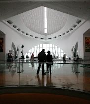
On the other hand, when a museum like the PMA is so close to Chelsea and 53rd St., perhaps it doesn’t feel the need to educate its audience in this way (assuming its audience can and does go to NY on a regular basis). It’s more complicated of course and has to do with a museum’s mission and I’ll have a few more thoughts at the bottom but first a Sunday picture show of the MAM contemporary art collection and then we’ll talk a little more about museums. Ladies and gentlemen, start your scroll bars. (top image is MAM Calatrava lobby on a cloudy, snowy day)
From the MAM Contemporary Art Collection
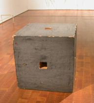
Jackie Winsor‘s “Painted Piece,” 1979-80. The piece has 50 coats of paint and was dragged along the sidewalk in front of the artist’s studio to give it that “shabby chic” ambiance. (Was she ahead of her time or what.) My introduction to Winsor’s process-heavy work came in 1992 at the MAM in a travelling retrospective they organized. It’s a show I still remember.
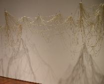
This Eva Hesse piece, “Right After,” (1969) shares the gallery with Winsor…
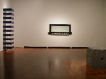
and with a Donald Judd stack — like the one at MOMA only MAM’s is blue — and with an Agnes Martin painting (not shown) and “Atmosphere” by an artist whose name escapes me and I can’t describe it to Google’s satisfaction so I will have to fill in that blank later (Maybe somebody can help me…I think the PMA owns a piece also). [note: thanks to readers Cynthia King and Chris Ashley who reminded me that the Atmosphere painting is by Neil Jenney.]
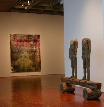
Magdalena Abakanovic‘s piece, “Two figures on a beam” (1992) (foreground) which faces Lake Michigan is near a Gerhardt Richter scraped painting, “Breath” (1989).
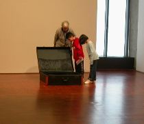
Robert Gober‘s “Untitled,” 1997, is an old-fashioned suitcase opened and empty. When you look into it, as these students and teacher are doing, you see (and hear) a bubbling, watery subteranean grotto with coral and seaweed, and if you look closely, you see the bare legs of a man dangling a baby in front of him. Whether he’s going to put the baby leg-first down in the water or what is going on is not clear, but the surprise of the legs is, well, it’s worth the price of admission. This piece is both weird, beautiful and dark. Life and death in a box — it draws me to it and shocks me each time I see it.
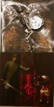
I didn’t remember that MAM owned a Komar and Melamid, but there it is, a painting from their Socialist Realist period (that is Stalin on the bottom and a girl with her pants down; and death with a clock — that works — on the top.). I’d like to hear the story of how this piece made its way into the collection.
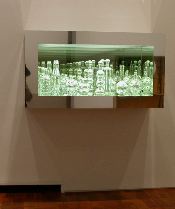
It’s smaller than the one in MOMA but this Josiah McElheny glass and mirror infinity box, “Modernity circa 1952” (2004), is a wonderful combination of craft, design and high art. Like a warped descendant of Roman glass (all beauty, form and function), its machine perfection and promise of infinity is all about image. Use and functionality be damned.
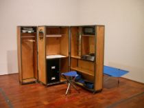
Speaking of functionality, Andrea Zittel‘s “A-Z Living Unit” (1993) sits opposite McIlheney’s box, and it’s a compact, survivalist warrior. It’s as full of life, hope, whimsy and humor as McIlheney’s is full of death, illusion and vinegar. I vote for Andrea.
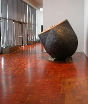
Philadelphia has a Martin Puryear piece outside in Fairmount Park. (I’ve never seen it but I hear it’s great….Resolution: Will see Puryear in Park this year.) Here’s MAM’s Puryear, “Maroon” (1987-88). It’s made of steel, wire mesh, wood and tar. Both bulbous and truncated, it reminds me of a hot water bottle, or of an internal organ, maybe the lungs, maybe of a giant smoker. It’s pretty great.
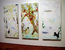
Laura Owens triptych “Untitled” (2003) is a surprise. I don’t remember an Owens piece having so much life and accessibility. Puppy in the snow, a tree with fruit, the land is wintry and snowy but the piece is downright vibrant in comparison with what I’ve seen which seems low energy and withholding of affect.
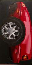
Peter Cain‘s “Miata” (1991) is around the corner from Owens in a kind of painting room that also included a nice Peter Saul (not shown). Cate reminded me that we (and Libby) had seen a show of Cain’s in Chelsea last year. The auto eroticism is just excellent. The piece reminded me that Patricia Piccinini is doing a similar car-love chunk-thing in her sculptures — which we also saw in Chelsea. See post and post for more on Piccinini.
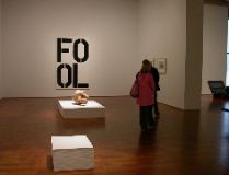
Next door to Gober’s suitcase is a room with a Christoper Wool, “Untitled” (1990) (background) and an infinite stack by Felix Gonzalez-Torres, “Untitled (Veterns Day Sale)” (1989) (foreground). I’m sorry my notes don’t say whose work is in the middle. I was too focussed on picking up my Veterans Day Sale piece I guess. Being a give-away artist myself, I feel compelled to collect Gonzalez-Torres’s work. Hardly a chore since I love his work anyway.
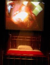
In the video area, near the Oursler piece (see previous post for more on that) is a Bill Viola installation in a dark room. You hear it before you enter. “Science of the Heart” (1983) includes a bed and a large projection of what looks to be a beating human heart. (Sorry about the fuzzy, crooked shot). The heartbeats speed up and slow down and, while I can’t say it’s my favorite Viola piece, it’s a lyrical work…
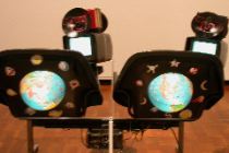
and so completely different from the Oursler and the Nam June Paik piece “Literature is not a book” (1988) (above) which is right nearby, that together they give you a hint of the range of what’s been done in video over the past 20 years. The Paik is two airport bucket seats with those televisions attached to them. There are some books skewered and unreadable on top of the tvs and the whole thing has a low tech space voyager ambiance.
Travelling Mark Lombardi exhibit
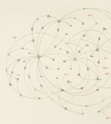
Tucked away in an upper level of the contemporary galleries we found the Mark Lombardi exhibit. A large, comprehensive travelling exhibit organized by Independent Curators International (ICI), the show had several senior-aged couples enthralled as they studied the works in depth. They were audibly awestruck by the artist’s reconstructions of the scandals of our times. Lombardi is a favorite of mine. He had several exhibits at Gallery Joe and the work is truly unique.
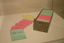
In addition to 25 works on paper, the exhibit includes a sample of Lombardi’s color-coded index cards with hand-written notes on them. There were 1,300 cards on view out of the total 14,500.
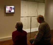
A 15-minute video based on an interview with the artist done by Andy Mann in 1997 offered some insights into Lombardi’s working method and his orientation to his material. The interview was shot in the artist’s studio in Houston (before his move to New York) and includes Lombardi, sounding rather perplexed, saying he worked with newspapers and other printed sources and that he found the Internet “a vexing challenge” because of the information explosion it would bring him.
Final thoughts or the beginning of final thoughts
Museums have missions and those missions come from somewhere (a founder’s dying wishes or will, etc.). We just had a big fight in this town about an institution (let’s not call it a museum — the Barnes) and its mission. People will continue to fight about defining that mission for years to come. Sometimes donations of collections steer a museum in a direction and wind up tweaking the mission in one way or another. The Arensberg collection of Duchamp and other works certainly influences the PMA. If you’re strong in an area, you want to be stronger, collect more and claim that territory as yours. The size and age of a building will influence a museum’s mission. The PMA’s building is a done deal and has been complete for years. The only expansion possible is expanding into another building, which, of course, they’re doing with the Perelman Building.
Finally, whether an art museum is the only show in town or is one of several museums influences its mission. It’s clear that the Metropolitan Museum in NY doesn’t see its mission as collecting a lot of modern contemporary art. With MOMA in town, why would it? It does show contemporary art, but not so much. In Philadelphia, the ICA brings in blockbuster contemporary shows and even though it’s not a collecting institution, perhaps the PMA is influenced in its mission by having the ICA so close.
Museums depend on people to steer them, and people have preferences and those preferences will steer a museum also. It’s complicated. Maybe a museum’s mission is an impossibility at base — to be a living encyclopedia of art and serve all the people all the time. No institution can do that.
A Little PMA History
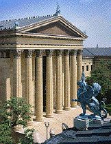
The PMA’s website says that the museum’s Department of 20th Century Art was established in 1971 but that they’ve always had a commitment to contemporary art. When Libby and I were talking about this the other day, she mentioned that even if the contemporary galleries were limited the PMA had the opportunity to show contemporary art in its special exhibitions galleries (site of the Manet and the Sea, the upcoming Dali exhibit and all other blockbusters at the museum.) She’s right. And the last time they’ve done a show by a contemporary living artist in those galleries, I believe, was the Francesco Clemente exhibit. Before that, there was an Anselm Kiefer exhibit, but that was years ago.
Apart from that, they’ve shown commitment to contemporary art recently through the Museum Studies series, wonderful but spotty, which brought in Rikrit Tiravanija (1998), Gabriel Orosco (1999) Richard Hamilton (2002) and Christian Marclay (2003) and three others. There was a Zoe Leonard installation in 1998 and a Fischli and Weiss video that appeared a few years ago. Right now, they’ve got Bill Viola‘s “The Greeting,” which supplements the Pontormo, Bronzino exhibit. Meanwhile the Photography, Prints and Drawings Department seems pretty consistently oriented to the present with shows of Mary Ellen Mark, Raymond Pettibon and contemporary prints.
Brief History of MAM
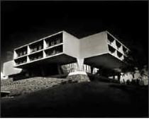
So here, just to compare, is a quick history of MAM. (Read more here.) Begun as two institutions, Layton Art Gallery and Milwaukee Art Institute, in the late 1880s/early 1900s. Merged into Milwaukee Art Center in 1957 and installed in the Eero Saarinan-designed building on the shore of Lake Michigan. (image is the Saarinen building. I had my prom there!) In the 1960s Peg Bradley, philanthropist and art collector gave money and her collection of 600 modern art works to the museum with the caveat that they had to build suitable galleries to house the work. In 1975, the new addition opened (they sunk it under the Saarinen building so as not to mess with the architectural masterwork.)
In the 1990s, with attendance up to 200,000 visitors a year, the museum wanted to build anew — especially a space with a big auditorium and big gift shop. They chose Santiago Calatrava in 1994 with the clear understanding and desire to build a Milwaukee landmark that would be an architectural ground-breaker and a leader in the new millenium. Building was begun in 1997 and opened in 2001. By the way, that $25 M debt has been whittled away at. There are now $21 M pledged and they’re not stopping until they get the full $25 M pledged. The board has been enriched with the addition of some big money players who are helping with the money issues.
Finally… and then I’ll let you go
I don’t think it’s unreasonable to want your museum to be the best it can be. I love the PMA and just wish there was a way to showcase more contemporary art there. Since the gallery space is constrained and seems destined to remain so, I have to hope they’ll throw some blockbuster contemporary art exhibits into the programming mix. Who’s to say that it wouldn’t bring in visitors and revenue? I know there’s an audience hungry for curated contemporary art exhibits and I think a show of works by…any of a number of contemporary artists would be a draw. (and I’m not thinking Jasper Johns, Robert Rauschenberg, David Hockney or any of the grey eminences.) Bring Orosco back or Pettibon…or how about some local artists, like Judith Schaechter or Eileen Neff or Terry Adkins. Even a group show of Philadelphia artists and not just those sanctioned by the Fleisher Challenge series. Something a little bold and unexpected. That’s what I want.


