 Saturday I hit my First Friday haunts, less exhausted and frantic than usual. I’m going to do FF (or should I say post-FF?) this way again.
I plethora of groups shows are all around town, some of it having to do with the economics of the January shopping dip, no doubt. I stopped at Vox Populi, Highwire and Nexus. I also poked my nose into Union 237 which had a 3-artist show.
I’ll start with Vox, which has guest artists filling its galleries (the other shows in later posts). The show out front, “passerby,” gave me a lot to think about. The artists–all respond to the mostly unnoticed urban visual overload. Each of them has a very different, very personal tactic for doing this, and those tactics give the show its punch.
In The 4th Room the show “No end by addition” has works by four other guest artists.
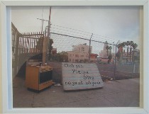 “Passerby,” because it is about selecting and collecting what the artists see, has the touch of the archive in it. This is most true of the work by Charles LaBelle’s “Exterior Song-Hollywod (Cracked Actor),” a series of photographs of an intervention on the streets of Hollywood, where he scrawled the words of David Bowie’s song “Cracked Actor,” one line at a time, on discarded mattresses (image right). He photographed the inscribed mattresses in situ and mapped the location of each one.
The photos, by their distance from the curb, suggest the view from a passing car window, and the sleaziness of the mattresses gives the lie to Hollywood glamor. Thus displayed, the mattresses also reveal the witlessness of the song lyrics. I mean, “Suck, baby, suck” is just a pitiful line. But grouped, LaBelle’s mattresses tell a sad story of romance and hopes and lives destroyed. The seriality creates a sort of anti-movie–a road movie–showing the truth about what Hollywood is, a seedy city past its prime.
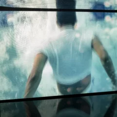
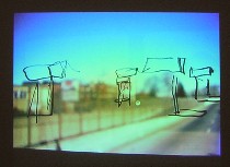
Grady Gerbracht‘s DVD slide show of his commute on New Jersey Transit is also a kind of road movie, in which he makes quick drawings on the windows of the bus of what he sees outside (image, top of post). But by time he’s done with each sketch, the subject is long gone and another cityscape takes its place, one that no longer fits inside the sketch outlines. There’s something poignant and boyish in this futile endeavor to save that which flies by as we march forward through time. The concept’s silliness got a laugh out of me and I too wanted the outlines to match the world outside. According to the gallery notes, Gerbracht began the project in an attempt to visually orient and locate himself in relation to a NJ transit bus route map, which is included in the installation. Although the ephemeral outlines fail to preserve the ephemeral experience of what’s out the window, at the same time they do stabilize the passing scene. Similarly, the slides, in their literalness and semi-permanence (they loop over and over), make an archive of what’s out there–a sort of home movie of travel.
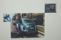 “Blue” by Kyungmi Shin is a photocollage pinned to the wall from her archive of photographs of things blue that she sees as she walks down the street. Some of the photos are banal, like the one of the sky. Some of the photos are shocking, like the one of a dead body covered by a blue police blanket, the blood pouring over the cobblestones into a pothole. Some of them are puzzling, like what I took to be a closeup detail of a very sexy motorcycle reflecting the buildings all around (left, image in upper left corner). The juxtapositions and varied sizes of the photos have a haphazard quality similar to the experience of walking down the street, and by spreading the photos out over several walls it also gives the sense of a road movie with blue a critical piece of the production values.
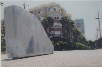 Although the work from Ruben Ochoa also calls up the road experience because the subject matter is freeway walls, his point has less to do with car travel and more to do with imagery, absence, presence and values. Ochoa is showing in “Greyscale, Freeway Wall Extractions” photos of sections of L.A. freeway walls on which graffiti has been painted over (image right). The paint doesn’t quite match the concrete. And Ochoa digitally inserts these blotchy concrete sections in unexpected urban settings where they stand like sculptures, intruding and overbearing. This work has a political edge, a suggestion that graffiti artists have been silenced. It also questions the visual quality of that which is politically approved–the brute ugliness of a freeway wall and how badly it fits in human-scale spaces. Whose taste is this anyway, he seems to ponder, and who gets to dominate and why is their view better?
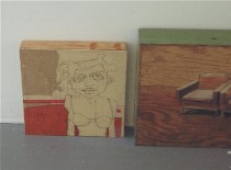 From Courtney Booker, pieces of found furniture and other street debris become painted images of retro furniture and people. Then the chunks with the people and the chunks with the furniture are placed together on the floor, more like the original discards than art (left).
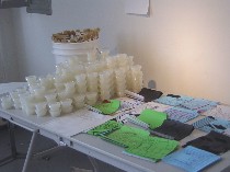 Dennis Lozen created piles of silk-screened, impersonal-looking cityscapes on small pieces of paper, offered brushes and little containers of wheat paste (the size your take-out salad dressing comes in) and suggested that gallery goers become urban art guerillas, pasting up their take-out art. He himself decorates the town with these. I’m planning to help him with my own take-home sample (Lozen’s posters, wheat past containers and brushes, right).
 “No end but addition” in the back features works by artists Seongmin Ahn, Jin Lee, Linda Pelaez and Katarina Wong.
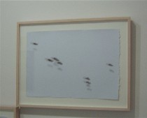
The pieces that interested me most were thumb prints with trompe l’oeil shadows by Katarina Wong, which she describes as migratory patterns (left). They’re more like one or two bugs or distant birds, crossing a vast space. Is she talking about human migratory patterns?
Wong makes molds of her friends’ fingertips, pins them up, and then paints them and their multi-light-source shadows with sumi ink on paper. The results have a weird, floaty quality that made me unsure at first if the prints were on the glass, casting the shadows or not. The answer is not. It’s all painted. And the choice of fingerprints brings up issues of uniqueness of human beings, and how pitiful to reduce someone’s uniqueness to a fingerprint and fingerprints becoming a substitute for making a mark. Anyway, I liked this. It was elegiac.
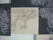 I also liked the intricate patterns of Jin Lee’s wall collage of canvases, which start with a single dot, lyrical and austere at the same time, although the work felt a little familiar (detail right). Without more context, I was unable to follow the thread of thought behind Linda Pelaez’s embroidery-thread wall stitches. Seongmin Ahn’s obsessively folded and speckled ricepaper, nicely situated in a corner, was a product of suffering, at once tough-minded and delicate, but not my cup of tea.


