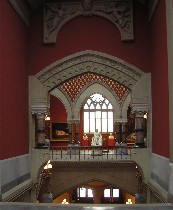
 The speechifiers at the press preview for the Pennsylvania Academy of Fine Arts 200th birthday celebration and new facilities kick-off practically killed my native optimism. Roberta and I (see Roberta’s post) went to see the new building and hear what the new mission was going to be (left, interior, grand staircase, historic PAFA building, with new paint job).
Alas, the new mission sounded like the old mission. But I found some signs of hope that this institution can dig itself out of the past and become the destination for art that it ought to be.
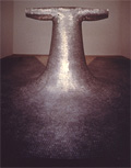 I think I’ll start with what interests me most–Alex Baker’s plans. Baker, the curator for contemporary art, whose hip-hot shows in the Morris Gallery have been the high points of PAFA’s exhibition schedule in the past two years, is cooking. Besides Eamon Ore-Giron’s and Nadia Hironaka, who Roberta previously posted were coming, look for work from Do-Ho Suh, the South Korean military vet whose work on loss of identity in groups includes the wallpaper of tiny heads that was part of the Fabric Workshop and Museum‘s wallpaper show in 2003 (right, Suh’s “Some/One” made of dog tags). [CORRECTION: This is Baker working in collaboration with the Fabric Workshop and Museum, and not an Academy production].
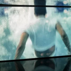
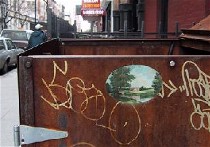 Brazil-born artist Vik Muniz, whose photos are confounding lies, is also on the schedule for September. Photographer Nan Goldin, whose photos tell more of the truth than you ever might care to know is coming up in December. And intervention artist/painter Ellen Harvey, whose New York Beautification Project of 40 oval landscapes, 7 inches wide, dotting the eyesores of New York, will be creating a site-specific installation in the center hallway of the upstairs galleries. The project “Mirror,” which has Harvey expanding into video and will include mirrors and faux-finishing techniques, is funded by Philadelphia Exhibitions Initiative. Scheduled for Oct. 15 to Jan. 8, it responds the the building’s High Victorian Gothic architecture. Also, look for video art from Beth Leister in the summer of 2006.
While Art Critic Ed Sozanski at the Philadelphia Inquirer is correctly worried about whether there will be curators to use the new spaces to good effect, Baker will continue holding the fort for contemporary art (see Sozanski’s piece here, using artblog’s ids–name, lrrf; email, libby@rosof.org; password,lrrfartblog).
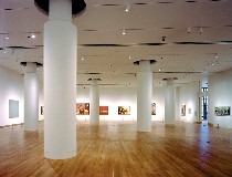 As for the new exhibition spaces in the new Samuel M.V. Hamilton Building across Cherry Street from the original red-bricked confection, they’re huge (see image).
The downstairs space, which looked like it would take up about 1/4 of a football field, was filled with tables and chairs for the next day’s gala, so it was tough to imagine if the art would look good once the tables and chairs were gone. We couldn’t back up from the art. We couldn’t move close to the art. Roberta nailed it I think when she said it was kind of like looking at slides of the art. But the tables and chairs are only temporary.
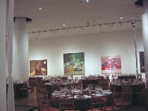 That aside, the room appeared to swallow the work–not all that different a problem from the way MoMA’s huge new contemporary galleries swallow the work, and similar to the way that the Institute of Contemporary Art, in its first couple of years in its current building, was unable to get a grip on how to make its large spaces not swallow the art whole. So I’m hoping that PAFA will eventually figure out how to make the cavernous spaces work, too (left image from left to right, Katz’s “Night,” Neil G. Welliver’s “Cedar Breaks,” and Philip Guston’s “Ominous Land,” viewed across tables and chairs).
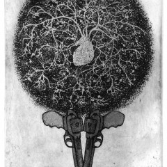
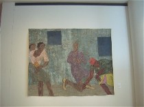 Among the pieces on display in the downstairs Fisher Brooks Gallery were the newly purchased “Seated “Boxer II” (1960) from Leon Golub. Another newly purchased Golub, “Threnody II,” was in the hall (image). (Baker gets credit for the Golub purchases). [CORRECTION: PAFA President Derek Gillman gets credit for this. The good news here is there’s a budget that’s being spent for Contemporary work. See an impressive list of new purchases here.]
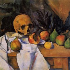
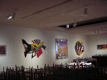 In the upstairs gallery, which seemed pretty much the same amazing size, PAFA unveiled “The Chemistry of Color,” a show of African-American art, most of it given to PAFA this year by Harold A. and Ann R. Sorgenti. Like downstairs, the space, cluttered with the tables and chairs, seemed to devour the work, some of which was pretty lively and would have looked great in other circumstances. (Center three pieces from left to right, “New Depths,” 1989, by Charles Searles; “Tar Beach #2,” 1990, by Faith Ringgold, and “Water Series #30” by Yvonne Pickering Carter). The exhibit also includes works by Syd Carpenter, John Dowell, Betye Saar, Jacob Lawrence, Willie Birch and scads of other notable artists, local and not local, with noteworthy work.
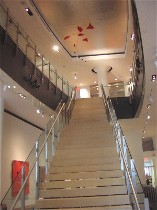 The entryway to the new building is a bit disappointing. I presume by its central stairway with faux skylight overhead that we’re supposed to be reminded of the grand stairs next door in the historic building, but alas, the modern stairway is so puny relative to its surroundings that it doesn’t meet the challenge. But that’s just nit-picking and architecture.
By the way the new gift shop, Portfoloio, also in the new building, is a lot perkier and hipper than the previous incarnation. I liked the green purses in sculptured shapes and some of the jewelry. Portfolio still doesn’t get kitsch, I’m unhappy to report. Others will be thrilled with that fact.
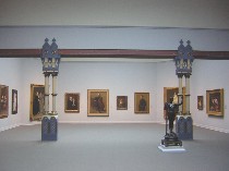 Speaking of architecture, the earlier eras of the collection did look great in the fabulous redo of the historic Frank Furness-George Hewitt building’s galleries. The paint job alone is worth the price of admission, inspired by the building’s original colors.
The hanging technique borrowed something from the Barnes Collection, grouping paintings within each period and genre by visual cues. The portraits and the landscapes looked spectacular, for starters. The lighting was perfect, illuminating familiar paintings in a way that invited a second look.
While PAFA’s definitely worth a visit again, it’s what the institution does with its new spaces that’s key to whether people will come back over and over. The old spaces will remain pretty stagnant. So to fill the galleries with visitors, PAFA needs good curators (no more bland faculty-curated shows pulled from the collection, puleez) who can bring in work that’s fresh and points of view that are fresh–and relevant to what’s happening in the contemporary art world. I think Aaron Levy, in his piece about bee hives and curating and archiving (see post), had it right. The hive (read art collection at PAFA) needs to change or it will not survive as a system.


