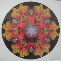
 The computer and Photoshop and Illustrator are so seductive. The result is an oversupply of mandalas–and other “art” products.
The biggest show within Highwire‘s group show of digital art is an array of beautiful mandalas from Joseph Wentland. Made from flower petals, the kaleidoscope mirror effect is mesmerizing, and easy to love. I especially loved this one for its 3-D element amidst the flat pattern. But I’ve seen far too many mandalas. (Didn’t Burnell Yow! also use natural materials for his mandalas–see post here? And there was a whole show in New York of mandalas–post here–so it’s quite the trend. ). Photoshop makes mandala-making too easy and they becomes a cheap shot after awhile, the decisions losing sight of the reasons behind them. Enough already.
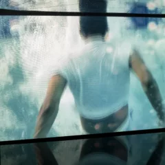
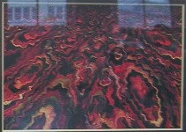 Anthony Ciambella had quite a display of body-based imagery in the show, video and mostly small 2-D pieces. Some of them were interesting and surprising, like the patterned intensity of “Vaginaland” (shown, left; sorry for window reflections.) This particular piece brought to mind marbled flyleafs of old books. I also thought Ciambella’s “Samson and Delilah” was intriguing. But once again, less would have been more. Some of the work creeped me out, and not in a good way.
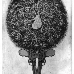
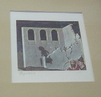 Barbara Spadaro’s three little digi-collages were a high point of the show, uniting fairytale- and old book-print aesthetics with her own weird little untold stories. I saw some other work of hers the same day in Muse Gallery, and liked those too, but preferred the restraint of the ones at Highwire (an example right).
George Shinn also provided one of his digital drawings, goofy and sociable–they have a directness that the Photoshop crowd loses.
Others in the show were Lisa Spero, Jeff Thomas, Ken B. Miller and Stephen Iwanczuk. Most of the show, was an enthusiastic profusion of digital processes. But with such a large quantity of work that’s based more on enthusiasm than on outcomes, the work that takes the next step gets lost in the shuffle. Too bad.
At Union 237, three artists showed three very different bodies of work. Self-taught artist Dean Rosenzweig showed jittery, intense paintings filled with words and lines and ADHD; Sheila M. Brown, the only one of the three with a fine arts education–BFA cum laude from Moore College–put up a suite of bold, empowered nudes; and Kristin Brandt had a series of what I’d call ancestor paintings.
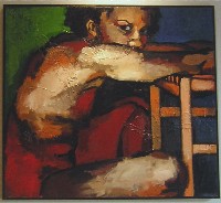 Brown’s nudes, if you like studies of nudes, were juicy, tough and beautiful. I know there’s a market for this genre, and these were a good example of it. While I don’t really think Brown pushed beyond the genre, she does what she does well, with Roualt-y outlines, earthy tones including lots of red, burlap swatches for texture, ultra-close-up cropped figures and sometimes tile-like backgrounds (a Bonnard reference?) (“Awake,” left).
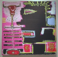 Rosenzweig had me poring over his words and incantations, his sketchy outlines, his surprising divisions of the canvas into swatches of color. He used some of his incantatory phrases in more than one painting. And he has copyright symbols all over the place. He acknowledges Basquiat, Warhol and Clemente as inspirations, although it’s the Basquiat that comes through in what I saw (right, “Mad Cow”).
If the work looks familiar to you, he did the interiors of Bar Noir.
I don’t really know what I think of this work, yet, but I’m looking and thinking, and that already is a plus. If I walk out without thinking, the work has bored me. I’m going to try to keep him in my sights.
Brandt’s paintings seemed expected, the fuzzy imagery suggesting hordes of ghosts from the past and some spiritual connection. However the paintings offered few visual rewards via space or color or contrast.
I also stopped by Nexus‘ “discontent” (see Roberta’s post on this show), a show including 24 Nexus artist members. Here are a couple of observations about people taking some new tacks there:
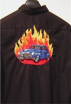 First, there’s Elizabeth New, whose beaded relief sculpture of a car embroidered on the back of a shirt was over-the-top bold and snappy. Previously, New had shown clever Photoshopped images with words that worked better in the small postcard size than the overblown poster size. But this car was a strong departure (left).
 Photographer Chris Macan, who previously revealed only other peoples’ vulnerabilities with his peep-hole art, actually revealed a little of himself with Polaroid emulsion transfers on four blocks–four confessions about unrealized projects (right). This is a good direction.
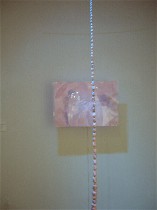 For a couple of artists, the explanatory story was great, the art not quite as strong, but still worth noting. Yukie Kobayashi’s “Window II, Outside of Window,” quoted a terrific poem about yearning and then offered a string of pink, hanging, lumpy giant pearls in front of a pearlescent square (left). The voluptuous finishes remind me of some Japanese work I had seen in New York, all about the glitz and glitter of the commercial world. But ultimately it was the poem that moved me most.
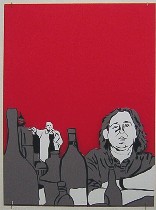 Nick Cassway’s story about “Chris and Slava” was more interesting than the charming illustration in Plexiglas and vinyl of the two men in front of a lipstick-red background. Was it red for political reasons? I don’t know, but Cassway is moving in a new direction from his poetic meditations on the fragility of life and he needs time to get where he’s going.
That’s it. Jeez, I hate writing about group shows.


