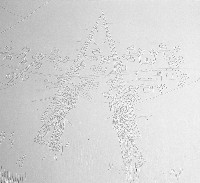
Surprise. All white and I’m hooked. I’m referring to Justin Witte’s new work showing at Vox Populi this month. “Whitewash” takes not-surprising imagery–I’ve seen these lumbering lumberjacks in the woods from Witte before–mixes in a surprising material, white puff paint, the kind craftsy people use to decorate sweatshirts, screens it onto triptych canvases painted white, adds urban and suburban landscape details, and voila, we’ve got something new and interesting (left, a detail image which at this low resolution doesn’t look like much).
witte, justin
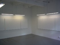 Part of what makes the work interesting is that you can get it on a really basic level and then find more in it than its superficial meaning about how, from afar, we don’t notice the violence and mayhem we’ve created on the other side of the world (right, installation shot).
hu, joseph
Part of what makes it interesting is its references to medieval triptychs and the detailed landscapes in the background of the paintings of that era–and how Witte translates that taste for detail into McDonald’s, McMansions, and McSprawl as well as ornate urban architecture.
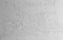 And part of what makes it interesting is that the paintings do not lend themselves to looking from afar and taking in the whole–all you see is white. You’ve got to get nose-to-nose with the paintings to see them, which means, since they are too large to take in all at once, that you have to walk along their length, crane your neck up, drop your nose down and read them like a story with incidents and complications that suggest terrible doings (left, another not-quite readable detail image).
In the distance, the landscapes of McMalls keep their distance from what’s going on.
Even though Witte is using imagery familiar from past work–especially the strangely static dudes in flannel shirts and the cut tree limbs–this change enriches the work, and even though inspired by specific events, the work is pretty open to multiple interpretations. I especially liked the way the white-on-white forces a meandering reading of the canvas.
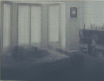 Also at Vox, Joseph Hu’s grisaille paintings of blurry, remembered rooms and spaces have a noir, high-contrast look that I don’t remember in his past work. The surprise is the hard-boiled look paired with soft-focus, homey spaces from middle-class suburbia. The show, “An Image That I Have of Them,” still leaves me puzzled by just what Hu feels about these memories of his past, but they’re beautifully painted and imply a search for meaning, significance and connection with the commonplaces of past experiences. Hu, by the way, also has work up at Peng Gallery right now (right, “My Bedroom in Leawood,” oil on canvas, 42″ x 54″, showing at Vox).
abrams, stefan
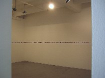 Also on exhibit are videos by Justin Marshall that collage clips from movies and print-outs from Stefan Abrams of photos downloaded from and Internet search for stefan.jpg, which is what he named the show. I had trouble staying focused on the videos, and ultimately I concluded that the strategy of borrowing that both of these artists use here is not enough. There needs to be some sort of transformation so the material transcends its sources (left, installation shot of “stefan.jpg”).


