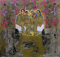
 Work that the canvas can barely contain, emotions that roil in improbably hot colors, drawings of stupendous detail and turbulence, lacy paper cutouts that bound up and around the walls in an installation, a sense of an explosive need to create has taken over at Rosenfeld Gallery, with the work of Emanuela Harris-Sintamarian (left, “Family,” acrylic, pencil on wood).
 Harris- Sintamarian, who’s about 28 years old, was born and educated in Bucharest in a world where, until 1989, art was a subversive activity. She is working on her second MFA, this one with a fellowship in painting from San Jose State University; the first MFA was in printmaking, on scholarship at the University of Delaware (right, “Savage Garden,” 2004, acrylic, silk-screen on canvas, 62″ x 73″).
The shock of a new culture and a land of excess and utter freedom is in the paintings. So is sadness about the past.
bottwin, richard
 Some of the paintings are so turbulent and layered with imagery that they are hard to read, but many of them are beautiful, with luminous, pop colors that ought not to be able to survive next to eachother. Instead they flourish together, offering a parade of backdrops for drawing and silkscreened images (left, detail from lower right corner of “Savage Garden”).
Some of the canvases are quite large (“Shutter to Talk” is 10 feet long) and look like no one else’s work (although the exuberance and expressionistic paint handling feel wild, like Jackson Pollack). The sense of excess and overcrowdedness is extraordinary.
rohlf, jason
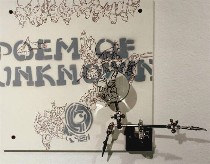
Some of the work is more subdued, like “Desene #3” (right, 12″ x 12″, marker on wood with magnifying glass), with the clinical magnifying glass suggesting the larger, austere words are pulling attention from something smaller and wilder and growing– the drawing details that need the magnification.
Harris-Sintamarian’s work stands in sharp contrast to the work now showing at Pentimenti. The work here–architectural wooden objects by Richard Bottwin in his exhibit, “Counterpoise,” and heavily painted and incised canvases by Jason Rohlf in his exhibit, “Palmipsests”–keep their subject matter close to visual and artistic issues, and exhibit an extreme self-control.
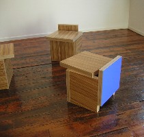 Bottwin was at the gallery when I stopped by, and he explained that his depth perception is off, so his art work is a process of flattening things out and then popping them up. The resulting angles are surprising, the woodgrain veneers comically askew. I particularly liked his three little chairs, “Large Stripe Cube #1, 2 and 3.” They have a child/playroom look because they’re low and boxy and two of them have a primary color panel, one red, one blue. But the shades are not quite primary–so they feel simple and complex all at once. Bottwin’s other eight pieces hang on the wall, all what-is-its that combine Bauhaus austerity with an anti-Bauhaus illogic (left, “Large Stripe Cube #1” in front, and cubes #2 and #3 in background).
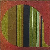 Jason Rohlf’s paintings are intense layers of acrylic, or of acrylic and collage on panel. Here too, there are moments of humor, like the thought bubble in “Spate” (right). The wallpapery stripes that emerge are not quite cheerful or jaunty, the usual affect of stripes, thanks to their colors; the incised circles and arcs in the background paint add to its materiality and to a sense of claustrophobia. Although the paintings suggest layers, everything is right at the surface. Even the stripes, which appear to break through, do not offer a sense of space. The paintings are a dark take on children’s scratch drawings, which involve scraping through a black top-coat of crayon to reveal a riot of colors underneath.
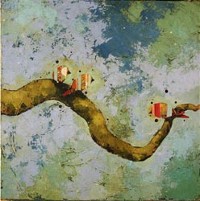 I confess that I prefer Rohlf’s older, more representational paintings of birds on branches, especially “Invited” (left) with the background offering more color and a sense of space and tree canopy as well as peeling, ancient walls. There’s a lightness of spirit and concept in these. The storybook branches remind me of Laura Owens’ trees, and the birds almost look collaged, their shapes simplified and striped to create a funny flatness on the writhing branch.


