Every time I grasp an overriding theme that applies to all four artists in Arcadia’s “A Closer Look,” the theme slips away in the midst of my argument.
The show, a regular event that draws four artists from the previous year’s “Works on Paper” show at Arcadia, this year was curated by ICA Director Claudia Gould. This year’s fab four are M. Ho, Bruce Pollock, Anne Skoogfors and Carl Fudge.
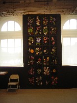
The show as a whole seems like a curious meditation on color (see Roberta’s post on how it’s a musical show). Skoogfors’ “Botanica,” 28 cyberprints of scanned-in flowers, offer the most intense of the color experiences on view.
What I got out of the floral grid was a questioning of reality. I’m not sure if every artist on earth is thinking deep thoughts about what is real or if it’s just me at the moment. But these super-saturated floral prints, which allude to traditional plant studies and prints more than they allude to still lifes, get their visual kick from the ultra-black grounds that don’t recede the way that blacks usually do. The intense flowers practically retain their juicy, living texture and seem, in fact, more juicy that any real flower has a right to be. They are transformed by the intensity of colors against the blackness into superflowers (installation shot above).
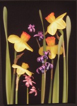 These studies exchange the traditional white background of taxonomical prints for a black one. The velvety blackness and that they are pinned to the wall further enforces the taxonomical allusion, reminding me of delicate butterflies pinned to black velvet. The grid installation turns them into a periodic table of flowers (left, one of the studies).
But the work is an attempt to create its own reality, not to understand the world we know. It is what it is–a scanned image, unreal and odd, and a pleasure to contemplate.
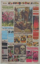
The colors in M. Ho’s nine untitled newspaper collages seem subdued by contrast. But in their own context, the daily gray of New York Times pages, they look lively indeed. These collages, which cover over the headlines–the captions, the text, all the words–with blocks of color and prints of flowers and plants, began with the war in Iraq. The newspaper photos that remain, comment on one another, their original context stolen and redefined by Ho’s collage. Not only are the newspaper collages lovely, but they offer up the bleak sadness and ironies of the society we live in–life as death (right) or bodies in circles of power and powerlessness (below), for example. The colors offer a reminder of what’s here that we are not paying enough attention to as we get our daily dose of demoralizing news.
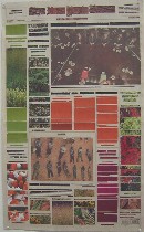 The grid of these pieces is something quite different from Skoogfors’ grid. Ho’s grid is imposed by the newspaper itself and its flow of words in columns, its organization of stories into idea units. But she chooses not to obliterate that grid. What she obliterates is the words, thereby creating a new world order, a new sense of priority.
The last time I saw this work in quantity, it was laid out on a table, to be touched and turned over like a newspaper is read. On the wall, it’s easier to see the patterns, but the tactile fragility of the newsprints contrasted to the tensile quality of the collaged papers is compromised.
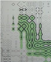
Carl Fudge’s two screenprinted paintings, “Overflow Orange” and “Overflow Green” are black and white interrupted by color. The process–the lines are copied into a computer from erotic Japanese woodcuts and then blown up and taken out of context and screenprinted onto the two canvases–seems to be more about decoration and line than content. The resulting images are not erotic; there’s a decontextualized arrangement of lines and spaces, which then get filled with color in parts of the painting, as if an industrial accident has ocurred, and paint has invaded an otherwise sterile world.
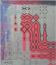 In the green painting, the green is corralled by the lines. The orange painting goes somewhere else; dry brush strokes of mixed colors besmirch the environment without regard to the lines. The paintings have a strange mix of exuberant color (they hark to OSHA warning paints) and repression, a mix of safety and danger, and a complete airlessness and spacelessness. I’m not sure I like the world they depict.
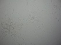
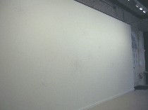 But the world Bruce Pollock depicts in “Every Infinite Place in Space”–an installation pencilled and inked directly on the white wall–has no sense of repression and no color. Using the fractal repetitions that we know from his paintings, he creates a deep, deep space, a universe of optimism and distant horizons (installation shot, right, detail below left).
 Aside: Pollock has some work of quite a different order at the Rosenwald-Wolf Gallery, right now–beautiful, layered paintings of telephone poles, and also three little wooden ur-buildings, also covered with beautiful layers of paint.
At Arcadia, by the simplest of means, with process not the subject but rather the product as the subject, Pollock has created his own rhythmic universe, with room in its inner space and outer space for all of us to contemplate our place and our purpose.


