 The Fleisher Challenge 3 exhibition is a funny combination of icy and hot. Sculptures by Ephraim Russell and Julie York have an almost clinical hands-off-ness to them, as if the work were made in a factory (Russell) or laboratory (York).
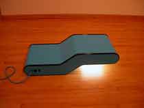
Russell’s works have a kind of faux utilitarian aspect which seems just great. They are take-charge objects that imply you need them, a little like those slicer/peeler/tv channel changers advertised on late night tv for $19.99. How can you live without?
But as with the medical scanner/lightbox/copy machine gizmo pictured at the top — a work the artist calls “S.A.D. Sculpture” (maybe a pun on CAD programming?), there’s no human use for this baby. But it sure seems to be doing its job well whatever that may be.
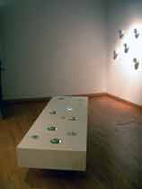
York’s installation, which involves many cast porcelain objects encased in cylindrical containers whose lids are glass lenses that distort what’s inside evoke Mutter Museum body part specimens in formaldehyde. The cylindrical specimen jars protrude from the walls like carbuncles. Or some are encased in the top of a large white box on the floor which makes them windows into a coffin of sorts. (image is installation shot of York’s “Swell”)
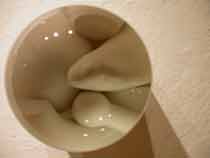
And while their overall ambiance is clinical, the atmosphere created by viewing up-close distortions of what might be stumps of fingers, or bones or human organ parts (penises abound) turns the chamber into a hothouse of voyeurism. (image is detail from one of York’s objects)
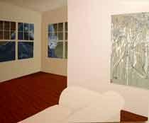
Kate Stewart‘s large paintings have a cool bleached out pallete and an odd abstraction of space that is also very removed from life’s daily aspects. (image is Stewart’s “Lachry Mose” and what you can’t see at this small size is that there’s a beautiful curling tidal wave about to crash into the house. The wave is pictured through the windows.)
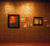
On the other hand, Stewart has a wall installation that includes a group of small, eco-disaster-themed paintings — framed like they’re family portraits or photos from favorite vacations. The small works sit on an ornate gilded and stenciled wall and the whole package is suffocatingly decorative. While Stewart’s pastel paintings are cool and clinical this installation wall seems impasssioned and while I read eco into the underpinnings, a more metaphorical reading would have the eco-disasters (tornado, hurricane, volcano) as stand-ins for mom, dad and grandpa. Either way, there’s flames here that don’t seem to exist in Stewart’s other works here.
These two approaches to art-making — cool and distant versus hot and personal — are streams running their courses today in art. Young artists in particular seem to embrace the extremes — either describing the world — themselves, their buddies, their obsessions — in the hottest and most personal of ways. Or, they’re running in the other direction — making work that’s like the world seen through the wrong side of binoculars.
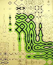
The cool stream may come straight out of the universities and the legacy of thinking instead of observing…or observing with an eye towards deconstructing. “A Closer Look” at Arcadia has its share of academic deconstructivist art. And Libby and I saw some of it at Scope (although what sticks in my mind is the art that was less decon and more comic). While I like the play of mind at work in art of this type I wonder about the influence of the university on art. Is the MFA-ing of the land creating an art that is so clinical and meta that it’s on the verge of being anti art? Amidst all the cleverness and thinking where’s the joy of making? (image is detail of Carl Fudge’s “Overflow” at Arcadia’s “A Closer Look” exhibit, a piece based on Japanese erotic art)
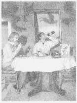
The hot stream comes out of zines, teen art, comic book mania, scrapbooking, the rise in popularity of outsider art, the rise in status of photography and the fad for memorization. I’m not passing judgment. There’s no right or wrong, good or bad here. I’m just noting the phenomena. I can make a case for both and in fact like both approaches when done well (although in my heart I’m more a comic book pour it on with passion type of art lover). (image is Rob Matthews’ “Communion with New Wine” from his exhibit at Gallery Joe)
I will leave the discussion here since this post is already very long. You must have thoughts about this.


