Lots of Americans have the day off today for Memorial Day so I thought I’d run a few pictures from a show that I saw in an office building that’s probably deserted on this Memorial Day but was bustling the day I was there. The show is a large group exhibit by CFEVA artists in the lobby of Morgan Lewis and Bockius at 17th and Market Streets.
I love when art pops up in public spaces. And this show of new talent is good. (CFEVA, formerly Creative Artists Network, juries emerging artists into its mix and then helps them for two years — offering exhibition opportunities and mentoring services. They’re kind of like Mixed Greens, Paige West‘s New York organization.)
This large show — only up to June 2 — is notable for lots of photography and for a couple of stand-out paintings. Prices are affordable and I haven’t been back to see what’s sold but I’m guessing works flew off the partition walls at the opening.
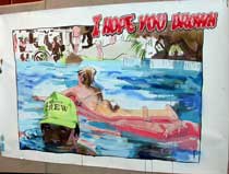
Notable for its anti-corporate affect is Adam Parker Smith‘s big loose watercolor painting of a swimming pool scene. (top image) The work is a big postcard with a snarky caption that instead of reading “Wish you were here” states “I hope you drown.” I hope the picture sold.
It is not framed and simply pinned to the cloth partition and felt like it had just been taken from the artist’s studio. Libby and I saw — and we both loved — Parker Smith’s wall of cartoon drawings in the Inhabit show at Sean Stoops‘ apartment. See Libby’s post. The guy has a passive-aggressive orientation to the world of relationships just like that of Eric McDade, another artblog favorite.
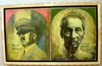
Watch out for paintings by Bedel Tiscareno whose double-header on panel, “Gregorio Cortez and Joaquin Murrieta,” is a beautiful icon that seems to refer to two wars (World War 2 and Vietnam) and I’m guessing memorializes two beloved (to the artist) soldiers who died in combat. The oil painting’s surface is a marvel of built-up collage-like touches. Yummy.

And in the most extreme partition pairing I’ve ever seen, the hyper-realist boudoir paintings of Mahtab Aslani — silk underwear and pearls (image below) —
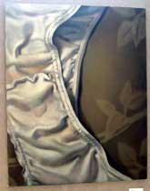
sit right next to the fierce aboriginal works of Hoppi Emberson. (pictured above) The pairing hurts Aslani more than it does Emberson.
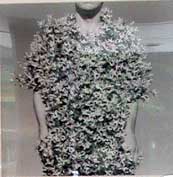
Keith Sharp, whose photo works I’ve written about in the Weekly for years, continues to please with his witty surreal photographs that capture dualities. This series dwells on man and nature with a shirt made of forsythia that makes me laugh and feel the urge to scratch (image above).
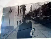
Other photographers making an impression, and like I said there are many in this show, are Serge J-F Levy, whose black and white street shots, though conventional, are beautifully done. I especially love “West 4th St. NYC” with its fierce old lady (pictured above).
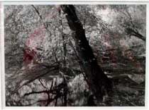
Mike Froio‘s landscape photographs (above), also rooted in the tradition, have a beauty and voluptuosness that reminds me of Stuart Rome, next up at Gallery 339. (And if I recall my conversation with 339’s Martin McNamara, I believe that gallery is looking to work with Froio in the future).
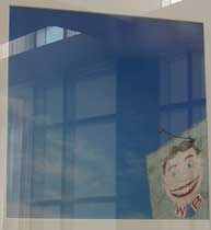
Mike Mergen‘s color photos of the Jersey Shore show an eye for the odd composition (lots of sky, edge of building, like in the image above — sorry for the glare). Mergen also likes the odd material (that carny stuff that Atlantic City does so well). I was reminded of our girl Zoe Strauss‘s shots of crumbling infrastructure and painted signs on sides of buildings. But also Adam Wallacavage‘s playful and loving shots of street-side kitsch. Speaking of Wallacavage, a Space 1026er, wherefore art thou, Adam? We haven’t seen your works in public here for too long.)
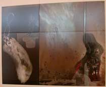
Jackie Fugere‘s toned silver prints riffing on rabbits and luck (above) have some charm although with their complicated imagery and dark tones they are almost too hard to read as images especially placed as they are on the partition away from the window which casts them in dark shadow.
Glare (and shadows) are an issue throughout the show unfortunately. The lobby is airy and bright but the afternoon sun creates quite the impediment to seeing works framed and under glass. And work on the dark side of the partitions is washed in a grey shadow that brings it down a notch — in both color and ambiance.
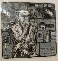
Christopher Hartschorne‘s print, “What Now,” (above) which I’ve seen before at least in reproduction, is great up close. The work quotes from Rodin’s “Thinker” but this guy’s down in the dumps and his existential mental wanderings give the impression of constant shrugged shoulders and a migraine headache coming on. Some of the words behind this thinker are: “At least the sun is out,” and my favorite, “Coffee doesn’t give me a buzz anymore.”
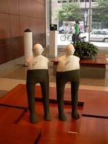
Finally, in the craft department, Jill Bell‘s ceramic piece (above) a kind of Tweedledee and Tweedledum with broken hearts, is sweet.

And her cereal bowls with fierce faces — at $40 each — are just the thing to greet you in the morning. I hope she makes some coffee mugs sometime. I’d be all over them.
The show’s a Philly show no doubt about it (figures, landscapes, crafts) but it’s got summery charms and the works are likeable and well done.


