 I’m not sure why our visit to New York was somewhat dispiriting. After all, we did see some work worth seeing.
At James Cohan Gallery we saw interesting work by Hiraki Sawa, Vito Acconci and Nam June Paik, not all of it recent. Others in this small group exhibit of five big-name artists were Roxy Paine and Ingrid Calame.
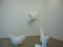
Sawa’s “Stopped Things Can be Seen Between These” (left) is an installation of five huge white cast resin birds (40 3/4 x 46 x 20 1/2 inches each), pumped up kitsch curios, the color sucked out. Noises invade the space, including the sound of the artist’s slow, slow, slooow voice uttering what sounded like bass violin tones. The noises require attention and time. The disjuncture of all this with the reality of live chickadees was nearly funereal. Yet the birds remain charming and lovable, even though they are basso and look cold to the touch. It’s a wake up and smell the roses piece.
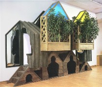 Kitsch is also on the mind of Vito Acconci, whose piece “Houses up the Wall” (right) still has something to say after 30 years. Acconci has made a homely rectangular garden structure pressed up against the wall. A couple of steps lead to the semi-enclosed seating, which is utterly claustrophobic. And the black leatherette seats invite a posture that’s bent over, derriere jutting behind. This may not be leveraged concrete bras or masturbation below the gallery floor, but it’s still funny and weird, a kind of anti-outdoor anti-gazebo in which to feel self-conscious and to suffer. (I forgot to mention the mirrors, which boost the self-counsciousness factor a little higher). It’s sort of the opposite of wake up and smell the roses.
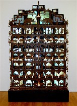 And kitsch of another variety shows up in Nam June Paik’s “Elephant Gate” (left) an ornate found gate taller than a man in front of a bank of 43 video screens showing a variety of images including a sexy, bare-breasted blond, tourist postcards of Southeast Asia, and other quick-cut images from Indian television. The sparkle of light and motion behind the traditional gate are mesmerizing–a pop culture tankha that casts a questionable light on meditation. The candles in front of the gate seem subdued, overwhelmed by the jazzy tv imagery. What’s ceremonial becomes less interesting and what’s hopped up becomes a new way of leaving the real world around us. The piece suggests a role for video as perhaps just another form of religion.
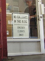 And speaking of worship, my favorite sign warns rabid gallery goers that there are no galleries inside. Why, it’s like “Day of the Locusts.”
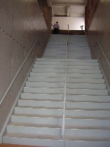 This particular group of art locusts began wondering about all the stairs we had to climb. I don’t remember this being an issue in the past. We had to mount stairs to reach Paula Cooper’s second space which gave us sooo little a reward in return, the space a veritable cubby hole, even by Philadelphia gallery standards). The big front stairs up to Tony Shafrazi (left), which we declined to climb, reminded me of Chichen Itza (the gallerist overheard my comment and started to laugh, which made me feel bad for not going inside; after all, how often do you get that much reaction out of the people in a New York gallery?) One more grouse about the upstairs galleries–it’s hard to do the stick-your-head-in-the-door-and-run trick.
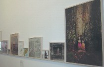 At the street-level main space of Paula Cooper, “Exquisite Pain,” an installation by Sophie Calle, was in need of some exquisite editing. Each daily snapshot from a three-month trip had a lovely red stamp that counted down the days until Calle would return home only to discover that her boyfriend had left her. The imagery didn’t carry her story or the sad stories of others whom she involved in an exorcism of her misery. Enough said.
 Photographer Uta Barth at Tanya Bonakdar (I think this place also used to be a first floor gallery; what the…) showed some images of flowers that were chilly and thin. Gone the point of still life, here, the meditation upon nature severed from its natural environment. Instead, we have technical tricks–is it a photo or a painting; is it a photogram or a painting; how is it mounted? Here were flowers in daylight-flooded architectural space–pretty and design-y, but not so interesting. I couldn’t help but wonder if the similarity of the artist’s name to the art dealer Ute Barth might have given the artist a leg up.
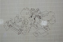 Daniel Bozhkov’s “Advanced Swedish for Beginners” (right) at Andrew Kreps got a number of chuckles out of all of us, i.e. Roberta, her sister Cate, our friend Ava, and me. An Ikea-furnished bedroom was behind white gauzy Ikea curtains with how-to images showing anything from evacuating an aircraft to building a bookcase to engaging in sex. A television on the bed showed the artist and a native Swedish speaker taking turns reading from the Ikea catalog. It’s all a little claustrophobic, cheesy and quite funny .
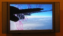 In front of the curtain, rows of Ikea chairs with safety vests underneath are in rows in front of a video of a plane window with the artist tracing on it what he sees outside–ice crystals and the plane’s wing. This brought me right back to Grady Gerbracht’s DVD slide show of his commute on New Jersey Transit (see post), in which he makes quick drawings on the windows of the bus of what he sees outside. But by time he’s done with each sketch, the subject is long gone and another cityscape takes its place, one that no longer fits inside the sketch outlines. In Bozhkov’s drawing, what may disappear is the people inside the plane, victims of icing. The commonplace in Bozhkov’s (and our) world becomes a threat to our individuality and a threat to our lives.
 Some felt “paintings” by James Gobel at Kravets/Wehby amused for the technique and material as well as for the Louis XIV-style posturing of overweight, overdressed, overcoiffed gents living the Alex Katz life amid ribbon festoons and mushrooms in front of the Alps–or the Rockies–or maybe the San Gabriel Mountains. The light is L.A. and so is the lifestyle. I was reminded of the time my parents unwittingly went to the mostly-gay beach at Riis Park. The crowd on the next blanket pulled out their wine glasses and my dear mother leaned over to suggest that perhaps paper cups would be more discreet. Then she realized she’d missed the point. Gobel celebrates the point.
He also strikes a blow for the not-so-buff pouffy male and his right to be decorative, too. The work is arch drawing-room farce, awfully well done, but sooo slick, more slick than his former work, and ultimately it seems a bit like profiteroles for the hungry.
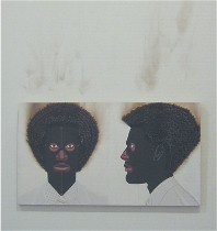 I found it amusing and instructive that this fabric work of art by and for men was across the street from Jeff Sonhouse’s fabric art work of African American men at Kustera Tilton Gallery. The work is the opposite of arch. The images are bitter riffs on black stereotypes. Their methodology is outsider-y rigid portraits with decorative fabrics and hair of matches (loved it) or steel wool (didn’t really want to look at it). The faces are masked and scary. The work is interesting, intense, and a little hard to look at, let alone take in–but that’s the point (left, “Diffusion,” the hair made up of burnt matches that left soot and scorching).
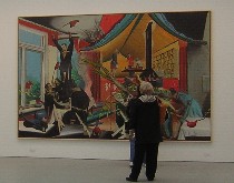
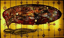 I’m going to leave wholly to Roberta the excellent Judith Schaechter, at Clare Oliver, who seems to be going in a couple of different directions and mixing some political issues with the psychological ones. I’m also leaving Roberta the ambitious Neo Rauch, whose strange 1950s textbook colors and costumes merge with mysterious narratives about power in the workers’ state (left, Schaechter’s “Body Bag”; right below, Neo Rauch’s “Neue Rollen” with a gallery goer perusing it).
 By time we left New York, I had had quite enough–and yet not quite enough. We discovered all the shows we missed when Roberta read the Chelsea gallery flyer on the way home. So I’m dying to go back. And thank you, Ava, for driving.


