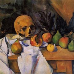
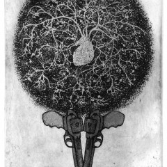
 A great vibe was going on over at the ICA between the Richard Pettibone retrospective and the student-curated “Framing Exposure: Process and Politics.”
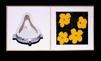
Pettibone, best known for his appropriation in miniature of humongous Pop art work from the ’60s, mixes in some conceptual art of his own along with miniaturized versions of other work he admired, from Shaker furniture to Constantin Brancusi sculptures to Piet Mondrian paintings. He even “improves” the Mondrians, adding shadows for the lines! The multiple homages to one hero after on one hand ends up looking obsessive. This totally inside-the-art-world artist begins to take on a d.i.y. basement workshop tone just because of the quantity. On the other hand, his shadows on the Mondrians, his admiration of Marcel Duchamp and his application to art history of Duchamp’s dictum about readymades–gifts that might be remade by anyone, his challenge to the authorship of the paintings all speak to subversion, not mere hero worship as the show seems to posit (a Pettibone’s “Marcel Duchamp, ‘Fountain,’ 1964 and Andy Warhol, ‘Flowers’ 1964,” 2003, oil on canvas, 8 5/16 x 16 3/8 inches).
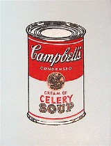
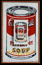 Pettibone’s copies of Pop giants put the large canvases right back into the scale from whence they came–magazine and news photos and comicbook pages, thereby losing the commentary that Pop gargantuanism proposed about how these images–the Andy Warhol celebrities, the Roy Lichtenstein lips–took on a life of their own and became such a big part of each of our lives. But Pettibone adds the commentary that these big images are reaching most of America via small images in magazines, not in their physical giantism. My favorite piece, in this category of popularization of art, is his teeny “Mona Lisa” (left, Pettibone’s “Andy Warhol, ‘Campbell’s Soup Can [Pepper Pot]” 1962 [three times], 1965, oil on three attached canvases, 10 3/8 x 6 3/8 inches).
 He’s also raising questions about whether the large scale is worthy.
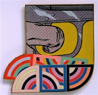
Unfortunately, the small paintings, like doll-house furniture, often become precious and sweet. In Pettibone’s best work, though, they become something else. Some of the Warhol Marilyns are just beautiful, luscious morsels of glamor that each of us can put in our pockets. Some of the Frank Stellas, alas, when reduced to striped patterns on small rectangles become little more than mazes for a kid in Highlights for Children. Or perhaps that’s Pettibone’s point. The exhibit argument as a whole suggests not, but I’m not so sure (right, “Roy Lichtenstein, ‘Trigger Finger’; Frank Stella, ‘Yozd II’; ‘Yozd II,'” 1969, acrylic on shaped canvas, 9 1/2 x 9 1/2 inches).
The joining of several different artists’ pieces into one work reminds me of Lichtenstein’s merger of several images, and it also reminds me of work from artists to come, like David Salle. And it’s a further subversion of authorship.
Here are a few of the other artists in the Pettibone pantheon: Jasper Johns, Al Held, Barnett Newman, Ed Ruscha, and from the world of literature we have Ezra Pound, whose “Make it new” idea is a perfect literary parallel to Duchamp’s readymades–take it and remake it.
The compression of these tiny pieces onto tiny walls that compress the second-floor cavern at the ICA made me feel squeezed. At the same time, it was probably the right decision for showing these little guys. A big space would have swallowed them whole. I especially liked the vitrines that showed some of the work front and back–just in case you didn’t get how obsessive and meticulous this work is.
 My favorite gossipy aside in the show was that when Pettibone, who was not a woodworker, went into production of numerous Brancusi endless columns and the Shaker furniture tributes, he went to his neighbor Richard Artschwager for help! Oh, my. That’s too rich–Artschwager, the incredible intellectual of an artist whose woodworking steals from popular junk materials like formica and whose creations are unique Platonic fantasies, lending his expertise and workshop to this guy whose main physical-world maneuver is compression (left, “Constantin Brancusi, ‘Column of Infinity’ 1918-1937,” 1998-2001, painted maple, dimensions variable–think table-top size.
I’m not saying his compression was pointless. It was smart. I spent a lot of time in there (oh, so many pieces). I thoroughly enjoyed his conceptual pieces. Using trains to squeeze the last blob out of a paint tube and then creating beautifully crafted records of each event was smart and funny and well done. I loved the paint collision with his own little version of a Warhol soup can. The whole train series was great. So was his conceptual grid-stack of little soup can images.
 Here’s the text of one of his word pieces, a small retangle with perfectly executed letters except for the number which is blotted out and written over in a sloppy hand: “I wish I dould do something quick and spontaneous. But no, everything I do takes forever. For example, this painting took me 55 hours to make.” Also on the painting is a hand written tally suggesting time spent on the painting. Anyway, I thought this was pretty damned witty. Pettibones best photo-realism snapshots reminded me of Robert Bechtle.
The show is a critique of the art world and the power of images and media–and ownership of the artwork.
 And those themes were central to the student-curated show with the incomprehensible name “Framing Exposure: Process and Politics” as well. One of the highlights was Andrea Fraser’s “Little Frank and his Carp.” The video plays a voice over of the acoustiguide tour to Guggenheim Bilbao, all attention on the building as Fraser walks through with the other tourists. At one point she raises her dress and moons the building. She earns barely a glance. Frank Gehry’s exhibitionism trumps hers and the art be damned (left, still from “Little Frank and His Carp,” 2001, DVD, 6 minutes).
 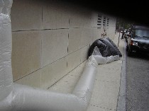 From M.Ho’s obliterated New York Times pages (see post by Roberta and post by me) to Christopher Chiappa’s portrait “Asshole” made from collaged asshole images to Michael Rakowitz’s inflatable outdoor personal shelter for the homeless (shown outdoors) to Craig Baldwin’s tampered-with billboards, there was plenty to contemplate about museums and images and ownership and message. This was a good show and a good pairing with Pettibone. Others in the show included Lisa Johnson, Francesco Simeti, Tokihiro Sato, Gerhard Richter and Ronald Jones (right, Rakowitz’s “paraSITE,” polyethylene tubing and attachment hardware, 11 x 3 1/2 x 4 feet, shelter part only).


