 The two great pleasures of the sculpture show at the Main Line Art Center. “Rearranged/Redevined: Domestic Objects Reconsidered” are word play and a sense of humor. This show belongs to Marcel Duchamp and Claes Oldenburg.
Roberta mentioned how much she enjoyed this show in her post (here) and her Philadelphia Weekly piece. In fact, I went there on her recommendation. So it’s two thumbs up from R & L.
I notice that domesticity has suddenly become legit and a guy’s zone. Well, it’s about time, considering that all of us live in the domestic sphere. And it’s a good reminder that what is domestic is important and wrought with big issues, while the daily maintenance chores help maintain perspective and humor.
Anyway, here are images of some of my favorite pieces from the show and a comment or two on them.
Gary Miller’s “To Go Outside,” (top image) is a set of pumped-up, take-out wooden chopsticks in their wrapper. They are as charming for their scale as for their name, which sounds like a bad translation of “take-out food” at the same time that it locates the piece outdoors. The piece raises the issue of taking a country’s food out of its native context and exporting it to the land of the golden arches, which are also too big for their boots. Loved this piece.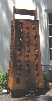 I second Roberta on this one, Billy Blaise DuFala’s “Monster X,” a cheese grater straight out of “Monty Python and the Holy Grail,” a comic giant’s suit of medieval armor (it’s on wheels, and I have a picture of a video that showed at Space 1026 of the piece being dragged through Center City; I couldn’t find the post so I guess I never wrote it). The name of the piece makes it human (in case you hadn’t noticed just by looking), and it also makes it an Xtreme boy too clumsy to perform wheelies. Taking the grater out of the unfinished Space 1026 and putting it in the tended garden at the Main Line Arts Center gives a better sense of its loopy scale and rough texture–think Oldenburg’s “Clothespin” here. My own grater, which used to be my grandmother’s, has a brown patina on it that’s pretty close to the rust color on “Monster X.” Xtreme kitchenware, it’s the ur Cuisinart.
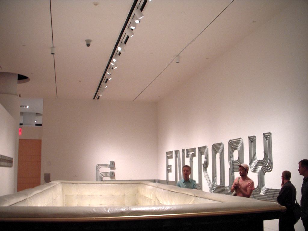 “Dumpster Coffin,” also by Dufala, makes a nice rusty pair with “Monster X.” The Middle-Eastern-meets-Victorian decorations on the dumpster are subdued enough for the funeral. But the white satin interior is a shocking reminder of the opulence that real coffins have inside. It’s also a reminder about people who make dumpsters their homes; and a reminder of all the home furnishings that meet their end in dumpsters.
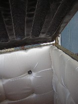 The merger of delicate decorations, luxurious fabric and the brute metal is about touch and values and beauty. The name of this piece is dumb-simple descriptive and just right.
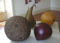 While we’re in the zone of oversized objects that become something other when they are exploded to monster size, Ming Fay’s “Radiant Fruit” is the food version of “Man-in-the-Moon Marigolds.” Their presence is so tactile, their giant texture calling out for carresses, they too take on a human quality. The practically glow with their ability to satisfy hunger, projecting an aura of empowerment. There’s something sly about their size, making them so accessible they become inaccessible.
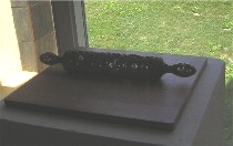 Jean Blackburn, the only artist in the group not from Philadelphia or New York, hails from Rhode Island, one of the homes of New England apple pie. So this rolling pin, bored into and virtually eviscerated, seems appropriate. It’s called “Thick or Thin,” which besides being a pie-crust quality, is also an endurance quality, and woe to the thin skin and thick skull that could get bonked by this symbol of marital bliss. Blackburn also offered a lacy cooking pot that couldn’t hold its water any more that I thought was interesting.
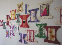 Eurhi Jones’s “Daily Devotion of Diapers” is a wall of diaper shapes made of rich damasks and jacquard patterns, pieced together and embroidered or appliqued with foods. They have a ceremonial quality, like clergy vestments and kimonos. And the foods which go in and come out each day are the mother’s communion wafer and wine. The white beaded splatters of milk, the rich purple plums, the sparkling watermelon rind are a spectacular surprise, untransformed in these diapers, still fresh and inviting. Only a mother could love it or see it that way and believe it.
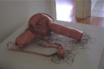 The other sewing pieces were by Margarita Cabrera, and this one, “Pink Blow Dryer,” made me laugh out loud. It’s sexy, a body part, and it’s tangled with threads–the hair it dries and ahem the other hair as well. The seams are on the outside, the stitching a statement about women’s work, as is the hairdryer itself. The gallery notes mention that Cabrera is Mexican and small electrics are a big product for Mexican women working in factories. But without this knowledge, the work still stands–and even though the scale remains realistic, the soft treatment again reminds me of Oldenburg.
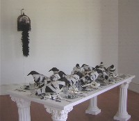 Warren Angle’s “Banquet” (in foreground) I have seen before at the Borowsky Gallery. On top of white classical columns, the bandaged crows have a rooftop feast, eating off black-spattered mirrors on tar beach. Not good for the tummy. Only the columns seem to survive nicely in this environment. And nearby (in background,) a feathered boa chirps in a birdcage, another mordant take on life’s chances in the here and now.
Now we’re up to the bronzes, or coppers, or brasses. 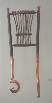 Steve Donegan’s “Liar Chair” won me over with its punning title as well as with the weirdness of the biomorphic chair legs beneath the formal, proper chair shape. There’s nothing proper about those legs, and nothing reliable about them, either. The medium is electroformed copper.
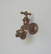 Walter Martin & Paloma Munoz’s bronze “Improved Faucet” raises questions about whether the shortest distance between two points is really always a straight line. It also raises the question of whose judgment determines how things get done.
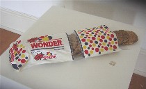 And Timothy Blum’s gold-plated bronze “New Bread” slices, wrapped in a silk embroidered Wonder Bread bag, with the silver cinch tab (my favorite part of the piece; it’s in the right foreground on the pedestal) is totally the wrong color for Wonder Bread, which we all know is white and spongy. This stuff looks like health food. And the embroidery is great and believable, although I wished it had stretched a little farther afield.
Others in this show were Roberley Bell, Carla Rae Johnson, Robert Lobe, Carol Cole and Shawn Williams. The local artists were Angle, Cole, Donegan, Dufala, Jones and Miller, with Williams from somewhere in Pennsylvania. The rest are from New York. The show was curated by Mary Salvante.


