 What’s surprising at Seraphin? If you were thinking that a gallery that mostly trades in New York big names, etc., can hold few surprises, you’d be surprised.
There’s a show there that’s neither safe nor big-name, and it’s mainly local.
I have to think that Seraphin gave this show a chance because June is the beginning of the summer art doldrums. Curated by gallery assistant Todd Keyser, the show, “Philadelphia Cheek,” has a bit of humor, a bit of surrealism, and a plunge into darkness–much with a supercilious or cool tinge (hence the show title).
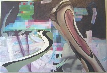 The work comes mostly from young people who came of age when 9/11 changed the world. The imagery is mostly dark, with a smiley face painted on top. So Jason Loebs’ juicy paintwork and stretched, distorted comic figures live in a pixillated world with unclear parameters and no solid earth underfoot (right, Untitled 1, 53 x 36 inches).
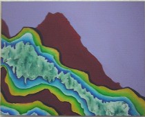 And Ben Will’s paintings have titles like “Mortar Defense Unit.” This one to the left, “The Warmth of the Fold,” at least offers a suggestion of sexiness along with its unnatural landscape. Will’s beautiful colors in the other pieces belie his dark subject matter.
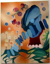
Alana Bograd’s swell comic surreal paintings with manga influences offer a space that’s only space, no ground. But there’s plenty of worry in the imagery. In “Winged” (top, 28 x 22 inches), plants are trampled by an elephant-like foot that morphs into a mutant shape. Small creatures on chariots fly, and bubbles and blue sausages run riot against an orange sky.
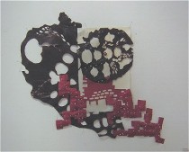 There’s plenty more worry here. Dee Nicholas’ beeswax coated paper construction “The Secret Life of Bricks” suggest multiplication out of control and an effort to pin it down and hold it together with lots of corsage pins. There’s something creepy and Victorian about this work. Maybe it’s the pearly-headed pins and the doily. Maybe it’s the waxiness that makes me think of amateur science. And then there’s the subject. But I loved the jaunty, toppling brick buildings, the black sky with white holes (right, “The Secret Life of Bricks,” beeswax, hand-made paper, corsage pins, sclupy, 36 x 24 inches).
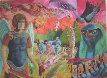 It’s mostly the men in the show who go the comic narrative route, like Loebs. The somewhat incoherent landscape in Walter Benjamin Smith II’s ambitious “Greetings from Earth” (left, 40 x 60 inches), looks like a series of layered stage flats beneath toxic skies. There’s some comic-book composition in the interplay of large and small scale and in Batman flying in from the right, plus there’s a bunch of characters who look like they belong in a Monty Python skit. It feels Photoshopped, but it also has grandeur and something of Renaissance religious paintings in its composition–with two close-up saints flanking the central action in a more 3-D world. The message “Greetings from Earth” is not so much funny as desperate and sarcastic.
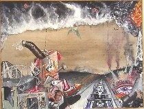 Even darker is Christopher Sweeney’s “7:30 Coal Pitch Drive” (right, 22 x 17 inches), which has a fun-house and the nightmare scariness of a decrepit honky-tonk carnival parading as a strip mall along a semi-deserted roadway. With agitated, deliberately unpleasant paint handling, the painting virtually shouts a dare–love me as I am with my dirty-looking surfaces and borrowed imagery.
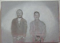 Keyser’s “Big Day” (left, 14 x 70 inches) is a grisaille painted snapshot of himself posed with his martial-arts instructor, both dressed for combat, no background to speak of, and we get to make up the story. This is not a funny story (clearly Keyser thinks it is but we all know that artists are not to be trusted about their own work) but rather the story of passing a test or hurdle, with its anxieties and its sense of responsibility to mentors and parents. This piece is so much more personal and meaningful and unexpected compared to his glib grid of tongues in cheeks.
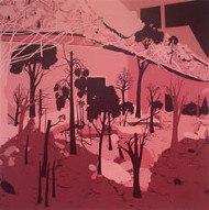 I didn’t yet mention Mauro Zamora’s monochromatic portraits of nature defeating architecture only because I have seen them before. Flattened, hard-edge silhouettes of trees and plants growing through roofs and into skeletal buildings suggest worry about man’s control of the situation. Since it’s one of my personal preoccupations, I keep looking at Zamora’s work, which stands out in this show for its professionalism. What had seemed simplistic to me on my last look–too easy a message in too simple a package–seems more complex to me, this time out; I found more to look at (always a good sign) and I’m moving into his corner (right, “Sacked,” 60 x 60 inches).
 The other work I’ve seen before is by Hedwige Jacobs. Her no-depth landscape on canvas and her animation loop “Growing Grass” (left) tickled me last time I saw them, in “Green,” over at the Esther Klein Gallery. The animation wasn’t working when I stopped at Seraphin, but I remember loving it for its charming depiction of the not-so-charming truths of life, death, regeneration and maybe even overcrowding. Jacobs also has something up at the University of Maryland right now. I’m surprised at how little my previous posts on her say, because her work really left an impression on me, both at Klein and in an online show at The Vacuum (by the way, check out Roberta’s recent post on the current show at The Vacuum).
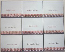 Photographer Ellie Brown’s “Nice” (right) is the funniest piece in the show. Each box in a grid of nine photographs says someone is nice–for instance, “Andrew is nice” or “Kelly is nice.” Below the message is a band of repeated, tiny photo portraits, presumably of the named person. Suddenly, thanks to Friendster and its endorsements of friends, junior high school fate books and multiple wallet-sized portrait exchanges at graduation have multiplied into a manufactured kaleidoscope of relationships. We’re deep in cyberspace where friendship has become metastatic and wide publication forces us into insincerity. It’s scary. But it’s also funny. This piece puts that minimalist grid to good use, manufacturing friendship with tongue firmly and appropriately in cheek. This is by far my favorite piece from Brown. She also has work up at Afif (see post) and at Tower Gallery in Northern Liberties.
I don’t know that this is the show that will shake up Seraphin’s business plan. But I was glad to take a look. It was worth my while.


