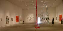
There’s something about putting art in a grand space that elevates it. The Ice Box is Philadelphia’s grand space–big unobstructed high-ceilinged. Your spirits rise just being in the room. And while everyone wants to see a huge work, something on the scale of Richard Serra‘s steel canyons, say, in there, or maybe a big inflatable Panamarenko, big is not the only way to go here.
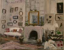
The Tyler MFA show is a paintings-heavy exhibit with a few tiny works that hold their own in the big room by drawing you in to their microcosms. Some of the small works are so engaging they make the room fall away around you. Kelly McRaven‘s two small Vuillard-like interiors, (one is above) the first works you encounter when walking in the Alex Baker-curated show, are tiny. And what makes them captivating is the puzzle of why a young Tyler MFA would paint them. Academy-style paintings from a graduate of Tyler, the school that’s so not-Academy it almost shouldn’t be in the same sentence? I puzzled over that without finding a satisfactory answer. Perhaps the works are fantasy paintings, perhaps the photo source material is from magazines, perhaps from the artist’s own photos of trips to fancy houses. Either way the modest-sized works convey a fascination with although not really a longing for a different time and place. Rather if anything what I picked up was a judgment against our view of the past and our longing for it. These paintings don’t seem to long for this lifestyle but they do want a viewer to look and think about that time, those people, that richly-appointed place. And compare.
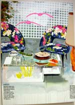
Like I said, the show’s paint-heavy and many of the works seem solid. I especially like Michael Eudy‘s “Untitled,” (above) another painting of a swanky interior (this one contemporary) which must be based on a magazine photo and showed nice iconoclastic attitude towards the source. It took me a while to warm up to this painting. Its surface is turgid with thick paint and doesn’t please up close. But from a middle distance its graphics, colors and composition are compelling and odd and stay with you.

Amy Lincoln‘s “Alex,” a nice washy portrait, reminded me a little too much of Elizabeth Peyton, but redeemed itself by not falling into the realm of fashion. The portrait is more sensitively drawn than Peyton’s works and has the feel of psychological truth.
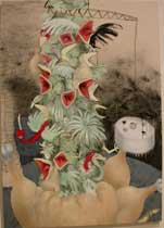
Kirsten Ullrich‘s “Poultry” a tower of babbling open-mouthed fowls makes me laugh. The excellent cartoony painting takes you from Frank Purdue to Carroll Dunham and Norman Rockwell, and its colors are simply great.
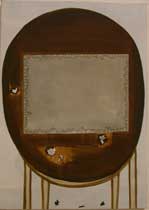
Maria Walker‘s “Untitled,” a reductivist game table with a puzzle in progress presented something that felt new. I want to say Richard Artschwager and his playful furniture came to mind.
\
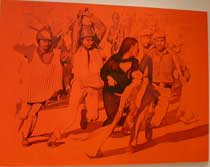
Maanik Singh Chauhan‘s two fiery orange paintings based on newspaper photographs are latter day cousins of Warhol silkscreen paintings. The works focus on Sikh subculture, showing in one, a group of turbaned men playing basketball, and in the other a street confrontation with police about ready to crack some heads. Chauhan is represented in the Voxennial show with a small oil painting of a sleeping Sikh. I love the impulse to paint from your life and make it monumental. Everybody should paint themselves as if they’re Paul Bunyan or Joan of Arc. Nobody else is gonna do it for you.
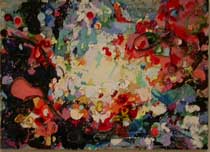
Elizabeth Atzberger‘s “Continental Mark III” is a gloppy abstract amalgam painting that includes 3-D elements from the floor of a girl’s bedroom: jewelry, rubberbands, a showlace. Fun.
Drawing up a storm
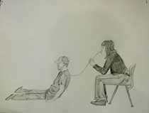
A fair number of artists present drawings in the show. Nice counterpoint to the paintings.
Ianthe Jackson‘s “Three drawings for performances” are a high point both for the ideas at play (people interacting with each other to play up power and balance issues) and for Jackson’s delicacy of touch in her drawings. (above shows a woman either sucking the life out of a man or perhaps pumping him up with air, who knows)
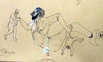
Jason Scuilla and Althea Murphy-Price‘s large panel drawings are drawings duking it out with painting. Big as any painting in the show — bigger even, Scuilla’s multi-panel drawing, based on Michelangelo’s “Last Judgment” painting, is a riot of sex, anger, love, and white out or white chalk maybe. I thought it was pretty great. (above is detail of Scuilla’s piece)
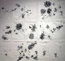
Murphy-Price, who has an outstanding sculpture in the Voxennial, draws hairy dots with hairy lines in a map-like configuration that suggests statistical data like population density or income levels. “The Distance Between” with its hairy black holes is an angry work that called to mind another angry maker of black holes, Kara Walker. Murphy-Price is an artist I hope to see more of.
In the interest of getting this post up I will leave the sculpture components of the show until later today. A parting note here. Like the curated Penn MFA show this curated MFA group exhibit is excellent. I like art fairs but give me a good curator any day. They can make the work sing in chorus.


