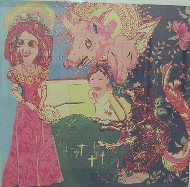
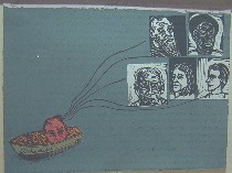
Before this show blows right out of town, I wanted to get something up about the Print Center’s “79th Annual International Competition: Printmaking.” It’s one of those shows that challenges any assumptions about prints as a weak medium, often falling prey to deadly process and control and old hat imagery. Well, at least I confess I sometimes feel this way about printmaking–but not after seeing this exhibit (right, Briana Clark’s screenprint “Little Red Ridinghood,” 10 1/2 x 11 inches).
This show’s a gem, with lots of provocative work from lots of artists I never heard of as well as some artists I have. Forty pieces by 35 different artists are included in the show, which was curated by Judith B. Hecker, the assistant curator in the Department of Prints and Illustrated Books at MoMA. Only one print in the show was entirely digital. The others relied mostly on traditional means of production (left, Jacques Moiroud’s etching “Sweet & Sour,” 24 x 18 inches, New York, which won an award).
Familiar names in the show include three local artists–Kip Deeds and artblog favorite Jeanne Jaffe, both of whom won awards, as well as Althea Murphy-Price, who recently had a terrific piece in the Voxennial (see post here). Deeds’ piece was purchased for the Print Center Permanent Collection at the Philadelphia Museum of Art, selected by John Ittmann, curator of prints there. The name of the award was the Anne Kane Museum Purchase Award for his screen print, “By Gone Attachements” (screenprint, 11 x 15 inches; Deeds is from Newtown, PA, and Roberta has written about him here).
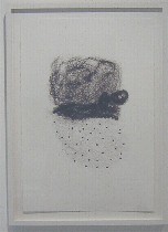
Although the means were traditional, the subject matter was right up to date, the imagery and styles chosen by artists with eyes wide open. There are wacky angles suggested by camera imagery and the movies; there’s cartooning; there are metaphorical narrations and metaphorical abstractions and metaphorical portraits; there’s a lot about how people relate to one another and about where people fit in the world at large. There are references to art history and the imagery of advertising that surrounds us daily (left, Murphy-Price’s “Up Do Series No. 1” is a similar idea to her dramatic “Sunday Crown” sculpture, but the print’s curly hair lines are delicate and gestural. Murphy-Price is an artist to watch).
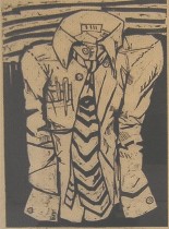
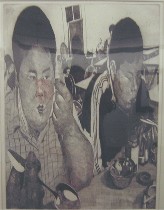
While some images seem to hark back to the 1940s, even those retain postmodern touches that make them look fresh (right, Daniel Brewer’s woodcut “Empty Shirt,” which captures a person cramped by the corporate life in the cartoony lines of the cramped clothing).I cannot possibly begin to name each artist whose work I admired, because I liked nearly every one of the images. So I’ve put up a few images and just want to urge you to go to this show.
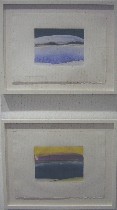
Also at the Print Center is a show of prints by Elizabeth Osborne. While I found this work less surprising, it has some fine moments, such as the view of a lake taken under different conditions. The contrast between the two is a reminder of what Osborne’s work is about (top image, “Lake,” and bottom, “Calm Water”).
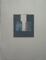
The other great moment, for me, was a view of Osborne’s studio with a river beyond, the river becoming a metaphor for life passing by as the artist works, and also a metaphor for how art gives only a slice of what’s out there (right, “River Studio”).


