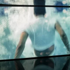
 The show “Point of View” at Vox Populi this month is about landscape, but not necessarily landscape as we know it. Rather, the artists in the show use new materials, break out of the picture frame, and just rethink the angle they take on the world around them (left, “Under a River Bend” by Sarah Wayland-Smith).
Vox Director Yana Balson, who curated the show, brought in 10 emerging artists from Wisconsin, California, Germany, Philadelphia, and a bunch from New York, a nice way to reinforce the Philadelphia’s connection to the rest of the art world.
balson, yana
The show had a number of powerhouse pieces, including Andrea Loefke’s installation and John Rappleye’s drawings, both in the front gallery.
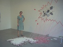 Loefke’s installation balances a tension between the perfection of a suburban scene with a sense of danger. It’s a miniature world where the perfect green grass lawn, up on a pedestal, has a white picket fence that is falling apart. It’s a land of multiple houses with no straight edges that are also creatures with googly red dots for eyes. The sky above explodes in a comic book thought bubble and the flat clouds move forward from drawn space into real space, their blue edges heightening the unreality of the flatness. And then there’s the pink string forming links between the sky and the sparkly land (right, Loefke at the opening night, towering over her untitled installation).
Like so many of the pieces in the show, this is an imaginary landscape, a sort of storybook land that’s open to all kinds of interpretations. Between the perspective of looking down on the tiny homes, and the eyes of the homes, and the sky peeking out of the explosion on the wall, I get a surveillance theme, but Loefke, who was at the opening talk, spoke of the pink strings as a connection between the city and the spiritual sky, and the blue edges of the clouds as a way to undercut the danger.
The piece is very open, great to look at and a magical place.
I also liked moving an installation that’s even a smaller scale than a table-top train set installation down to the floor, and the way it holds its space by the pink-string connections to the wall. Very nice. Very interesting.
Loefke, by the way, is a German native who now lives and works in New York City.
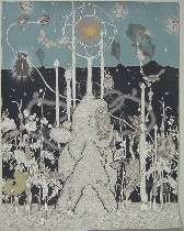
The drawings, black and white with just touches of color, by John Rappleye also have a magical quality and a storybook quality. The landscape they imagine is a place abundant with creatures that require looking to see some of the time. It’s close to reality but not quite, the trees out of control like baobabs that turn into elephants. The plants are odd. There seem to be tubes providing some form of life support like air or food. Rappleye’s drawing and brushwork are wows that hold on to the traditions while taking a trip into jungle-y spaces of the mind and making time travel into deep space (left, “In the Tomble This Nature Abounds).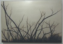
Maggie Tobin’s use of synthetic goatskin stretched over a mirror creates a luminous backdrop that reminds me of Daguerrotypes. The paintings themselves, spare, dark tree limbs against that luminous sky go in several mutually contradictory directions at once–Asian nature painting, man’s place in nature represented by the reflection of the viewer in the sky, and the decorative quality of that background. The branches become tangled force fields (right, one of Tobin’s paintings of tree limbs).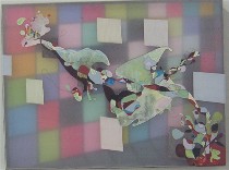
The sense of layering also comes up in paintings by Wisconsonite Julie Ganser. (I mentioned the Wisconsin connection in honor of Roberta, of course. As for Brooklyn connections, in honor of me, there are too many, so I’ll pass). Ganser uses lucite and synthetic acrylic stretched over it to create layers of space in her rather abstract paintings. The colors sparkle, and the layers create a shadow box effect. One piece has faux architectural perspective–a sort of grid–behind an island of cartoony gesture. Another piece is watery and deep (left, “Dark Spectre, Receding Grid”).

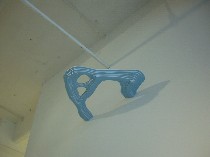
That urge to 3-D representations of landscape comes up also in the charming aerial pondscapes from Sarah Wayland-Smith. They are topographical maps of the bottoms of imagined waterways, viewed from beneath–looking like layers of foamcore painted sky blue. It’s nice to have them serve as blue clouds and bits of sky hanging above. Wayland-Smith also brings in three dimensions in her delicate, cut-paper layered landscape. The reductive paper shapes, the carefully chosen colors, the layers embedded in stacked framework in “Reflections on Water 2” give a sense of depth beneath a surface and preserve the traditional rectangle while subverting it by pulling it away from the wall, penetrating it with holes and taking advantage of shadows cast behind (a river seen from beneath at the top of the post, and right, “Reflections on Water 2”).
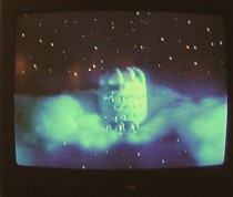
The show also includes set-up scenarios between toy-like animals in the woods, created and photographed by Cecilia Schmidt and a video of cheery aliens exploring a girly version of a sci-fi Versailles garden space by Kim Collmer, which made me think of Matthew Ritchie without the testosterone (left, a still from Collmer’s “Silver Seeds”).
Also there was a hole in the wall by Sarah Oppenheimer that questions the visual function of the gallery wall as a blind backdrop at the same time that it questions the structural integrity behind it and raises issues about the packaging of art; ultra-decorative patterns by Laura Jo Wegman that made me think of the works of two Vox regulars–Kate Abercrombie and Amy Adams for floral profusion meeting over-production; and digitally standardized landscape photographs based on the desire of tourists for souvenir pictures, by Justyna Badach, the lone Philadelphian in the mix. Badach teaches at Drexel University.


