 Twice in one week the issue of commerce co-opting art has come up. First there’s the brouhaha over the Ecko graffiti-art project in Chelsea (see today’s Inky) that a federal court judge in New York ruled yesterday was First Amendment protected free speech. This struck me as pretty funny, since it was more about promotion for Ecko clothes (at least, that’s how it looks to me from here).
Here’s the plan as described in the article:
The exhibition, set for Wednesday in Manhattan’s Chelsea neighborhood, is the brainchild of Marc Ecko, a fashion designer who began his career as a graffiti artist in New York.
According to plans laid out by Ecko’s company, Ecko Unlimited, 20 former graffiti artists will spray graffiti onto two-dimensional replicas of subway cars.
Mayor Michael Bloomberg went to court to try to stop the show on the grounds that it would incite graffiti vandalism of real subway cars.
He may be right; or the judge may be right in saying, as quoted in the paper, that according to Bloomberg’s reasoning, “a street performance of Hamlet would be tantamount to encouraging revenge murder.”
While the decision pleases me, I can’t help but think that what’s being protected here is commerce and Ecko, rather than art. However, if the graffiti artists go ahead and make some good art, well, then that too is under the protection of the court order.
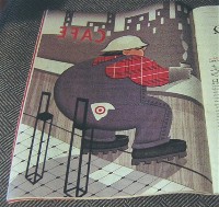
 If the work is spectacular, we’re more in the sphere of the Target ads in this week’s New Yorker (top, Robert Risko’s floaty construction worker).
I loved tons of these images. They are beautiful and witty. But ultimately, they too are mainly about commerce, capturing the Big Apple sizzle and identifying it with that formerly down-scale joint Target.
I don’t know how much money the artists got from Target, but I hope it was plenty. Ditto for the artists in the Ecko project.
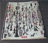
As for Target, it got what it wanted–an incredible image boost that builds on the already hip tv advertising campaign (left, Ruben Toledo’s maze of traffic lights and cell phone towers).
 After all these years of whining about how artists are undervalued and living in poverty, it’s good to see some of them finding their way toward making some dough (we assume)–so long as they can be clear-eyed about what they themselves, rather than the corporations, are trying to say with their work.
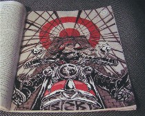
So here are the ones I was really super crazy about, because they went in some direction that was beyond mere advertising: Robert Risko’s big construction worker floating at a coffee counter; Yuko Shimizu’s motorcyclist emerging from a network of bridge cables; James Jean’s symphony of a little violinist’s mind as she steps onto a subway platform; Ruben Toledo’s city of utility poles, from streetlights to cell transmitters to dog walkers with a Don Quixote vibe; Andre Dubois’ shoe bridge; Rachel Salomon’s transformation of skyscrapers into flower petals on a decorative scroll (right, Shimizu’s motorcyclist).
 Each of the others also had some element that drew me in, like the hair landscape in Jason Greenberg’s otherwise expected cocktail party; or the target animals in a classic New Yorker cartoon milieu, by Gary Baseman; or the merger of photos and other media in Katherine Streeter’s creepy mermaid (left, the shoe bridge from Dubois, and Salomon’s wallpaper-like take on birds eye building views as flowers).
I got a stiff reminder of how marginalized the artists are marginalized in this advertising campaign when I read around the blogs that came up on Google. The chit-chat was about how much money was spent on advertising space and whether the ads violated editorial integrity. No one seemed concerned about whether the artists made money or how much they made or whether the art was any good.
…well almost no one. The one voice that had something to say on the subject of art was Anna Conti, with great pictures and all. But her post didn’t come up in Google. Who knows how many others there are out there?
On a local note, whenever I go into 222 Gallery, I feel like I’m walking on the edge of the commercial design world, and rarely does the work transcend its commercial impulse–although the gallery presents it as if it does.
No way am I saying that art shouldn’t make money. What I am saying is that art needs to go beyond commercial appeal. It’s too narrow a subject.


