 Two exhibits this month have been talking to each other across the urban grid.
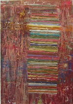
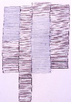
Anne Seidman at SchmidtDean Gallery and Tim McFarlane at Bridgette Mayer Gallery both have drawings of stacks of lines and compressed blocks snuggling up to one another, suggesting buildings and people. (Seidman’s show is up until Oct. 15, but McFarlane’s has already closed. However a couple of his pieces are included in a show up from Sept. 30 to Oct. 29 at Gallery Siano called The Urban Canvas. See end of post for more places to see McFarlane’s work). (image top, Seidman’s “Untitled #8)
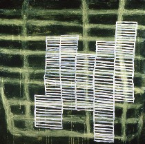
What interests me is how neither of them is a Minimalist, but both of them are creating work that is an outgrowth of Minimalism. Nor are they abstract expressionists. There’s a hard-nosed geometry that goes into these abstractions. But they both come to a similar place from opposite ends–McFarlane from minimalist blocks/buildings and Seidman from spare, almost Asian-looking gestures on the page, the wall, wherever (right, McFarlane’s “Floating Green Grid,” acrylic on canvas).
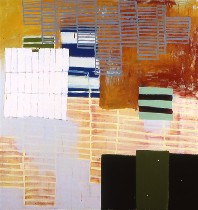
I think of Minimalism, with its reductive spaces, grids, industrial chic as a philosophy of perfectionism and perfectability, in which a perfectly flat red shape suggests the opposite of the handmade, but rather an aspiration to machine-made slickness. Whether we’re going as far back as Malevech’s Supermatist crosses and blocks or as recent as Barnett Newman’s zips, there’s some suggestion of transcendence, of reaching beyond the material world to some perfection. If I look at the recent work being made in Philadelphia in this tradition–the rectangles of Doug Witmer or Kevin Finklea or Kevin Strickland–there’s a spirituality, the material reaching beyond itself to suggest some kind of asceticism that rejects the earthly confusion of daily life. (The is not to be confused with the work comes out of color field, its very opposite, which suggests that materiality itself is transcendent–I’m thinking here of work by artists like Marcia Hafif and David Goerk). (You can see work by the Witmer and Finklea here; and you can see work by Hafif and Goerk here). ((left, McFarlane’s “A Dream Askew,” acrylic on canvas).
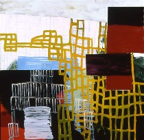
I also think of Minimalism as a philosophy of mass production, in which multiples, each exactly alike, pop out of the machinery, and in which humans play the role of handmaidens to the glorious process that enables such control, such uniformity, such perfection. To reduce a canvas to a color swatch or to a grid or some other non-inflected, non-gestural pattern is to repress individuality and humanity and the artist’s hand. It’s a universe beyond quirks (right, McFarlane’s “A Moment’s Flicker,” acrylic on canvas).
What I see in both McFarlane and Seidman is a subversion of those strategies of art-making to the opposite purpose. Their work takes grids and lines and bends them toward gesture. The two create color planes that refuse to lie down flat, but rather simmer in layers or under delicate skins of paint that are the very opposite of Minimalism.
In this age of computers, where the arcs and perspectives that a CAD program can create to perfection, these works are a rebellion, a reassertion of the artist’s hand, the artist’s eye and the artist’s individuality.
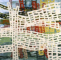
McFarlane’s ladders crisscross and droop and lean in front of backgrounds of color or grids or rope ladders. They remind me some of the time of orange construction fencing, the perfect, factory-made grid drooping and stretching, pulled by gravity and by posts stuck in an undulating landscape. McFarlane’s ladders are not well-behaved. Some of them lie down. They are sensuous things and sensual things humping along and reproducing in a crowded architectural world. It’s not that the spiritual universe is lost in these paintings. It’s there in the background, or in the floating boxes. But it’s also inherent in the ladders. This world, where idiosyncrasy and hubbub dominate, is McFarlane’s heaven (left, McFarlane’s “Folding in on History,” acrylic on canvas).
The choice of ladders, usually a metaphor for the struggle to heaven, is a terrific metaphor for people who are earthbound. But likes their beautiful, uneven selves (right, McFarlane’s “Double Filtered Stack 2,” graphite, oil stick on paper).
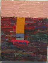
Seidman’s paintings of off-kilter blocks suggest landscapes at the same time that the paint surfaces suggest skin. Maybe it’s the Guston pink of some of the skies. Or maybe it’s the poured-on paint areas with their smooth pool-like surfaces, or maybe it’s the scraped colors that to me look like layers of skin as well as strata of earth. Whatever their intended subject matter, I see skin.
Seidman’s paintings achieve those effects using a variety of water-based media including acrylic, gouache and housepaint (left, Seidman’s “Untitled #4”).
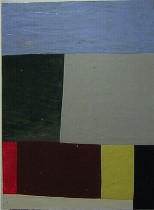
Skin is not what a proper Minimalist would have painted. Nor would a Minimalist have painted this kind of landscape. Minimalism is basically a non-fleshly, non-earthly concept (right, Seidman’s “Untitled”–I’m not sure which number. I messed up in my notes which I very carefully tried not to mess up).
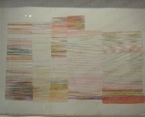
I also find it interesting that Seidman, whose stacks of lines are an outgrowth of isolated, caligraphic, gestural marks, have become crowded and repetitive, the gesture nearly, but not quite, repressed. One of the things that is interesting in the Seidman show (but only for an art lover, I suspect) is the revelation of the progression in the drawing end of the gallery (left, Seidman’s “Untitled”–another number mess-up).
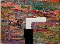
Ultimately, though, it’s her paintings that make me swoon. I guess I’ll use the word sensuous again. So much color is compressed here into so little space, and each area struggles to announce its individuality (right, Seidman’s “Untitled #6).
Part of what amuses me about this turn of events in the art world (okay, so I’m daring to call it a turn of events) is the lag-time in popular culture, in which today’s bionic, six-pack bodies seem to come from the same impulse as Minimalism. But true Minimalist work at this moment in time seems not to reflect the zeitgeist of the art world.
The work from Seidman and McFarlane, however, seems on the pulse–pondering the human condition in abstract form, a parallel take on the issues being mined by younger artists like the kids at Space 1026 or Vox Populi, who are using either cartoons or maximal, color-filled and stuff-filled installations to make poignant existential statements.
(A note from McFarlane: Just as a head’s up, I’m doing the Philadelphia Open Studio Tours again this year. My weekend is on October 15th and 16th. Also, I’ll have work up at the Affordable Art Fair in New York City at the end of October. Bridgette’s gallery was chosen to be in the fair and I, along with several other artists from her gallery, was chosen to have work shown in the booth there. It runs from October 27th-30th and is on Pier 92.)


