 The three members showing at Vox Populi have some weird decorative vibe going. All three–Max Lawrence, Amy Adams and Anne Schaefer make me think of ways we pump up the looks of the spaces around us. Yet the three bodies of work are distinct and completely different.
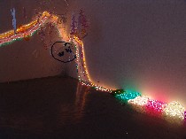
Lawrence, who goes wild and funky and basically out-of-control when he installs a big space, and has total control when he paints or creates an image in a smaller frame, swathed swags of colored rope lights all over his assigned gallery space for his installation “Scorch Doppler, unearthing the demise of a teenage phoneme….” It’s curtains meet Christmas. The ropes, which coil in piles on the floor as well as drape around the space, also remind me of Mardi Gras lagniappe.
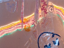 In a quadrant of the room in front of the rope lights hang puddles of epoxy with images like eyes and atomic explosions. I’m not sure of how they tie in, but they catch the rope-light extravaganza and they sway in the breeze–motion is always a plus.
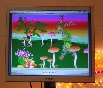 But to me the guts of the installation are in the small screen and the interactive keyboard-controlled projection on the wall. On the small screen are trippy images of mushroom-inhabited landscapes and swivelling silhouetted body builders and perfect girls raising issues about what we do to ourselves and how the culture delivers messages about how we ought to fit some commercialized image of a human being.
What he’s done with this serious subject turns out to be pretty funny and entertaining. I especially like the body builder’s moves.
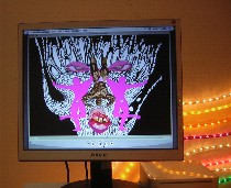 Plus it’s beautiful to look at, with the computer-program crispness of Jennifer Steinkamp‘s Dancing Girls (see posts here and here) or of Anne Skoogfors’ “Botanica” (see posts here and here), plus the intense color of a Peter Max painting, without the kitsch.
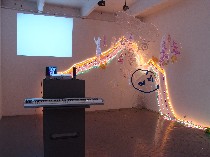 Some of these images, which he has drawn, not borrowed, are mixed with musical loops and words in the keyboard-controlled interactive part, which also brings up the issues of our relationship to our body. The words, which I could barely understand, include “did he”, “did she,” “where did”, “drinks, “eats,” smokes,” “coconuts,” “balls,” “beers,” etc. Some of the images are sound files converted into visual files on the computer. With all these tools, you can make your own mini music video, sort of.
Whatever you press on the piano starts creating a loop that interacts with whetever else you press.
In a conversation with Lawrence, he mentioned his own body image, from being an 220-pound teenager to becoming 140-pound young man. He’s been pretty much the same size and shape–normal–since I’ve known him, and it seems that it’s the messages of the culture that remain, that are disturbing him. Lawrence said, “People treat you differently when your fat and when you’re skinny… Will people like me better if I’m skinnier?”
I have trouble making the link between the themes of the smaller pieces and the nuclear explosion of the larger installation. But there’s a trippy consistency of bright color-and-light overload that swirls into some centripetal galaxy of a living room.
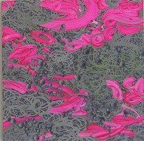 Amy Adams, whose work last year was all about nothing, the void, the cybervoid, and the void of consumer glut has taken some of the same imagery and recast it into something wholly decorative. The void work was also decorative, but in a rather unusual way. In that work, the flat, textureless balls and their sometimes silver interstices gave back such a nothing as to be amazingly something (“Untitled,” 24 x 24 inches, acrylic on panel).
 This new work, in her exhibit “skylark,” has brush strokes. They’re David Reed-style brushstrokes, statements about paint and the act of painting. But unlike David Reed’s brushstrokes, these are decorative baubles in Anne Craven pinks or swimming-pool blues amid the field of the nothing-balls from the previous work, decorative chandeliers of drips, and spaghetti-like tangles (“Untitled,” 30 x 12 inches, acrylic on panel).
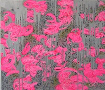 Some of these brushstrokes are baroque–complex squiggles of pendants amid the spheres. Some of the spheres take on a gothic sort of darkness. There’s also a new depth of field in these paintings, a forward and back, an undulation in some of them, an endless cave quality in others. They continue to surprise me, finding a new sort of nothingness to paint about–the paint itself. But the spaghetti and the spheres, with their no-texture, suggest not just a cyberworld but a tangle of wires and neurons, and only the brush stroke is human (“Untitled,” 48 x 42 inches, acrylic on panel).
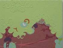 Anne Schaefer, who last showed work of and about fabric, has moved on to wallpaper (at least that’s what it reminds me of) in her exhibit “Sum.”
Schaefer layers paint and collage and I’m not sure what to create textures that remind me of historic textured wall coverings for dados and such. But they’re fragments, as are the intense bits of color that pop from the dark-colored backdrops.
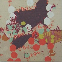 In a way, I feel like I’m in a Better Homes and Gardens, in which retro color and motifs have painted the landscape. I liked looking, but I’m not sure why, yet, other than I’ve never seen this work before. I need more time to figure out why it makes me want to see it (I can’t tell you the titles to these because my systems failed me).
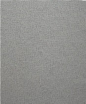
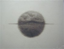 In the 4th room, there’s work by guest artist Jason Hughes. There was a video of someone walking in and out of deserted industrial-looking hallways. I lost track of time and space in the video, not knowing if I’d seen the scene in front of me before or not, but I do think that’s part of the point, and it made sense with his piece which was an amazing cut-out maze with little graph-paper-like lines (detail below left).
 It also related nicely to a film-strip-like series of face photographs, but my favorite piece here was a drawing so strange that I want to see it again (above right).


