Maybe it was youthful exuberance (not ours, of course, but the artists’), but yesterday’s First Friday highlights included an installations at Space 1026 and Black Floor that tickled me (image, right, Teresita Fernandez’s “Fire” being admired at the Fabric Workshop and Museum).
We had started out at the Fabric Workshop and Museum, where we listened to MacArthur genius Teresita Fernandez give evasive questions about her work and drone on about the wonderful experience of collaboration with the Fab. Some of it wasn’t her fault. As always, the Fabsters ask leading questions about just how amazing the collaborative experience was.
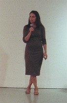 The big installation piece, a labor-intensive ring of fire made of dyed silk threads with mucho help from Fab workers, was too literal and industrial-looking for my taste. Although it did offer some shimmering and moire effects plus a little jiggle factor in the strings, ultimately it was awfully minimalist in the worst sense–screws, pieced metal rings, anti-lyrical (right, Fernandez speaking).
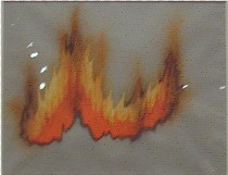
The small collage drawings on the wall, however, were something else entirely. They were beautiful, intense, evocative of fire in ways that the big, pumped up ring didn’t begin to realize. Made after the big sculpture, they are worth going to the Fabric Workshop for (left below, one of the fire collages–the reflections of light are not part of the art–sorry).
 While there, we met up with Brent Burket, artblog’s New York correspondent and a Fab member, who came here especially for the Fernandez piece. He seemed more kindly disposed that I was.
We also bumped into curator Andrea Kirsch who reminded us that Fernandez had had a piece at the ICA under the Patrick Murphy regime. It was rooms created with scrims. I remember I saw it, but I don’t remember what I thought of it.
The white and the black, part 1
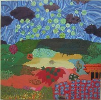 Ultimately, the four of us set out together for a quick pitstop at Vox Populi–here’s an image from the Kate Abercrombie exhibit, “Ghost Town of the Sky,” Abercrombie’s work is moving a new direction, with a kind of patchwork approach to landscapes where Indian miniatures and chintz unite. Some were not as successful as others, but as usual, her work is worth a look. This was my favorite, the amazing sky-and-black-clouds pattern showing influences from Japanese wood blocks. The clouds were rather bat-like (image right, from Abercrobie’s exhibit).
[insert 10/12/05–I don’t know how I could have forgotten to write that at Vox we bumped into Anabelle Rodriguez from Taller Puertorriqueno. She was exuberant and heading upstairs to the Fabric Workshop to see the Teresita Fernandez work.]
 Also showing there were Eva Wylie’s exhibit “Near Berserk” and Nami Yamamoto’s “White Noise.”
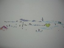
Wylie’s use of borrowed landscape-related images,was subtly disorienting and surprising. The tents and mountains, including cross-hairs that look like printer registration marks or vice versa, are taken out of context, flattened, juxtaposed and turned around to create a panoramic wall installation, silkscreened directly onto the plaster (image left, a detail of one of Wylie’s two panoramas made with the same images shuffled differently).
There’s also some thinking about the computer, where scale becomes a shaky verity. I presume the images are taken from the computer, both because of how they look and because Wylie’s previous installation used computer images. The result is at once strange and familiar–great to look at.
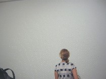 Yamamoto’s white dots stuck on the white wall and colored ones drawn on paper are inspired by patterns in nature, but they seem stuck at that initial thought, so I take this as a step on a path in a new direction. We’ll have to wait and see where it goes. (Here’s a picture of someone looking at what almost appears to be a bare wall, but it’s covered with white dots).
The black and the white, part 2
 We traipsed on, our clothes glued to us by the amazing humidity, to Space 1026, to see Nick Paparone and Jamie Dillon’s “Everest,” a small mountain-top of polyurethane foam resting on a white rug with undulating edges in front of a two-wall backdrop –a wallpaper-like strip of white and black mountain tops against blue sky (left, a shot of the installation of “Everest”).
 We all remarked on the danger posed to the all-white rug by the soupy weather. No they hadn’t Scotch-Guarded it. And yes, they were sorry they hadn’t.
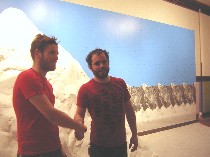 For $5, they took pictures of people in front of the mountain. I won’t say the result is uncanny. It’s funny, instead, as is the mountain, with a boy-makes-model or boy-builds-a-train-landscape kind of gruffness. Therein lies its charm. Any attempts at realism are subverted to an almost child-like idea of what a mountain is like (image right, that’s Dillon and Paparone, left to right).
Needless to say, there’s a gap between reality and the idea, and I for one think the idea is a lot more fun. The real mountain is brutal and cold. When Paparone said they were interested in Everest as an idea, I immediately thought of the work of Philadelphia artist Matt Pruden, who’s also interested in Everest as an idea–about nationalism and glory.
By the way, we wrote about Paparone and Dillon when they showed a little slide that ended in a pitch-black room with no apparent way to exit at the late, lamented Project Room.
The black and the white, part 3
After Roberta posed for her picture and received it in a handsome Everest memento photo folder with slots to hold the picture corners, three of us–Brent, Robert and I (Andrea left us)–headed to Black Floor. “Close Your Eyes, This Will Take Some Time,” turned out to be a sort of anti-Everest. Everything in this installation was black.
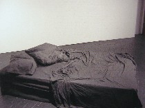 Sabrina Lessard’s light-absorbing black bed looked totally real to me. I couldn’t understand why the two young ladies in the gallery were squatting near it, and not sitting on it. But the bed wasn’t a bed at all, but an idea of a black bed made of a mix of resin, gypsum and fibrglass, with a polymer top coat. Very high tech materials, for what didn’t look high tech at all. Unlike Everest, the material had no give whatsoever. Very funny (Lessard’s “Close Your Eyes, This Will Take Some Time”).
Lessard, who has done casting for Norman Paris and Virgil Marti, and has gotten lots of casting experience working with Kait Midgett, said her bed was the opposite of white, the traditional bed-sheet color.
Amplified from speakers were answers to questions about beds that she asked people–about dreams, experiences in beds, and suggestions for bed names. The answers to the bed names question ranged from a launch pad to a worm hole to a white protection place, a place of safety.
“My concept was just the opposite,” she said, referring to the place of safety suggestion. Then she noted that we spend 30 percent of our lives in bed–probably even more than that. And beds are sometimes places of danger, where people die or lie sick.
Philadelphia art-scene props
She also reeled off a list of familiar names from the Philadelphia art world who helped her, so if you helped her, believe me, she credited you and said she felt totally supported. “I think that’s specific to Philadelphia,” she said. “It gave me the security and the guts” to get the piece done.
Speaking of networking, she was selling imprinted tee shirts and pillowcases silkscreened by Paparone and Dillon, the “Everest” crew.
New York Jenny Holzer digression
 Then Burket left us for New York and the Jenny Holzer piece based on poems projected on the outside walls of the New York Public Library (here is one of Burket’s images of that). By the way, Holzer is due to speak at the University of Pennsylvania Nov. 16. Here’s a link to more information about Holzer’s talk.
Here’s Burket’s email on Holzer:
And O MY GOD, the Holzer. The 2nd time that art made me cry yesterday. I’m really glad I made the effort to get back in time too because today the rain is really heavy. The other great thing with the Holzer was watching some of the locals walk by who weren’t expecting to see all these huge beautiful words on their library. That and the crowds of people that specifically came to see it. Somebody even brought a group of high school kids.
You can see more info and more images here on the Creative Time Blog.
Networker extraordinaire
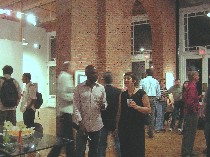
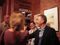 We headed off to Gallery Siano for some networking of our own. There we found Vince Romaniello whose online videos of artists working in their studios is turning into quite the archive. The exhibit is of his artwork plus pieces from his network–i.e. his video subjects and fellow bloggers. The videos themselves, which are a public service, are also projected in the exhibit(left, Romaniello on the right, schmoozing).
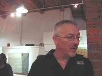 We found another out-of-towner, art blogger Chris Ashley, who was visiting from the Bay area (not kidding!) and had a piece in the show (image right, Chris Ashley).
 We also found artists Tim McFarlane (left) and Tremain Smith, also in the show and subjects of Romaniello’s videos. The evening ended abruptly when we dashed out late for our dinner date with Murray (image left, McFarlane and Smith to the right of him are in the center of the photo).


