[Ed. note: Artblog contributor Colette Copeland‘s critical writing class at Penn visited Slought Foundation‘s “Comicology” exhibit recently. Below are three responses to the exhibit — which I thought would have been an immediate thumbs up for students but apparently is more of a thumbs sideways instead. Here’s my post on the show.]
Dealing with the Disgust factor
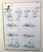
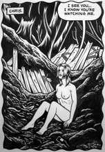
While there appears to be variety in the highlighted works, there is an overall sense of uneasiness as one views each image. I’m not sure if it was the young lady swaying in the still air after hanging herself at the persuasion of her envious girlfriends, or maybe it was the cigarette butt that was emerging from an open wound on a man’s big toe. Images of snakes slithering around one’s head and detached ligaments being thrown around on a sheet of paper evoke questions in my mind. Questions like, “what am I doing here?!?!” (image is by Anders Nilsen, whose work the writer is talking about.)
While I am personally disgusted by such visceral images being flashed before my eyes as if it is supposed to be the latest in popular art, I’m sure it wouldn’t take long to find one who would revel in such images. For me, graphic cartoons lack a universal element that other works are able to boast. While some might argue that it takes a girl hanged from the oak branch in her back yard in order to decry the wrath of adolescent females, this subliminal message is only visible if one can surpass the initial shock that the image alone creates.
For those of you born with a high threshold for stomach-twisting images, perhaps Slought is for you. Slought has done a commendable job of not only bringing together this diverse collection of intense expressionism, but it also has ensured that unconventional art will always have a safe-haven here in Philadelphia.
— by Brandon Dunn
Dealing with the Wall factor
After years of reading comics and graphic novels, I have never thought of them as anything more than that – humorous stories told through small drawings, intended for entertainment. Enjoyable, but certainly not “works of art”. Thus, I initially had no idea how to respond to seeing these “comics’ mounted on the wall of the Slought Foundation.
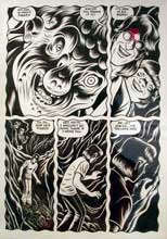
I like Charles Burns’ drawing style – crisp, dynamic, entirely black and white, and full of stark contrasts between light and shadows. (images above and below are by Burns.) I looked through one of his graphic novels – in book form – at the gallery. His themes are darker than, say, your everyday newspaper comic strip. His subject matter is sexually charged, and deals with frightening things like death and physical decay. Each frame is haunting. Nine sequential pages from one of Burns’ books are mounted on the gallery wall, and appropriately titled “The End” from Black Hole First 9 Pages (2004). Each page is about 11” by 14”. Even after reading it 6 times, its meaning was still a mystery to me. Maybe that was Burns’ intention. A seemingly adolescent boy (the main character?) peers through a gaping crack in the body of an ambiguous creature that could be half infant, half frog. The “story” progresses with the physical decay of this creature and of the surroundings. While these pages certainly demonstrate magical realism, something was lost in the transition from the book to the wall presentation. It took me some time to put my finger on exactly what, but I realized that much of the mystery and suspense involved in reading a graphic novel comes from its presentation as a book – concealed within a cover, its progression dependent on the reader’s page-turning. Laid out on the wall, I felt that much of the anticipation was lost. I could not control the turning of the pages, and the frames became little more than nine pages of black and white drawings, rather than part of the action of a graphic novel.
In fact, this is how I felt about the entire exhibition. I felt like I was reading pages that were supposed to be in books, as though random pages of a novel had been torn out and hung on the wall. The action, while intriguing, felt out of context.
–by Gabi Matouk
Dealing with the Truth factor
Slought Gallery’s Comicology: The New Magical Real (Sep. 10 – Oct. 22) had a range of the dramatic, humorous and bizarre. I was particularly interested in the fairy tales that were reinvented into the comic strip setting, as they had aspects of the familiar as well as the peculiar.
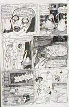
In particular, Dame Darcy’s comic strip about Rapunzel was a contradictory mix of children’s fairy tale and horror story. She took a well-known children’s story, removed the friendly, Disney exterior, and added moderately gruesome pictures to the original story. The result was a social commentary on “truths” fed to us by society; in this example, the comic strip evaluated the validity of the “happily ever after” belief. (image is from Dame Darcy’s Rapunzel)
In this version of Rapunzel, the doll – a replication of Rapunzel herself – is the narrator. Generally, dolls appeal to children, but the story this doll tells is not child-friendly. The doll as narrator gives Rapunzel a voice she might otherwise not have had; the comic strip seems to be a reflection of what Rapunzel experienced.
At the end of the story, the doll reassures the viewer that Rapunzel and her prince do, in fact, live happily ever after. However, the audience’s confidence is shaken. The piece forces the viewer to re-examine what happily ever after is, and why culture seems to make selling points based on this shaky “truth”. This piece seems to say that the happily ever after beginning and ending is the fairy tale and the substance in-between, as gruesome as it is, is reality.
–by Kate Long
Slought Foundation’s Comicology runs to Oct. 22. 4017 Walnut St.
(215) 222-9050 Wed-Sat 1-6 pm


