(Colette Copeland’s art criticism writing class at the University of Pennsylvania went to November’s First Friday in Old City. Here’s what some of them had to say:)
Mouse tales at Carbon 14
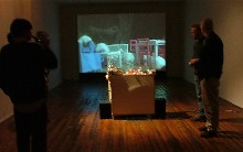 Rodents are generally perceived as creepy, overly abundant and unnecessary creatures in today’s city life. Usually, they are not featured as subjects or objects in art works. Artist Chris Bergen does both. By putting mice in an apartment-like boxed space, equipped with actual miniaturized IKEA furniture and cardboard packaging boxes, he asks the viewers to question their assumptions about these creatures.
Bergen’s “Mice” exhibition at Carbon 14 gallery drew in an interested and mixed crowd of viewers. His installation piece included 25 feeding mice roaming in a glass box in the middle of the gallery floor various obstacles to interact with in the box. The mice were videotaped and recorded and the sound and video was projected on the wall (right above, installation shot of “Mice”).
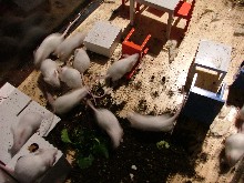 Bergen commented that he didn’t want to scare off some people from his artwork by using live animals and so he explained to every viewer that came in that the mice would only be up for that Friday and Saturday and then the installation would come down. Even though he was using live animals in his work, he seemed concerned with their well-being and with the audience’s knowledge of his concern (left, detail of “Mice” installation).
 The gallery gave off a chill, come-in-and-check-this-out sort of vibe. The artist and a bunch of his friends were sitting around outside the steps of the gallery and inside on a couch, just talking to the crowd. This created a very open, relaxed atmosphere which allowed the viewers to go over and interact with the mice, picking them up, laughing and pointing among themselves about how cute and silly these little
animals were.
Perhaps Bergen was noting here how displayed and watched our commercial lives are, living in plain view of everyone. Here, the lifestyles of the mice are the same as our own – we run around our apartments with our cluttered furniture and recorded lives – from security cameras to cell phone conversations, everything we do is taped. And here, people were amused at how displayed and silly the behavior of the mice was even though we live the same way. Through Nov. 30th. Carbon 14 Gallery, 123 N. 3rd St. Call for gallery hours, 215-923-2352.
–Post by Anastasia Kouriatova
This year’s print invitational
 This year’s Philadelphia Invitational Portfolio from the Philadelphia Print Collaborative presented eclectic and quirky prints by some well known artists. The work is on exhibit at the Silicon Gallery.
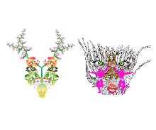
Maximillian P. Lawrence’s piece was probably my favorite – he very cleverly put together different objects to form two different faces. In his print, the face on the right was constructed out of people, and what looks like some sort of plant in the background. The face on the left was a collection of flowers that forms a face (left, Lawrence’s print–see post on related work here and here).
 Natasha Pestich took a completely different approach with her print, “Trojan.” This piece seems more like a comic, and is more analytical than Lawrence’s piece. Pestich humorously substitutes a giant beaver made out of wood for the Trojan horse. The text at the bottom states, “He came to realize that the struggle was not ‘out there’, IT WAS WITHIN HIS OWN SELF” (right, “Trojan”).
The diversity of the prints made this exhibit fascinating, which also included work by Katie Baldwin, Daniel A. Heyman, Dennis Lo, Tristin Lowe, Diane Pieri, and William Smith. The prints successfully functioned individually, while collectively complementing each other.
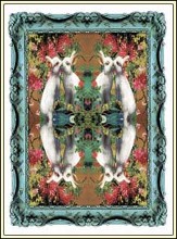 The exhibit also included prints from past years’ portfolios, inluding a print from Virgil Marti, “Bunny Multiplication,” in which a white rabbit is the focal point. The print is composed of one quarter of the print reflected until the page is filled. This technique creates a surreal, kaleidoscopic feeling, which I really liked (left, “Bunny Multiplication”).
The show runs to Nov. 26. Silicon Gallery, 390 N 3rd St.
–Post by Kate Long
At home in the city
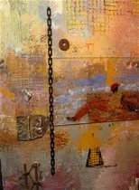 Walking into ArtJaz on Second Street, you encounter two different yet complimentary
spheres of art. Displayed on the left is the vibrant, active art of Deborah Shedrick and on the right we see the subtly beautiful urban works of Stacey Brown. In the center of the room, is a beautiful African bust; she seems to hold these two worlds together (right, “Lay Down Your Burdens”, 18″ x 36″, by Shedrick).
Both of these artists use a style evoking a semi-decayed feeling.
Two pieces epitomize this exhibit: Shedrick’s “Black On White” and Brown’s “Cool Jazz.”
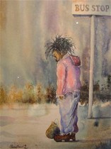 The first of these works is a geometric marvel. Simple. Black. White. It contrasts itself: both warm and cold (left, “The Bus Stop,” 11 x 16 inches by Brown).
The second work, “Cool Jazz,” Shows a man, eyes hidden behind his hat’s brim. Even though we cannot see his eyes, it seems that he can see ours. This figure, pierces us with the look of eyes we cannot see. They see through his hat, through the shadows that seem nearly to swallow him whole, and through the plane of the painting–into our world. ArtJaz Gallery, 53 N. 2nd St.
–post by Jesse Harding
Water on the move
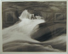 One of the most attractive things about contemporary art is novelty – new media, unconventional subject matter – artists are constantly putting forward new ideas, and pushing the envelope of our definition of “art”. With innovation dominating the art world, taking a step back to traditional methods and mediums can feel incredibly refreshing. This is how I felt when I came across Alan Sockloff’s exhibit “Dynamic Water: Abstractions and More” in the Muse Gallery (image, “Tohickon Creek #47” (2002), 16 x 20 inch toned silver gel photograph).
I am not typically attracted to traditional subject matter, and in photography, water is as traditional as they come. What keeps Sockloff’s work from falling into the cliché trap is totality: he isn’t just photographing water; he’s studying every aspect of it. Classic, not cliché, is the best way to describe his pieces.
He explained to me that he wanted to capture the patterns that the movement of water creates – something that freeze-frame photographs miss out on. He is fascinated by water as “the most basic element we have”.
Close-up views, like ‘Tohickon Creek #47’ (2002) capture the abstractions and graceful patterns created by flowing water as it interacts with solid masses. ‘Acadia
N.P. #14’ (2003) looks at the more forceful side of this interaction, as a wave is caught just as it violently crashes against a rock. Sockloff also captures the beauty of still water as it reflects light, such as in ‘Ralph Stover S.P. #09’ (1994) where the vivid reflections of trees are caught in one static moment on film.
Sockloff has an obvious appreciation for the untouched elegance that is so often overlooked in nature. There’s no denying the feel-good power of art that reminds us that some of the most beautiful things are right in front of our eyes. Show runs until Nov. 27. Muse Gallery, 60 N. 2nd St., 215-627-5310, Wed.-Sun. 12-5 p.m.
–post by Gabi Matouk
Conflict and industry
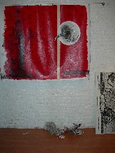 The exhibition titled “Maps and Scissors” offered me no explanation as I first walked into the Hurong Lou Gallery. I saw the maps, and I guess they were cut apart by scissors; but I couldn’t help focus on the rolls of brown paper, pieces of plastic tarp, and buckets scattered around the floor, and I was confused—what is part of the exhibition and what is not (image, detail from “Maps and Scissors” installation)?
 Then, I heard someone explaining to a lady that it was all part of the installation. As I stepped around the ‘trash’ on the floor I began to notice the images on canvas [on the wall]—images of old black and white maps torn away at the bottom and then juxtaposed with a bright red wallpaper-like pattern. The canvases were large and hanging by a metal pole..
The industrial theme of the exhibition continued as I walked downstairs—this theme provided somewhat of an explanation.
The voice of the artist, Blazo Kovacevic, resonated from his artwork as all his work seemed to have one theme and one concern—industrial progress and social conflict. Even as his medium changes—from acrylic on canvas to glass tables—the black and white antique maps were still Kovacevic’s main concern. Through these maps he explores conflict by confronting “contradicting visual elements.” The old is displayed among the new; delicate drawings of lighthouses are displayed with a harsh red paint with a modern flair; art is formed into a useful table.
People were enjoying the opening of this exhibition as it offered plenty to think about. The messy construction-look of the gallery suggested that Kovacevic intended his works not to cease when the canvas ceased. As I exited the gallery I noticed a woman reach for a piece of paper sticking out of a wood circular shelf, and as her hand touched the paper I heard a voice stop her, explaining that the paper was part of the installation. This just reaffirmed my confusion of boundaries—where does the art start, and where does it stop?
–post by Lara Aleman
Real meets unreal
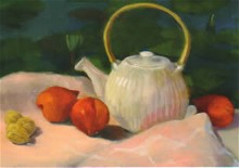 Judith Viner’s exhibit, A Closer Look, showing at Third Street Gallery, urges her audience to look deeper into her oil paintings and discover qualities and characteristics that are not readily apparent. The exhibit mostly consists of still lifes, depicting fruits, flowers and teapots. They are very basic oil paintings; one feels a sense comfort and pleasantness because the forms are recognizable and composition familiar. However, a closer look shows something different, something that does not quite sit right.
In “Pears with Water Lillies,” Viner finely renders five yellow-orange pears atop a table with a pink slate cloth. The colors are rich and complementary and the pears’ textures are delicately detailed. It is a seemingly basic still life. However, the background is a flat, spaceless mass of color. There is no perspective or sense of depth. Squished green ovals, representing water lilies, seem to be floating in spac, as if the background was waterlily wallpaper. Here, the focus is on the object, the pears. The background is abstracted, lacking a sense of depth and detail. The stereotypical still life breaks down. It is no longer a composition of objects, where background, foreground and focal points exist pleasantly. Viner separates the object and background, creating an interaction between two different entities. So which is more important of the two, the object or that which supports the object and gives it context? Perhaps Viner is urging her audience to consider that not everything should be perceived as objects and focal points, but rather to take a closer look at the smaller things, the backgrounds and foregrounds of still lifes and life itself.
Judith Viner’s A Closer Look is showing to Nov. 27
–post by Mark Rubbo


