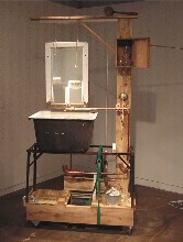
Here’s a picture of one of Frank Vagnone’s sculptures at Fleisher-Ollman (image, “Sink”).
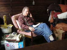
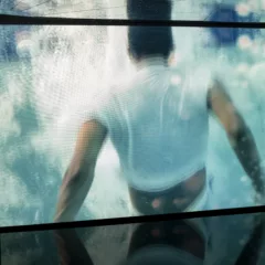
And here’s a picture of our friend Knox in his studio in Philadelphia.
I don’t imagine they know eachother, but both of them live in the Walden Pond of the mind.
Vagnone’s pieces are in the “Meatballs” show, this year’s version of F-O’s annual emerging artists spectacular, curated by William Pym and Jina Valentine. [CORRECTION: Add Brendan Greaves to the curators of this show–Libby, 12/21]. I won’t bother explaining the tortured reasoning behind the name of the show. Suffice it to say that this time, the two curators relied less on networking an more on an open call for artists. For some reason, the show seems a little tamer than the last time out, but there’s still plenty to contemplate.
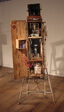
What Vagnone is contemplating is people and mirrors. Vagnone takes that tight, Philadelphia approach to assemblage–trying to fix up scraps into something beautiful and controlled (I’m thinking of work by Randall Cleaver, for instance)–and shakes it right up. The constructions seem to be humans, hanging together by a hair, looking for their own image in the mirror. Questions about beauty and worth and self-worth and art are packed into these somewhat fragile forms (image, Vagnone’s “Vanity”).

The biggest surprise in the show was by Mark Khaisman, a Moscow educated artist and architect. Khaisman’s lightbox pictures are made of that cheesy, translucent brown packing tape, the layers built up to create degrees of opacity (image, “Conversation”).
Photo-based, the subjects are cinematic pregnant moments. In terms of subject matter, my favorite was “Conversation,” showing the talkers from the knees down. The other two images are in hallways, outside doors, giving a sense of being shut out. The images are part of a series, “Spaces of Suspense.”
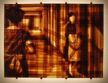
The sepia tone is especially surprising given the film noir look of this work. Occasionally Khaisman throws in some wrinkles, but it’s mostly pretty straightforward layering. The results are arresting.
The other tape piece in the show is on the gallery’s window. B. Ever Nalens, who has had a Fleisher Challenge, created a transfer piece, with a large image picked up by narrow strips of Magic Tape, a technique that’s over the place; but this is the first time I saw it used to transfer a really large image. I liked the frosty, venetian blind effect breaking up the image, which quietly melted into the gallery space, barely announcing its presence.
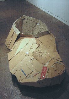
The corrugated cardboard and nuts-and-bolts constructions of Michael Coppage, a PAFA alum, had a large, cartoony presence. His giant comma of a piece reminded me improbably enough of the elephant poop from Chinatsu Ban’s “V W X Yellow Elephant Underwear” (see post). Even though Coppage’s material is homely and nothing like the slick manufactured commercialism of Ban’s piece, the filip of a twirl that could be a curly tail or the peak of soft ice cream brought those two pieces together for me. The subject matter is pretty close (image above, another piece by Coppage, is a shoe shape lined with newspaper).
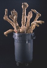
Coppage, an Academy grad, uses a method that’s similar to the one used by Roberto Visani in his piece “Corner Cutters” (see post) at the “Frequency Exhibition” at the Studio Museum. Their work reflects two sides of the same coin–too much money and not enough money.
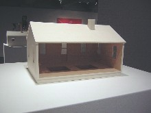
In the beautifully constructed category, there was also Leah Bailis little pristine houses on pedestals with their bottoms dropping out, their bases sagging–the American dream gone awry. I wonder if she just bought a half-million starter house and is wondering if she can make the payments.
The show has two painters, Alex Paik and Timothy Gierschick (I think I have to put Nathaniel Davis in the drawing category).
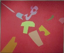
Paik, whose work I had seen at the University of Pennsylvania MFA show, is making work that crosses the low-key Zen of Penn faculty member Hitoshi Nakazoto with James Havard’s floaties. But Paik is working with pop colors and abstracted forms from video games. The work has acquired its own personality and a cartoony spatial energy in the past year.
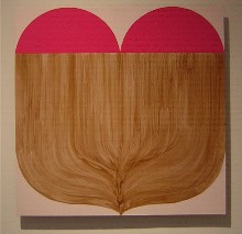
And Gierschick paints icons, or maybe they are logos for some mysterious religion. They have an earnest sweetness as they explore the mysteries of gravity, balance and what’s inside. They are reductive what-is-its. I googled Gierschick and discovered he’s one of the artists who with Ben Volta and Dayton Castleman have studios in a local church. Another little network discovered.
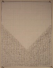
As for Nathanial Davis’ drawings on graph paper and on wood, I especially liked the anti-rigid graph paper drawings which turn the grid into a sagging network. I can almost see the callous where Davis’ tightly-gripped pencil hits his finger. Davis, who has a BA from Columbia, was curated into a show at Deitch Projects by the oh so hip Dearraindrop and Hanna Fushihara Aron.
The show also included photos by Johanna Inman and video by Jack Sloss.
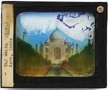
Inman, a Tyler grad, took photos of the deteriorated state of pre-35 mm. slides. Fleeting imagery of travels and historical structures is not such a surprising thought, but the execution and choices are great (image, “Taj Mahal”).
Sloss’s video comes in two channels, each one a different order of the same imagery. I sat through some ailing older white woman droning on while the camera slowly panned around the room (her bed was in the living room) about how all the black kids at school liked her; and I sat through a lot of quick cuts of interior spaces and exterior spaces I couldn’t identify; I also sat through solid color screens and captions about the American dream still being alive, silent sections and music-backed sections. I honestly couldn’t make head or tail of it in either version–or the point of having the two versions. I but I loved the bleachers Sloss set up to ease the viewing experience.


