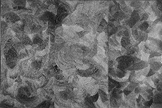
It wasn’t anyone’s fault, really that the image on the Pageant Gallery promotional material looked underwhelming, like a riot of intelocking pie-shaped tree-trunk segments, crosscut to show varied ring patterns. The exhibit’s name, “Polar/Solar,” didn’t help (image, “Offering,” by Sean Riley).
But when I saw Sean Riley’s piece, “Offering,” in person, I was pretty surprised. I’d have to say this piece is worth the price of parking. For starters, it’s a triptych, 96 x 144 inches. It’s all tiny white dots, maybe 1/8″ in diameter each, layed down in repeating arcs on a black background, and in person it has an explosive exuberance that matches its obsessive intensity.
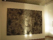
I asked about the dots. It turns out Riley dips a nail head in paint and then stamps away (image, “Offering”).
Because the piece is a triptych, the shapes also bring to mind the halos on the parade of saints and the bent-over, haloed heads of a pieta or whatever other central saint motif.
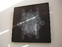
There’s a Precisionist influence in Riley’s abstractions, a suggestion of protractors and compases and other mechanical drawing tools. I don’t know that he uses them. Appropriately enough while I was looking, shafts of light marked off shapes on the paintings.
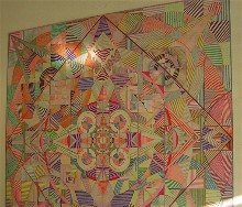
Of approximately the same height as the tryptych, Riley all created an intense square-based, mandala-like piece, “Mother’s Work,” that Pageant’s Daniel Dalseth said was inspired by quilts. A more unfabric-like quilt is hard to imagine, unyielding and flat, all based on precision of color and line. I can’t remember ever seeing a piece on this scale that is so linear. Again, it’s intense and obsessive, its sheer determination a spectacle (image, detail of “Mother’s Work”).
This work gives off an outsider vibe.
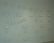
In stark contrast, the work of Enrico Riley (no relation to Sean), also showing at Pageant, gives off an ultimate insider vibe (image, “Blue and Green” installation).
Dalseth said Enrico was a long-time friend from Dartmouth, and Sean came to him from his Penn connection and Terry Adkins. The thing that made Enrico’s work most interesting to me was the arrangement of small, canvases, barely visible on a white wall, the installation measuring 100 x 150 inches.
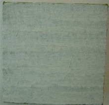
In a number of pieces, including the installation, “Blue and Green,” Enrico layers white paint, its bands of slightly drippy brushstrokes almost completely masking an undercoat of color. The physical presence of the brushstrokes, the even, overlapping drips layered like a flapper’s fringes, the whiteness, of course reminded me of Robert Ryman (detail from “Blue and Green”).
But what pushed these white-out paintings into another sphere for me was the arrangement on the wall, looking all the world like punctuation or notation, that it turns out is a reference to musical notation. Like a lot of young men in the art world these days, Enrico is into music, as is Dalseth.
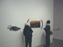
This use of paintings as notation also brought to mind an installation we saw in Chelsea last week, with the paintings lined up around the room with marks of punctuation suggesting there was a continuity, a sentence or rebus and if only we could figure out the meaning (image, Jeanne and Roberta looking at a part of Vernon Fisher’s “American Tragedy” installation, including some parentheses whomped on the walls, at Charles Cowles Gallery).
I love the concept of notation, and I think Enrico’s installation is on to something.
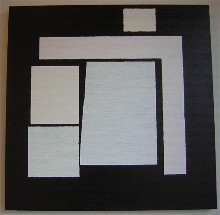
Enrico also had a couple of pieces that showed an exuberance, with embedded shapes that suggest instability and motion and closeness. One of them made me think about recent exhibits from both Anne Seidman and Tim McFarlane (see posts here and here), but the sense of urban closeness is decidedly not Enrico’s theme (image, “Untitled,” 35 x 36 inches).
As for whiting out color to the point of near invisibility, I think it’s a waste of good paint and it makes me feel like I’m being denied one of life’s great pleasures. It’s a punishment none of us deserves.
But the concentration required for the final product is not so far from what Sean is doing, making marks in a controlled rhythm that borders on obsession. Both these young men, however, are art insiders: Enrico’s MFA is from Yale (1998), and he has had several impressive honors, including a purchase prize from the American Academy of Arts and Letters (2004), a couple of residencies at the Vermont Studio Center and a Phillip Morris Fellowship. Sean is a University of Pennsylvania MFA (2004) where he won the Joan Mitchell Award and the Charles Addams Prize.
The show is up until the 18th at Pageant.


