Two photo-collagers at Drizzle are a reminder that everyone’s doing it but not all photo collages are equal. Jaison Crockett’s collages are seamless narratives that suggest surreal and paranormal happenings, the more mysterious the better (image, Crockett’s “DNA Cocktail”).
“Starward” uses scale to knock figures and a collection of toys into deep space. Is it a fairy tale? Is it a joke? Is it part of a weird story about parallel worlds? I didn’t care. It was fun.
When the narratives are too clear, they’re less successful as such. But the ultraclear “DNA Cocktail” still manages to charm. A man, shown multiple times in the same scene, drinks a glowing cocktail, and a woman, dressed in the same clothes, enters the room. The charm is in the composition which seems to borrow from the Leonardo daVinci “Last Supper”–a horizontal lineup of sitting people, a standing figure in the rear middle. But here we are in a youthful, budget-furnished apartment. And the new woman is giggling. It’s visually satisfying.
And with paranormal and surreal currently in the art world agenda, it’s hitting our zeitgeist buttons.
Some of the pieces seem like throwaways–too many guys floating in a sitting position. But if you’re looking at photo collages, where incoherence often rules, here’s a good place to look.
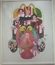
By way of contrast, Drizzle is also showing Jordan Eagles’ glib, Peter Max style Pop photo-collage posters of Americana. They’re deft, but not so interesting. Besides, I confess I’m having trouble separating the work from his blood spin art at QBix, which I can’t even bring myself to look at any closer than a peek into the gallery window (image, Eagles’ Thanksgiving poster).
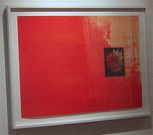
Kiki Gaffney and Joan Witek are a contrary pair and yet both fit nicely in the decorous work that Pentimenti generally shows.
Gaffney has always been on the verge of fabric with her pastelly drips and graphite flowers on mylar, stitched down to the matting in the upper corners. Witek is fierce, with her architectural black pastel and silver pencil drawings on paper (image above, one of Gaffney’s paintings on mylar).
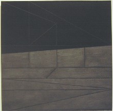
But both gave me nice surprises–Witek because her fierceness has a texture, sheen and bend that the flat computer screen cannot communicate, and Gaffney for boldness added to her work (image, a Witek drawing).
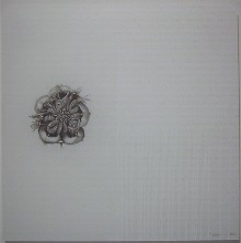
Gaffney has pumped up and/or soured her colors, added some mappy stitchery to one piece, included some paintings on plexiglas, and responded to the harder surface with a more hard-nosed paint grid that renews the fabric reference. Even the flower drawings in graphite look fiercer (above, a Gaffney painting on Plexiglas).
While the paintings and drawings of these two artists don’t have much in common, they still manage to talk to eachother, with their blocked-out fields.
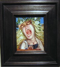
I went in here thinking I’d be crazy about the Carrie Ann Baade and lukewarm about the Laura Pakarow. I was wrong (above, Baade’s “Mademoiselle in Distress”).
I liked the Baade work, but once I realized how she was putting the work together, combining borrowed bits of imagery from paintings past, I was less enchanted. I like the scale shifts. I love her painting technique–very Old Masters. Some of the combinations are pretty great.
But the threat of hell that pumps the sincerity of the Flemish masters from whom she borrows is reduced to melodramatic psychological states. The result is a little distant from the soul of its sources–veiled and cool.
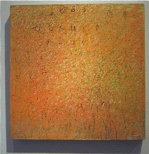
But the work I can’t get out of my mind are the paintings by Pakarow. The colors and intensity, the layers, the mark-making, the jazziness of the dancing dots–they all glow. The work makes an impression like the jazzy abstractions of Beauford Delaney, each color sparkling. But the paintings are smaller, and so are the dot-sized marks. The marks claw their way through the layers and so do the less dominant colors. Very nice (image, “Another Day,” by Pakarow).
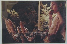
Ethnography and street photography are reflected in Tony Rocco’s collection of 27 photos he took in Colombia’s Cali state from whence his mother hails (image, “Nina Vendiendo Mazorca”).
Rocco uses both black and white and color, and some of the images are swell. But he’s printing with a computer, and the results in a few of the larger color photographs look digi.
Rocco’s mission in Cali was to show a different face of Cali than the newspapers generally show. He has done this, and as usual, his people and attention to texture can be quite compelling. But speaking of people, what happened to the ladies? Is there only one woman, a madonna-like young one holding an infant, in all of Cali?
(By way of comparison, Susan Bank’s documentation of Cuban country life in the current Fleisher Challenge is consistently visually challenging and arresting in content.)
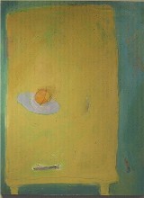
Also at 3rd Street, Katherine Kurtz’s Table Top Series of paintings are whimsical meditations on how daily life comes and goes. The perspectives on the table tops take some tilt from Cezanne still lifes. But there’s a pleasant modesty of intention, a joyous approach to color and what looks like an easy pleasure in mark-making that fits the daily comings and goings on this metaphoric symbol of home life, the table (image, “Peach Descending Yellow Table Top”).


