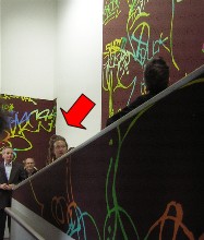
The ramp at the Institute of Contemporary Art continues to be the most challenging space to do anything meaningful in, but lately, there’s been some good success–this lates success being the work of Ingrid Calame, who’s the eighth artist to tackle the space (image, detail of ramp installation with arrow indicating Calame, who is talking about her project to ICA members).
Calame’s history of art making is in tracing stains, like oil stains, on pavement, and using the shapes to create her work. Most recently she has been using just the outlines of the tracings, layered into lacy images. This time, however, she took the tracing concept in other directions, and the result is great to look at, energetic, and coherent in any number of ways.
In the ICA members walk-around, just before the opening Friday, Calame said that when she took a look at the space, she realized lacy tracings weren’t going to hold up. So she added bold swatches of color to the mix.
She used a sign paint called “One Shot,”–highly toxic but quick-drying. The colors are spectacular.
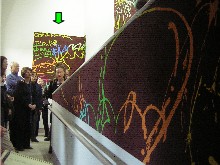
The undercoat is made of loosely applied areas of bright color. Then the top coat, a vivid shade of brown, allows the traced shapes she drew from along the Los Angeles river to show through. She was thinking childhood scratch drawings, with the top coat of black crayon removed to reveal the colors beneath(image, another detail of ramp installation with arrow pointing to Calame).
The shapes include tracings of layers of graffiti. After the election, she said, she became interested in the words. “Oh, this is a conversation happening in front of me,” she recollected thinking. “People were writing over what others have written and changing it to something else.”
The result is graphic enough to hold up in the difficult space, which is exactly what graffiti does, competing with the frantic urban landscape.
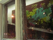
The shapes of the murals are another layer of tracing, based on the shapes of the windows and the angles of the ramp and how the shapes appear in the window reflections (Calame’s installation reflected in the windows).
Calame also was especially interested in how the murals appeared from outside. “This is a diorama, a little shoe box,” she said. “It’s best viewed from outside.” (There’s a specific parking meter across the street from which the view is tiptop).
I also liked the trope of graffiti, an outdoor phenomenon, going indoors and then again outdoors via the windows.
Calame, who’s jaunty with a fountain of fair dreadlocks, compared her creation of the piece to preparing for Thanksgiving. “It was months of preparations. And then we did it like that, in a week.”
Yum.
…On another ICA subject,
I added to my post on “Holiday Home” that it was funded in part by Philadelphia Exhibitions Initiative, which deserves a share of the praise. Roberta also added a tidbit on “Holiday Home,” here


