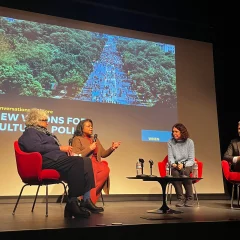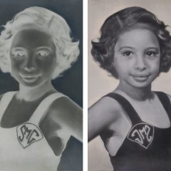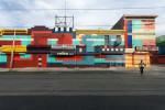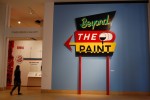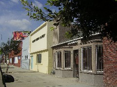
The galleries in L.A. show blind eyes to the street, look forbidding and closed, look not much like galleries. This is part of a row of galleries in Culver City along La Cienega Blvd. I almost didn’t find it, having mistakenly turned onto La Cienega Ave. But artist Carol Es pointed me in the right direction–told me where to see some art in L.A., and when I was lost, set me straight.
The stuff inside the galleries, like stuff at galleries everywhere, ranged from great to huh?
I started out at Es’ gallery, George Billis, which also has a New York space (it’s also Anne Seidman’s gallery), and had a great time there.
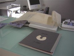
Carol Es’ book, 1-Self
For one thing, they showed me a copy of Es’ artist’s book, “1-Self,” recently purchased by the Getty. It’s packaged in a box that’s lined with sewing-pattern tissue, and it’s a mix of words and sewing-related images. Some of the originals of the images were in the gallery, too. Like all of Es’ art, it’s beautiful and delicate and vulnerable.
San Pedro
Two days later, the morning before my return to Philadelphia, I dashed over to Es’ new studio, a beautiful, airy space with a zillion windows on top of a hill in a park in San Pedro. The studio is in one of the buildings that were old army barracks, and the whole gallery and art area is now owned by the L.A. parks department.
I misjudged the time it would take to get there, however, and didn’t really have enough time to look and just talk. Damn. I felt guilty because Carol rushed over to show me around. And she felt guilty because the trip took longer than I expected and she blamed herself for that. But really, it was bad planning on my part.
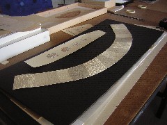
Above is one of the pieces Es had on a table. It’s all poked with pinholes and texture. She had lots of pieces of similar paper, many with small, painted images that looked stiched to the paper. One was a pattern piece of a shirt front, with a heart in just about the right spot.
Es is getting ready for a show at the Torrance Art Museum, an installation of a zillion of her cut-out pattern pieces pinned to a wall. That’s all she could get out before I had to leave. As I left I fingered some lacy paper–the negative pieces that Es had cut out. They were beautiful.
What else I saw in Culver City
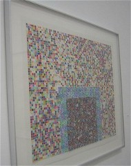
by Ellen Frances Tuchman
Two artists were showing at George Billis when I was there–Ellen Frances Tuchman and Julie Speed.
Tuchman’s airy mylar sheets are covered with stitched on tiny beads and sequins and other trimmings as well as what looked like marker and paint. The work has an architectural quality, including dark doorways and mosque-like towers. In several of the pieces, Tuchman rolled up sliced paintings and attached the coils to the mylar in a chock-a-block arrangement that brought to mind clock springs, or rolled anchovies packed in a can. The central dichotomies in the work are between the pretty airiness and the looming architecture; and between the breezy, decorative look paired with intense process.
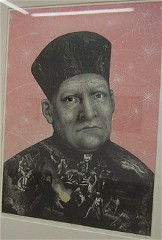
my favorite piece by Julie Speed includes images from a damaged bible
At the other end of the visual spectrum, Texas artist Julie Speed’s show “Bible Studies,” combines borrowed and collaged imagery with printmaking. The words and images are cut out of a distressed bible. There’s a touch of humor here, but it’s pretty dark and not particularly kind to her subjects–Old Masters grotesques, beautifully crafted and full of obsessive detail, in surreal spaces–much like a lot of Philadelphia art I see. Speed is in the collections of a bunch of Texas museums, including the San Antonio Museum of Art and the Austin Museum of Art. She sells things before they’re finished, according to the gallerist, Manolo.
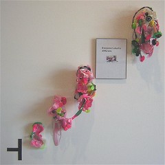
“Everyone’s Skull is Different,” by Jon-Paul Villegas
Next door at Lizabeth Oliveria Gallery Jon-Paul Villegas was showing work made of glue sticks and found objects, plus words that didn’t quite work for me. Nonetheless, I liked the shapes he made, that brought to mind toys, gift-store kitsch, roadside shrines and automobile finishes–not to mention Banks Violette.
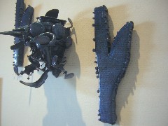
by Jon-Paul Villegas
Although the work resisted my inner monologue of stories and reasons, I felt like it was just a notch away from that open place where the plot thickens to suit the viewer.
The other two galleries I stopped at were Blum & Poe and Sandroni.Rey.
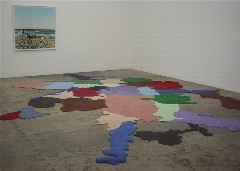
by Friedrich Kunath
Blum & Poe, from which I expected mucho, was the only gallery I went in that had the full New York-Chelsea chill in its spaces. But the work, by Friedrich Kunath of Cologne, Germany, seemed to barely make a dent in the forbidding spaces and felt somewhat undercooked. I liked the mappy rug on the floor, not so original a thought, but nicely done. A nearby photo of a man swathed in upscale bedding on a cot on a beach looked more like an ad for Ikea than a work of art. A stuffed bird wearing shoes that left paint footprints all across the gallery floor was jejune.
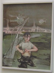
by Anthony Goicolea
At Sandroni.Rey, Anthony Goicolea’s drawings of campfire boys were beautifully drawn, painted, composed, but they looked suspiciously familiar. One painting looked like a Joy Feaseley, another like an Amy Cutler, and all of them looked like the work of Hernan Bas.

Goicolea wasn’t the only creator of some weird back-to-nature notion. After all, we were in L.A. where the rivers are lined with concrete. Here’s one of them right near the row of galleries. It’s hard to tell, but the dark area on the left is a “waterfall.”
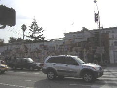
And speaking of the great outdoors, I also want to mention that this huge 1976 mural by our own Jane Golden graces Santa Monica. It’s a little worse for wear, with grafitti and fading colors. But my favorite part was the painted-out name after Golden’s. The cover-up paint was fresher than the rest of the mural. I wondered, did the artist paint it out himself, embarrassed by his past work? Oops, there I go again, making up stories.


