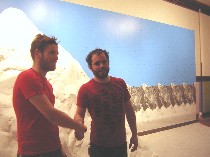
Nick Paparone and Jamie Dillon standing in front of Everest
Mountains and boulders of papier mache are everywhere, it seems. In the past year Roberta and I have seen four.
The first was Everest, the hilariously diminutive, comic-booky version of a white-out mountain at Space 1026 by Nick Paparone and Jamie Dillon. A deadpan rendition of the grandeur of nature, including a white rug beneath, it came straight out of Miss Dingle’s kindergarten’s stage-set building project. It made a mockery of the ambitions of mountain climbers and the eagerness of travellers and their tourist snapshots at the same time that it took a swipe at the power we impute to nature.
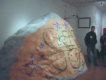
Paparone and Dillon’s boulder, a repainting of Everest
Then the two artists further diminished the mountain by transforming Everest with several coats of paint, making it into a graffitied boulder. I knew this boulder from my childhood, an outcropping of rock in New Jersey, on the route to the Catskill Mountains from Brooklyn, with fraternity letters, declarations of love, and layers of names. When it turned up in Nexus as part of the Benjamin Franklin tribute, it brought back those memories and elicited a big laugh for the shamelessness of the transformation. At the same time that the boulder suggested how proud and influential those words can be, broadcast to a large audience–all this in honor of Franklin the writer and publisher and rights advocate–the repainted rock also suggested how transitory a mark we as humans make with our art, our marks, and our words.
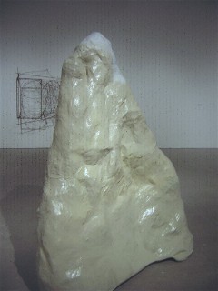
Jessica Jackson Hutchins’ white mountain; Hutchins is inspired by the Northwest coastal and Icelandic landscapes
But then a non-comic mountain of papier mache turned up in one of the current ICA shows, Gone Formalism. The mountain is one of several bits of nature seriously rendered in papier mache by Jessica Jackson Hutchins–almost adamantine…and yet not.
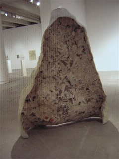
The back side of Hutchins’ mountain on display
The mountain is a facade, the newsprint and substructure displayed on the back. Not comic, this mountain is mostly a suggestion of the fragility of nature–but there’s something else going on here. After all, why display the back if it’s only about fragility and pollution and such, I wondered. This mountain, which was somewhat more carefully crafted than Paparone and Dillon’s, still had the chunkiness and cheapness and homeliness of papier mache, and was proud of it. It was a salute that said nature is beyond us and our abilities to recreate. But it sure is worth a try.
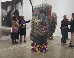
a couple of Dan Colen’s untitled boulders at the Whitney Biennial, made of styrofoam, papier-mache, oil paint and paper
Last Roberta and I saw Dan Colen’s papier mache boulders plastered with graffiti and faux bits of chewing gum at the Whitney yesterday. The chewing gum looked more real than the boulders. So did the graffiti. The rocks are expressions of anger, turds atop wooden pedestals with cheery messages like “Eat shit and die.” The pedestals suggest they are comments on art as well as on what is happening to the world around us. It’s saying it’s all crap.
In the context of Urs Fischer’s punched through walls which frame the boulders (see previous post), the entire art world is fragile, falling apart, open to attack.
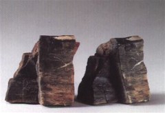
a pair of rocks, one real, the copy acrylic-painted cast bronze by Vija Celmins
All of the papier mache rocks seem antitethical to Vija Celmins’ small cast rocks that look so real it is hard to tell the cast versions from reality. Celmins’ rocks have a sense of permanence and indeed they have lasted nicely for more than 25 years, so far. But one punch from Rocky and pouf, the papier mache mountain becomes a molehill.
Roberta and I had our own papier mache phase. Now even the beloved self-portrait pinatas are serving as landfill. Hey, we liked those pieces. But papier mache is not meant for the ages. It’s cheap. It’s easy. It’s junk art, no matter how excellent, destined to turn into dust if not into landfill, eventually.
Perhaps the papier mache outcroppings are in vogue because they are of an age where we use the term “virtual” to mean not virtual, an age when we think we’ve seen the real thing because we viewed it on a computer screen. It’s a world in which a magical perfection from Photoshop and Illustrator and CAD can be vaporized with the touch of a computer key.
In our world we find entertainment and meaning in a machine that spits back to us only what we’ve put into it. We’re not looking outward to the real world and the incomprehensible, limitless universe. It’s too scary. To cover a “rock” with graffiti is to plaster our puny selves on top of nature’s majesty, to shout me me me, like a child looking for attention, to claim power where we have none.
As we said in the previous Whitney post, this year’s biennial is angry and it’s mostly about people looking at pop culture and seeing a void and seeing ugliness. Mountains are real and beautiful and long-lasting. Papier mache doesn’t even try to be any of those things. It has given up the hope of transcendence. This art is not for the faint of heart.


