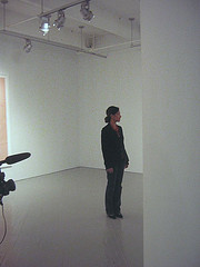
Shahzia Sikander speaking at the Fabric Workshop and Museum, with video camera on left
Shahzia Sikander came to the Fabric Workshop and Museum Friday to talk about her work there (see posts here and here). Sikander, a tiny woman further dwarfed by the scale of the gallery space where she stood during a walk-through for Fab members, started by crediting all the folks at the FWM with whom she is working, and gave a special thanks to local artist Kate Abercrombie.
I found that credit especially interesting given Abercrombie’s work, which is influenced by miniatures and is full of dreamy, patterned landscapes in candy colors.
Sikander, whose work also comes out of Eastern traditions, including miniatures, as well as Western art traditions, said she came to the FWM four years ago for the first time, and was eager to do something sculptural. “Once I got over having to do something completely different,” she said, referring to her usual 2-D practice, she ended up making the first of the book pages, The Illustrated Page Series #1, with its suggestion of a book, an object in the 3-dimensional world. This piece is to be the first in a series.
Talking about the influences that went into Illustrated Page–book illustration, and framing devices and miniature paintings–she said the work included images she had been developing in the more fluid ink on paper.
The borders she said were created in detail on a small scale, and then scanned, cleaned up, and upsized.
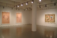
left to right, Pathology of Suspension #5, 2005, gouache on paper, 77 ½ H x 51 ½ inches, Courtesy Sikkema Jenkins and Co., NYC;
Pathology of Suspension #7, 2005, gouache on prepared paper, 85 H x 58 ½ inches, courtesy Eileen and Richard Ekstract, and Illustrated Page Series #1
Part of what Sikander said she liked about the book pages, unlike the quick, fluid ink drawings, was that she could keep revisiting the work, adding density and layers and new information atop the printed imagery. “It’s very different from the looser [ink-on-paper] approach,” she said.
She was a little reticent about her content, wanting to save some of it for the talk she was about to give an hour later. She said, “People seek meaning. But it’s not illustrative. I’m already dealing with a very illustrative genre.” She said narrative limits her.
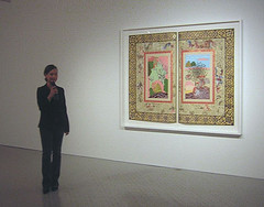
Sikander and her piece, The Illustrated Page Series #1, 2005-6, Work on paper (gouache hand painting, gold leaf, and silkscreen pigment), 80×66 inches (framed), made in collaboration with the Fabric Workshop and Museum.
She talked some about the sources for her imagery. She mentioned that the flying black shapes were based on the hair (taken from traditional miniature images) of the female worshipers of Krishna. She liked their abstract shapes, and said that not everything she used and borrowed had elaborate meanings.
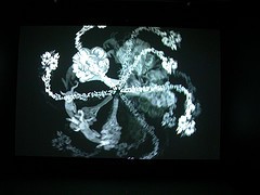
Of the Arabic script she used in her video,Dissonance to Detour, she said that she had read the script all her life, because Urdu is written in Arabic script. But she said that she didn’t understand Arabic. Arabic text, she said has a “strong sense of sculptural form,” which she then enhances. But, like the hair on the heads of Krishna worshipers, the form is separated from the original meaning, and becomes part of a visual vocabulary for her.
She said she works small and large, incorporating new media if she can. “I think it benefits…from changing course.”


